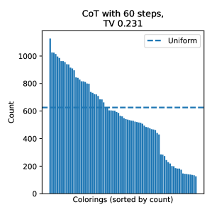
## Bar Chart with Overlay Line: CoT with 60 steps, TV 0.231
### Overview
The image is a vertical bar chart displaying the frequency distribution of "Colorings," sorted by count. A horizontal dashed line representing a "Uniform" distribution is overlaid for comparison. The chart's title indicates it relates to a "CoT with 60 steps" and a "TV" value of 0.231.
### Components/Axes
* **Title:** "CoT with 60 steps, TV 0.231" (Top center).
* **Y-Axis:**
* **Label:** "Count" (Left side, rotated vertically).
* **Scale:** Linear scale from 0 to 1000, with major tick marks at 0, 200, 400, 600, 800, and 1000.
* **X-Axis:**
* **Label:** "Colorings (sorted by count)" (Bottom center).
* **Scale:** Categorical, representing individual colorings. The bars are sorted in descending order of their count value from left to right.
* **Legend:** Located in the top-right corner of the plot area.
* **Label:** "Uniform"
* **Symbol:** A blue dashed line (`--`).
* **Data Series:**
1. **Bars (Primary Data):** Solid blue vertical bars representing the count for each coloring.
2. **Dashed Line (Reference):** A horizontal blue dashed line representing the "Uniform" distribution value.
### Detailed Analysis
* **Bar Data Series (Counts):**
* **Trend:** The bars show a clear, steeply decreasing trend from left to right. The leftmost bar has the highest count, and the rightmost bar has the lowest.
* **Key Data Points (Approximate):**
* **Maximum (Leftmost bar):** ~1100.
* **Initial Plateau:** The first ~15-20 bars show a gradual decline from ~1100 to ~800.
* **Steep Decline:** A pronounced, steep drop occurs in the middle section of the chart. The count falls from ~800 to ~400 over a relatively short span of colorings.
* **Tail:** The rightmost portion of the chart shows a long tail of colorings with low counts, tapering down to values near or below 100.
* **"Uniform" Line (Reference):**
* **Value:** The horizontal dashed line is positioned at a Y-value of approximately **620**.
* **Position:** It intersects the bar series roughly one-third of the way from the left, indicating that only the most frequent colorings (the leftmost bars) have counts significantly above the uniform expectation.
### Key Observations
1. **Highly Skewed Distribution:** The data is not uniform. A small number of colorings (on the left) occur very frequently, while the vast majority (the long tail to the right) occur rarely.
2. **Sharp Transition:** There is a distinct "cliff" or sharp transition point in the middle of the distribution where the frequency drops dramatically.
3. **Uniform Baseline:** The "Uniform" line at ~620 serves as a benchmark. The fact that most bars are below this line indicates that the distribution of colorings is concentrated in a few high-frequency items, with the rest being sparse.
### Interpretation
This chart visualizes the output distribution of a process (likely a Chain-of-Thought reasoning process with 60 steps) across different "colorings" (which could represent distinct reasoning paths, outputs, or states). The Total Variation (TV) distance of 0.231 quantifies the difference between this observed distribution and a uniform one.
The data suggests the process is **highly deterministic or biased**, favoring a small subset of outcomes. The sharp drop-off implies a potential phase transition or a threshold effect in the generation process—perhaps where certain constraints or rules cause a rapid decrease in the viability of many colorings. The long tail indicates that while most outcomes are rare, a non-zero probability exists for a wide variety of them. This pattern is common in generative processes where a few "attractor" states dominate, but exploration still produces a diverse, low-frequency tail. The uniform line highlights how far the system is from a random, unbiased exploration of the coloring space.