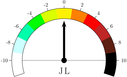
## Gauge Chart: JL Indicator
### Overview
The image is a gauge chart, also known as a dial chart, displaying a value indicator. The gauge ranges from -10 to 10, with different colors representing different value ranges. A black arrow indicates the current value, which appears to be close to 0. The label "JL" is present at the base of the arrow.
### Components/Axes
* **Scale:** The gauge ranges from -10 to 10.
* **Axis Markers:** -10, -8, -6, -4, -2, 0, 2, 4, 6, 8, 10
* **Color Gradient:** The gauge uses a color gradient that transitions from white to light blue to cyan to green to yellow to orange to red to dark red to brown to black.
* **Indicator:** A black arrow points to the current value on the gauge.
* **Label:** "JL" is positioned below the center of the gauge.
### Detailed Analysis
The gauge is divided into segments, each representing a range of values. The color of each segment corresponds to the value range.
* **-10 to -8:** White to light blue
* **-8 to -6:** Light blue to cyan
* **-6 to -4:** Cyan to green
* **-4 to -2:** Green to yellow
* **-2 to 0:** Yellow
* **0 to 2:** Yellow to orange
* **2 to 4:** Orange to red
* **4 to 6:** Red to dark red
* **6 to 8:** Dark red to brown
* **8 to 10:** Brown to black
The black arrow points directly upwards, indicating a value of approximately 0.
### Key Observations
* The indicator "JL" is at or near 0.
* The color gradient provides a visual representation of the value range.
* The gauge covers a range from -10 to 10.
### Interpretation
The gauge chart provides a visual representation of a value, indicated by "JL," which is currently near the center of the scale (approximately 0). The color gradient helps to quickly assess the value's position within the overall range. The chart suggests that the "JL" indicator is currently at a neutral or baseline level.