## Bar Charts: Impact of Pruning Strategy on Model Quality
### Overview
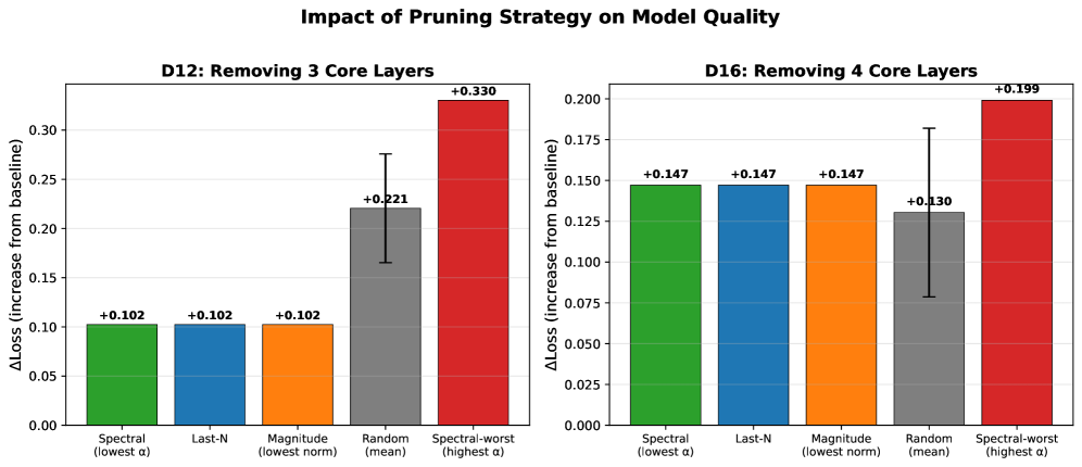
The image contains two side-by-side bar charts comparing the impact of different pruning strategies on model quality. The left chart (D12) focuses on removing 3 core layers, while the right chart (D16) examines removing 4 core layers. Each chart evaluates five pruning strategies: Spectral (lowest α), Last-N, Magnitude (lowest norm), Random (mean), and Spectral-worst (highest α). The y-axis measures ΔLoss (increase from baseline), and error bars indicate variability in results.
### Components/Axes
- **X-Axis (Strategies)**:
- Spectral (lowest α)
- Last-N
- Magnitude (lowest norm)
- Random (mean)
- Spectral-worst (highest α)
- **Y-Axis (ΔLoss)**:
- Scale ranges from 0.00 to 0.35 (D12) and 0.00 to 0.20 (D16).
- **Legends**:
- Colors correspond to strategies:
- Green: Spectral (lowest α)
- Blue: Last-N
- Orange: Magnitude (lowest norm)
- Gray: Random (mean)
- Red: Spectral-worst (highest α)
### Detailed Analysis
#### D12: Removing 3 Core Layers
- **Spectral (lowest α)**: +0.102 (green bar).
- **Last-N**: +0.102 (blue bar).
- **Magnitude (lowest norm)**: +0.102 (orange bar).
- **Random (mean)**: +0.221 (gray bar) with error bar (±0.05).
- **Spectral-worst (highest α)**: +0.330 (red bar).
#### D16: Removing 4 Core Layers
- **Spectral (lowest α)**: +0.147 (green bar).
- **Last-N**: +0.147 (blue bar).
- **Magnitude (lowest norm)**: +0.147 (orange bar).
- **Random (mean)**: +0.130 (gray bar) with error bar (±0.07).
- **Spectral-worst (highest α)**: +0.199 (red bar).
### Key Observations
1. **Spectral-worst (highest α)** consistently shows the largest ΔLoss in both charts, suggesting it is the least effective pruning strategy.
2. **Random (mean)** exhibits significant variability, as indicated by error bars (±0.05 in D12, ±0.07 in D16).
3. **Spectral, Last-N, and Magnitude** strategies yield nearly identical ΔLoss values in both charts, implying similar performance across layer removal counts.
4. ΔLoss increases with the number of layers removed (e.g., D16 values are higher than D12 for equivalent strategies).
### Interpretation
The data suggests that pruning strategies with lower α (Spectral) or norm (Magnitude) are more effective at minimizing ΔLoss compared to Random or Spectral-worst. The Spectral-worst strategy, which targets the highest α values, results in the largest performance degradation, likely due to removing critical features. The Random strategy’s variability (error bars) indicates inconsistent outcomes, possibly due to random selection of layers. The consistent performance of Spectral, Last-N, and Magnitude across both charts implies these methods are robust to changes in the number of layers pruned.
### Spatial Grounding & Trend Verification
- **D12 Chart**:
- Spectral-worst (red) is the tallest bar, confirming it has the highest ΔLoss.
- Random (gray) has the second-highest ΔLoss, with error bars extending to ~0.27.
- **D16 Chart**:
- Spectral-worst (red) again dominates, with ΔLoss of +0.199.
- Random (gray) shows a lower ΔLoss than D12 but higher variability (±0.07).
- **Color Consistency**: All legend colors match bar colors in both charts.
### Uncertainties & Anomalies
- The Random strategy’s error bars suggest measurement noise or variability in layer selection.
- The identical ΔLoss values for Spectral, Last-N, and Magnitude in both charts may indicate a design choice to group these strategies as "effective" pruning methods.
This analysis extracts all textual and numerical data, cross-references legend colors, and interprets trends to explain the relationship between pruning strategies and model quality.