## Composite Technical Figure: Causal Diagram and Scatter Plot
### Overview
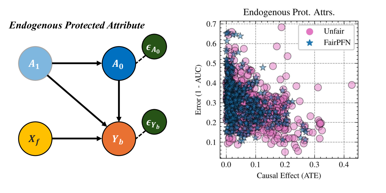
The image is a composite figure containing two distinct but related elements. On the left is a causal directed acyclic graph (DAG) illustrating a model for an "Endogenous Protected Attribute." On the right is a scatter plot titled "Endogenous Prot. Attrs." (likely an abbreviation for "Protected Attributes") that compares the performance of two methods, "Unfair" and "FairPFN," across two metrics: Causal Effect (ATE) and Error (1 - AUC).
### Components/Axes
**Left Component: Causal Diagram**
* **Title:** "Endogenous Protected Attribute" (top-left, italicized).
* **Nodes (Variables):**
* `A1`: Light blue circle, positioned top-left.
* `A0`: Dark blue circle, positioned top-center.
* `Xf`: Yellow circle, positioned bottom-left.
* `Yb`: Orange circle, positioned bottom-center.
* `ε_A0` (epsilon A0): Dark green circle, positioned top-right, connected to `A0` with a dashed line.
* `ε_Yb` (epsilon Yb): Dark green circle, positioned bottom-right, connected to `Yb` with a dashed line.
* **Edges (Causal Relationships):** Solid black arrows indicate direct influence.
* `A1` → `A0`
* `A1` → `Yb`
* `A0` → `Yb`
* `Xf` → `Yb`
* Dashed lines connect error terms (`ε_A0`, `ε_Yb`) to their respective variables (`A0`, `Yb`).
**Right Component: Scatter Plot**
* **Title:** "Endogenous Prot. Attrs." (top-center).
* **X-Axis:**
* **Label:** "Causal Effect (ATE)" (bottom-center). ATE likely stands for Average Treatment Effect.
* **Scale:** Linear, ranging from 0.0 to 0.45. Major ticks at 0.0, 0.1, 0.2, 0.3, 0.4.
* **Y-Axis:**
* **Label:** "Error (1 - AUC)" (left-center, rotated vertically). AUC likely stands for Area Under the Curve (ROC).
* **Scale:** Linear, ranging from 0.05 to 0.7. Major ticks at 0.1, 0.2, 0.3, 0.4, 0.5, 0.6, 0.7.
* **Legend:** Located in the top-right corner of the plot area.
* **Unfair:** Represented by pink/magenta circles (●).
* **FairPFN:** Represented by blue stars (★).
* **Grid:** Light gray dashed grid lines are present for both major x and y ticks.
### Detailed Analysis
**Causal Diagram Analysis:**
The diagram models a system where a protected attribute (`A1`) has an endogenous component (`A0`). `A1` influences both the endogenous protected attribute `A0` and the outcome `Yb`. The final outcome `Yb` is also influenced by `A0` and a feature `Xf`. The error terms (`ε_A0`, `ε_Yb`) represent unobserved confounding or noise affecting `A0` and `Yb`, respectively.
**Scatter Plot Data Analysis:**
* **Data Density:** The plot contains several hundred data points. The "FairPFN" (blue stars) points are densely clustered, while the "Unfair" (pink circles) points are more dispersed.
* **"FairPFN" (Blue Stars) Trend & Distribution:**
* **Visual Trend:** The cluster slopes gently downward from left to right.
* **X-Range (Causal Effect):** Primarily concentrated between 0.0 and 0.2. The vast majority of points are below 0.15.
* **Y-Range (Error):** Primarily concentrated between 0.1 and 0.4. The dense core is between 0.15 and 0.35.
* **Key Observation:** This method achieves low causal effect (low unfairness) while maintaining moderate to low error.
* **"Unfair" (Pink Circles) Trend & Distribution:**
* **Visual Trend:** The points are widely scattered with no single clear linear trend, but they occupy a much larger area of the plot.
* **X-Range (Causal Effect):** Spans almost the entire axis, from near 0.0 to over 0.4.
* **Y-Range (Error):** Also spans a wide range, from below 0.1 to nearly 0.7.
* **Key Observation:** This baseline method shows a strong trade-off: points with very low error often have high causal effect (high unfairness), and points with low causal effect often have higher error. There are many outliers with both high error (>0.5) and high causal effect (>0.2).
### Key Observations
1. **Clear Performance Separation:** The two methods form largely distinct clusters. "FairPFN" is tightly grouped in the desirable region of low error and low causal effect.
2. **Trade-off Visualization:** The "Unfair" method's scatter visually demonstrates the fairness-accuracy trade-off. The "FairPFN" cluster appears to break this trade-off, achieving a better Pareto frontier.
3. **Outliers:** Several "Unfair" data points are significant outliers, with Error (1-AUC) values approaching 0.7 and Causal Effect (ATE) values exceeding 0.4. The "FairPFN" method has very few points outside its core cluster.
4. **Spatial Grounding:** The legend is positioned in the top-right, overlapping some of the "Unfair" data points. The highest density of "FairPFN" points is in the center-left of the plot (ATE ~0.05-0.1, Error ~0.2-0.3).
### Interpretation
This figure presents a technical argument for a method called "FairPFN" in the context of algorithmic fairness.
* **The Causal Model (Left)** defines the problem: it illustrates a scenario where a protected attribute (`A1`) influences an outcome (`Yb`) both directly and through an endogenous component (`A0`), with unobserved factors (`ε`) adding complexity. This setup is typical for studying unfairness where the protected attribute is correlated with other features in the data-generating process.
* **The Empirical Results (Right)** demonstrate the solution. The scatter plot provides strong visual evidence that "FairPFN" successfully mitigates the unfairness (low Causal Effect/ATE) without a significant sacrifice in predictive performance (low Error/1-AUC). In contrast, the "Unfair" baseline exhibits the classic, undesirable trade-off: reducing error often increases unfairness, and vice-versa.
* **Underlying Message:** The composite figure argues that by explicitly modeling the endogenous nature of protected attributes (as shown in the DAG), the "FairPFN" method can achieve a superior fairness-accuracy balance compared to a standard ("Unfair") approach. The tight clustering of "FairPFN" suggests it is a robust and consistent method across the tested scenarios.