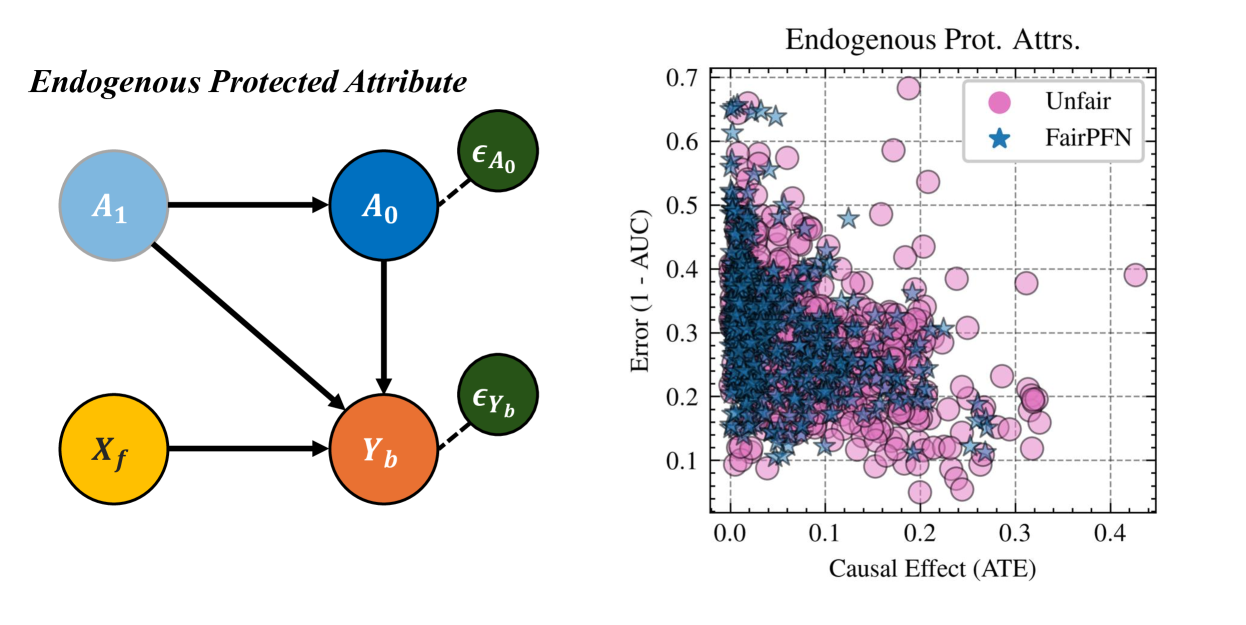
## Diagram: Endogenous Protected Attribute and Scatter Plot of Fairness vs. Causal Effect
### Overview
The image contains two components:
1. **Left Diagram**: A causal flow diagram titled "Endogenous Protected Attribute" with colored nodes and directional arrows.
2. **Right Scatter Plot**: A graph titled "Endogenous Prot. Attrs." showing the relationship between "Error (1 - AUC)" and "Causal Effect (ATE)" with two data series differentiated by color and shape.
---
### Components/Axes
#### Left Diagram (Causal Flow)
- **Nodes**:
- **A₁**: Light blue circle (top-left).
- **A₀**: Dark blue circle (center-left).
- **X_f**: Orange circle (bottom-left).
- **Y_b**: Red circle (bottom-center).
- **ε_A₀**: Green circle (top-right, connected to A₀).
- **ε_Y_b**: Green circle (bottom-right, connected to Y_b).
- **Arrows**:
- A₁ → A₀ (solid black).
- A₁ → Y_b (solid black).
- A₀ → Y_b (solid black).
- A₀ → ε_A₀ (dashed black).
- Y_b → ε_Y_b (dashed black).
#### Right Scatter Plot
- **Axes**:
- **X-axis**: "Causal Effect (ATE)" (0.0 to 0.4).
- **Y-axis**: "Error (1 - AUC)" (0.1 to 0.7).
- **Legend**:
- **Pink Circles**: Labeled "Unfair".
- **Blue Stars**: Labeled "FairPFN".
- **Data Points**:
- Pink circles (Unfair) dominate the upper-left quadrant (high error, low ATE).
- Blue stars (FairPFN) cluster in the lower-right quadrant (low error, moderate ATE).
---
### Detailed Analysis
#### Left Diagram
- **Flow Structure**:
- A₁ influences both A₀ and Y_b directly.
- A₀ further influences Y_b, creating a dependency chain.
- ε_A₀ and ε_Y_b represent exogenous noise terms affecting A₀ and Y_b, respectively.
- **Color Coding**:
- Blue (A₁, A₀) suggests primary causal variables.
- Orange (X_f) and red (Y_b) indicate intermediate/dependent variables.
- Green (ε terms) denotes noise.
#### Right Scatter Plot
- **Data Distribution**:
- **Unfair (Pink Circles)**:
- Clustered between ATE = 0.0–0.2 and Error = 0.3–0.7.
- Outliers extend to ATE = 0.4 (Error ≈ 0.2).
- **FairPFN (Blue Stars)**:
- Concentrated between ATE = 0.1–0.3 and Error = 0.1–0.3.
- Fewer points in the lower-left quadrant (low ATE, low error).
---
### Key Observations
1. **FairPFN vs. Unfair**:
- FairPFN methods achieve lower error (1 - AUC) while maintaining moderate causal effect (ATE).
- Unfair methods exhibit higher error, especially at lower ATE values.
2. **Causal Flow**:
- The diagram suggests Y_b is a downstream variable influenced by both A₀ and A₁, with noise terms ε_A₀ and ε_Y_b introducing variability.
3. **Scatter Plot Trends**:
- No clear linear relationship between ATE and Error; FairPFN points show a trade-off between fairness and causal effect.
---
### Interpretation
1. **FairPFN Advantage**:
- The scatter plot implies FairPFN methods reduce error (improving AUC) without sacrificing causal effect, making them preferable for fairness-aware modeling.
2. **Endogenous Attribute Dynamics**:
- The diagram highlights how protected attributes (A₀) and their noise (ε_A₀) propagate through the system, affecting outcomes (Y_b). This underscores the need to model endogenous confounding in fairness interventions.
3. **Outliers**:
- A few Unfair points at high ATE (0.3–0.4) with low error suggest rare cases where unfair methods perform well, possibly due to specific data distributions or model configurations.
---
### Conclusion
The image demonstrates that FairPFN methods outperform Unfair approaches in balancing fairness (lower error) and causal effect (ATE). The causal diagram emphasizes the importance of addressing endogenous protected attributes and their noise in fairness-aware machine learning systems.