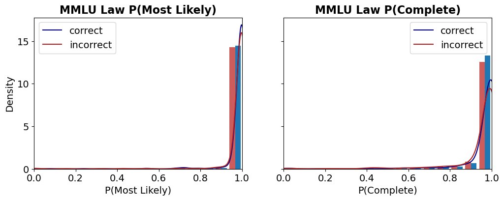
## Chart: MMLU Law Probability Distributions
### Overview
The image presents two probability distribution charts, each displaying the density of correct and incorrect predictions under different conditions: "Most Likely" and "Complete". Both charts show a high concentration of predictions near a probability of 1.0, with a greater density of correct predictions in that region.
### Components/Axes
**Left Chart:**
* **Title:** MMLU Law P(Most Likely)
* **X-axis:** P(Most Likely), ranging from 0.0 to 1.0 in increments of 0.2.
* **Y-axis:** Density, ranging from 0 to 15 in increments of 5.
* **Legend:** Located in the top-left corner.
* **Blue line:** "correct"
* **Red line:** "incorrect"
**Right Chart:**
* **Title:** MMLU Law P(Complete)
* **X-axis:** P(Complete), ranging from 0.0 to 1.0 in increments of 0.2.
* **Y-axis:** Density, ranging from 0 to 15 in increments of 5.
* **Legend:** Located in the top-right corner.
* **Blue line:** "correct"
* **Red line:** "incorrect"
### Detailed Analysis
**Left Chart: MMLU Law P(Most Likely)**
* **Correct (Blue):** The blue line representing correct predictions starts near 0.0 density at 0.0 probability, remains close to 0 until approximately 0.8 probability, and then sharply increases to a peak density of approximately 16 near 1.0 probability.
* **Incorrect (Red):** The red line representing incorrect predictions starts near 0.0 density at 0.0 probability, remains close to 0 until approximately 0.8 probability, and then sharply increases to a peak density of approximately 14 near 1.0 probability.
**Right Chart: MMLU Law P(Complete)**
* **Correct (Blue):** The blue line representing correct predictions starts near 0.0 density at 0.0 probability, remains close to 0 until approximately 0.8 probability, and then sharply increases to a peak density of approximately 13 near 1.0 probability.
* **Incorrect (Red):** The red line representing incorrect predictions starts near 0.0 density at 0.0 probability, remains close to 0 until approximately 0.8 probability, and then sharply increases to a peak density of approximately 10 near 1.0 probability.
### Key Observations
* Both charts show a similar trend: a low density of predictions until a probability of around 0.8, followed by a sharp increase towards 1.0.
* In both charts, the density of correct predictions is higher than the density of incorrect predictions near a probability of 1.0.
* The "Most Likely" chart shows a slightly higher peak density for both correct and incorrect predictions compared to the "Complete" chart.
### Interpretation
The data suggests that the MMLU Law model, under both "Most Likely" and "Complete" conditions, tends to assign high probabilities to its predictions. The higher density of correct predictions near a probability of 1.0 indicates that the model is generally accurate when it is highly confident. The slight difference between the "Most Likely" and "Complete" conditions suggests that the "Most Likely" setting might lead to slightly more confident predictions overall. The fact that both correct and incorrect predictions cluster near 1.0 indicates that the model can be overconfident in its incorrect predictions as well.