## Density Plot: MMLU Law Probability Distributions
### Overview
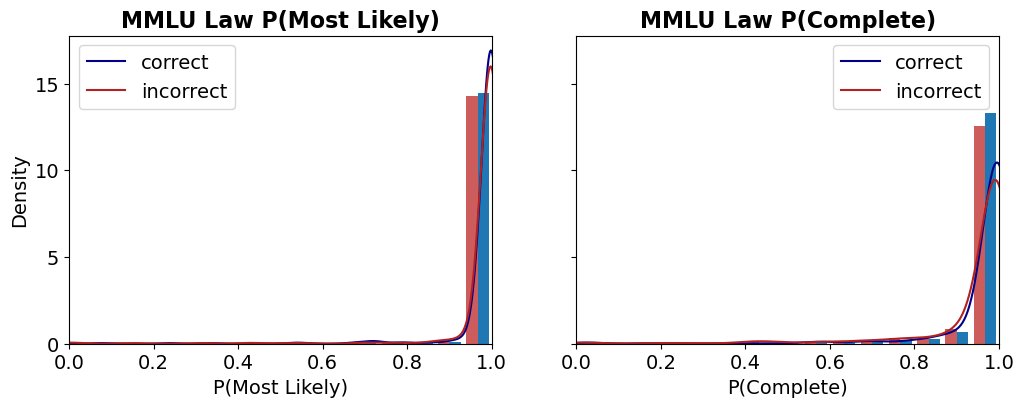
The image displays two side-by-side density plots, each combining a histogram with an overlaid kernel density estimate (KDE) curve. The plots analyze the distribution of probability scores for correct versus incorrect answers on the "MMLU Law" benchmark. The left plot is titled "MMLU Law P(Most Likely)" and the right plot is titled "MMLU Law P(Complete)".
### Components/Axes
* **Titles:**
* Left Plot: "MMLU Law P(Most Likely)"
* Right Plot: "MMLU Law P(Complete)"
* **X-Axes:**
* Left Plot: Label is "P(Most Likely)". Scale ranges from 0.0 to 1.0 with major ticks at 0.0, 0.2, 0.4, 0.6, 0.8, and 1.0.
* Right Plot: Label is "P(Complete)". Scale ranges from 0.0 to 1.0 with major ticks at 0.0, 0.2, 0.4, 0.6, 0.8, and 1.0.
* **Y-Axis (Shared):** Label is "Density". Scale ranges from 0 to 15 with major ticks at 0, 5, 10, and 15.
* **Legends:** Both plots contain an identical legend positioned in the **top-left corner** of the plot area.
* A blue line is labeled "correct".
* A red line is labeled "incorrect".
* **Data Series:** Each plot contains two overlaid series:
1. **Histogram Bars:** Semi-transparent bars showing the binned frequency distribution.
2. **KDE Curves:** Smooth lines showing the estimated probability density function.
### Detailed Analysis
**Left Plot: MMLU Law P(Most Likely)**
* **Trend Verification:** Both the "correct" (blue) and "incorrect" (red) distributions are heavily right-skewed, with the vast majority of density concentrated near a probability of 1.0. The blue "correct" curve shows a sharper, higher peak very close to 1.0 compared to the red "incorrect" curve.
* **Data Points & Distribution:**
* **Correct (Blue):** The histogram bars and KDE curve show an extremely high density peak in the bin from approximately 0.95 to 1.0. The peak density value is approximately 16-17 (slightly above the top y-axis tick of 15). There is negligible density below 0.8.
* **Incorrect (Red):** The distribution also peaks sharply near 1.0, but the peak is slightly lower (density ~14-15) and marginally broader than the "correct" peak. A very small but non-zero density exists in the 0.8 to 0.95 range.
**Right Plot: MMLU Law P(Complete)**
* **Trend Verification:** Both distributions are again right-skewed towards 1.0. However, the separation between the "correct" and "incorrect" distributions is more pronounced here than in the left plot. The "incorrect" distribution has a visibly longer tail extending towards lower probabilities.
* **Data Points & Distribution:**
* **Correct (Blue):** The distribution is tightly clustered near 1.0. The peak density is high, approximately 13-14, located in the 0.95-1.0 bin. Density drops off very sharply below 0.9.
* **Incorrect (Red):** The peak near 1.0 is lower (density ~12) and broader than the "correct" peak. Crucially, there is a noticeable secondary concentration of density (a "shoulder" or minor mode) in the range of approximately 0.8 to 0.9. The tail of the distribution extends further left, with small but visible density bars present down to around 0.6.
### Key Observations
1. **High Confidence Overall:** For both metrics ("Most Likely" and "Complete"), the model assigns very high probabilities (>>0.8) to the vast majority of its answers, regardless of correctness.
2. **Correct Answers Have Higher Confidence:** In both plots, the distribution for correct answers (blue) is more concentrated at the extreme high end (near 1.0) than the distribution for incorrect answers (red).
3. **"Complete" Metric Shows Better Separation:** The distinction between correct and incorrect answer confidence is clearer in the "P(Complete)" plot. Incorrect answers here show a more significant spread into the 0.6-0.9 probability range, whereas in the "P(Most Likely)" plot, even incorrect answers are almost all above 0.9.
4. **Potential Overconfidence:** The fact that incorrect answers still have probabilities peaking near 1.0, especially in the "Most Likely" metric, suggests the model can be highly confident in its wrong answers.
### Interpretation
These plots visualize the calibration and confidence of a model on the MMLU Law benchmark. The data suggests the model is **well-calibrated for correct answers** (high confidence aligns with correctness) but **poorly calibrated for incorrect answers**, exhibiting significant **overconfidence**.
The "P(Most Likely)" metric, which likely measures the probability assigned to the single top-choice answer, shows almost no differentiation in confidence between right and wrong—both are near-certain. This indicates that when the model is wrong, it is often "confidently wrong."
The "P(Complete)" metric, which may represent a probability derived from a more complete answer distribution (e.g., across all options), provides a slightly better signal. Here, incorrect answers show a measurable, though still small, increase in uncertainty (lower probabilities). This implies that analyzing the full answer distribution, rather than just the top choice, might offer a better avenue for detecting model errors or uncertainty.
**In summary:** The model demonstrates high confidence overall, but this confidence is not a reliable indicator of correctness, particularly when looking only at the most likely answer. The "Complete" probability metric offers a marginally better, though still imperfect, separation between correct and incorrect responses.