## Line Graphs: MMLU Law P(Most Likely) and P(Complete)
### Overview
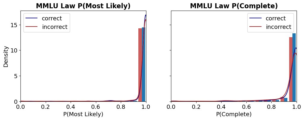
Two line graphs compare the density distributions of "correct" (blue) and "incorrect" (red) answers for the MMLU Law dataset. The left graph focuses on **P(Most Likely)**, while the right graph focuses on **P(Complete)**. Both graphs show sharp peaks near x=1, indicating high concentrations of answers at extreme probabilities.
### Components/Axes
- **Left Graph (P(Most Likely))**:
- **X-axis**: P(Most Likely) (probability of the most likely answer), ranging from 0.0 to 1.0.
- **Y-axis**: Density (scale from 0 to 15).
- **Legend**: Blue = correct, Red = incorrect.
- **Right Graph (P(Complete))**:
- **X-axis**: P(Complete) (probability of the complete answer), ranging from 0.0 to 1.0.
- **Y-axis**: Density (scale from 0 to 15).
- **Legend**: Blue = correct, Red = incorrect.
### Detailed Analysis
#### Left Graph (P(Most Likely))
- **Correct Answers (Blue)**:
- Density rises sharply near x=1, peaking at ~15.
- Dominates the distribution, with negligible density below x=0.9.
- **Incorrect Answers (Red)**:
- Peaks slightly lower (~14) near x=1.
- Minimal density below x=0.95.
- **Trend**: Both series converge near x=1, but correct answers have a marginally higher density.
#### Right Graph (P(Complete))
- **Correct Answers (Blue)**:
- Peaks at ~13 near x=1, with a gradual rise starting at x=0.8.
- **Incorrect Answers (Red)**:
- Peaks higher (~14) near x=1, with a sharper rise starting at x=0.85.
- **Trend**: Incorrect answers dominate at high P(Complete), though both series cluster near x=1.
### Key Observations
1. **Confidence vs. Completeness**:
- At high **P(Most Likely)** (left graph), correct answers are slightly more frequent.
- At high **P(Complete)** (right graph), incorrect answers are marginally more frequent.
2. **Peak Proximity**:
- Both correct and incorrect answers cluster extremely close to x=1 in both graphs, suggesting most answers are either highly confident or highly complete.
3. **Density Disparity**:
- The left graph shows a clearer distinction between correct and incorrect answers, while the right graph reveals a closer competition between the two.
### Interpretation
The data suggests that **confidence (P(Most Likely))** correlates more strongly with correctness than **completeness (P(Complete))**. When the model is highly confident, it is more likely to be correct, but when answers are highly complete, the likelihood of correctness decreases slightly. This could indicate a trade-off: overly complete answers might introduce errors, while high confidence without completeness might reflect overfitting. The sharp peaks near x=1 imply that most answers are either strongly correct or strongly incorrect, with little ambiguity in the middle range.