## Line Chart: Normalized Mean Test Loss vs. Global Algorithmic Time
### Overview
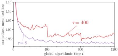
The image displays a line chart comparing the performance of two different parameter settings (τ = 8 and τ = 400) over the course of a training or optimization process. The chart plots the "normalized mean test loss" on the vertical axis against "global algorithmic time t" on the horizontal axis. The primary visual takeaway is that the configuration with τ = 8 achieves a lower loss value more quickly and maintains a lower loss throughout the observed period compared to τ = 400.
### Components/Axes
* **Chart Type:** 2D line graph.
* **X-Axis:**
* **Label:** `global algorithmic time t`
* **Scale:** Linear.
* **Range:** 0 to 1200.
* **Major Tick Marks:** 0, 400, 800, 1200.
* **Y-Axis:**
* **Label:** `normalized mean test loss`
* **Scale:** Linear.
* **Range:** Approximately 0.95 to 1.15.
* **Major Tick Marks:** 0.95, 1.00, 1.05, 1.10, 1.15.
* **Data Series & Legend:**
* **Series 1 (Red Line):** Labeled `τ = 400`. The label is positioned in the upper-right quadrant of the plot area, near the line it describes.
* **Series 2 (Purple Line):** Labeled `τ = 8`. The label is positioned in the lower-left quadrant of the plot area, near the line it describes.
* **Spatial Grounding:** The legend labels are placed directly adjacent to their respective lines within the chart's plotting area, not in a separate box. The `τ = 400` label is to the right of a local peak in the red line around t=800. The `τ = 8` label is to the left of the purple line's initial descent.
### Detailed Analysis
**Trend Verification & Data Point Extraction (Approximate):**
* **Red Line (τ = 400):**
* **Visual Trend:** Starts at a high loss value, experiences a very steep initial decline, followed by a period of significant volatility (noisy fluctuations) with a general, slow downward trend until approximately t=800, after which it shows a slight upward drift.
* **Key Approximate Points:**
* t=0: Loss ≈ 1.15 (starting point, off the top of the visible y-axis).
* t≈50: Loss drops sharply to ≈ 1.05.
* t=400: Loss ≈ 1.02, with high volatility.
* t=800: Loss ≈ 1.00, still volatile.
* t=1200: Loss ≈ 1.01, showing a slight increase from its minimum.
* **Purple Line (τ = 8):**
* **Visual Trend:** Also starts high and drops steeply, but converges to a lower loss value much faster than the red line. After the initial drop, it stabilizes into a much smoother, low-volatility plateau with a very gradual downward slope.
* **Key Approximate Points:**
* t=0: Loss ≈ 1.15 (same starting point as red line).
* t≈50: Loss drops sharply to ≈ 1.00.
* t=400: Loss ≈ 0.97, with low volatility.
* t=800: Loss ≈ 0.96.
* t=1200: Loss ≈ 0.955, maintaining the lowest value on the chart.
### Key Observations
1. **Performance Gap:** There is a clear and persistent performance gap. The `τ = 8` configuration consistently yields a lower normalized mean test loss than `τ = 400` after the very initial phase (t > ~50).
2. **Convergence Speed:** `τ = 8` demonstrates significantly faster convergence. It reaches a loss of 1.00 well before t=200, while `τ = 400` hovers above 1.00 until after t=800.
3. **Stability/Volatility:** The red line (`τ = 400`) exhibits much higher variance or noise throughout the process. The purple line (`τ = 8`) is notably smoother after its initial descent, indicating more stable training or optimization.
4. **Late-Stage Behavior:** Towards the end of the observed time (t=800 to 1200), the `τ = 400` line shows a slight upward trend, suggesting potential overfitting or instability, while the `τ = 8` line remains stable or continues a very slight decline.
### Interpretation
This chart likely illustrates the impact of a hyperparameter `τ` (which could represent a temperature, a time constant, a regularization strength, or a similar parameter) on the learning dynamics of an algorithm.
* **What the data suggests:** A smaller value of `τ` (8) is superior to a larger value (400) for this specific task and metric. It leads to both faster learning (quicker reduction in test loss) and better final performance (lower ultimate loss). The higher volatility associated with `τ = 400` might indicate that the optimization process is less stable, perhaps taking larger, noisier steps or being more sensitive to data fluctuations.
* **How elements relate:** The x-axis (`global algorithmic time t`) is the independent variable representing computational effort or iterations. The y-axis (`normalized mean test loss`) is the dependent performance metric. The two lines represent two different experimental conditions defined by `τ`. The direct visual comparison shows the consequence of choosing one `τ` value over the other.
* **Notable anomalies/investigative reading:** The sharp, simultaneous drop at the very beginning for both lines suggests a common, highly effective initial learning phase. The key divergence happens immediately after. The persistent noisiness of the `τ = 400` line is a critical observation—it doesn't just perform worse; it performs worse *unreliably*. The slight rise in the red line at the end could be a warning sign. A Peircean investigation would ask: Does `τ` control the "plasticity" of the model? A high `τ` might keep the model too adaptable, preventing it from settling into a stable, optimal state (hence the noise and late rise), while a low `τ` allows it to converge firmly.