\n
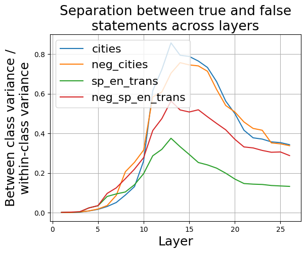
## Line Chart: Separation between true and false statements across layers
### Overview
This line chart visualizes the separation between true and false statements across different layers, likely within a neural network or similar layered system. The y-axis represents the ratio of between-class variance to within-class variance, indicating how well the layers separate true and false statements. The x-axis represents the layer number. Four different data series are plotted, each representing a different condition or dataset.
### Components/Axes
* **Title:** "Separation between true and false statements across layers" (centered at the top)
* **X-axis Label:** "Layer" (bottom-center)
* Scale: 0 to 28, with tick marks at integer values.
* **Y-axis Label:** "Between class variance / within-class variance" (left-center)
* Scale: 0 to 0.85, with tick marks at 0.2 intervals.
* **Legend:** Located in the top-right corner.
* "cities" - Blue line
* "neg\_cities" - Orange line
* "sp\_en\_trans" - Green line
* "neg\_sp\_en\_trans" - Red line
### Detailed Analysis
The chart displays four lines representing the separation ratio across layers.
* **cities (Blue Line):** This line starts at approximately 0 at layer 0, increases steadily to a peak of approximately 0.35 at layer 11, then declines gradually to approximately 0.25 at layer 27.
* **neg\_cities (Orange Line):** This line also starts at approximately 0 at layer 0. It rises more sharply than the "cities" line, reaching a peak of approximately 0.75 at layer 12, then drops rapidly to approximately 0.3 at layer 27.
* **sp\_en\_trans (Green Line):** This line begins at approximately 0 at layer 0, increases slowly to a peak of approximately 0.25 at layer 10, and then decreases to approximately 0.1 at layer 27.
* **neg\_sp\_en\_trans (Red Line):** This line starts at approximately 0 at layer 0, increases rapidly to a peak of approximately 0.55 at layer 14, remains relatively stable until layer 18, and then declines to approximately 0.3 at layer 27.
### Key Observations
* The "neg\_cities" (orange) line consistently exhibits the highest separation ratio across most layers, indicating the strongest separation between true and false statements for this condition.
* All lines show an initial increase in separation ratio, suggesting that the early layers contribute to distinguishing between true and false statements.
* The "cities" (blue) and "sp\_en\_trans" (green) lines have lower separation ratios compared to the "neg\_cities" and "neg\_sp\_en\_trans" lines.
* The peak separation ratio occurs at different layers for each condition, suggesting that the optimal layer for separation varies depending on the dataset.
* All lines show a decline in separation ratio in the later layers (beyond layer 18), indicating that the separation between true and false statements may diminish as the data progresses through deeper layers.
### Interpretation
The chart suggests that the negative examples ("neg\_cities" and "neg\_sp\_en\_trans") are more easily separated from the true statements than the positive examples ("cities" and "sp\_en\_trans"). This could indicate that the model is better at identifying falsehoods than truths, or that the negative examples are inherently more distinguishable. The initial increase in separation ratio across all lines suggests that the early layers of the model are effective at learning basic features that differentiate between true and false statements. The subsequent decline in separation ratio in the later layers could be due to overfitting, loss of signal, or the emergence of more complex relationships that are harder to disentangle. The different peak separation layers for each condition suggest that the model learns different representations for each dataset, and that the optimal layer for separation depends on the specific characteristics of the data. Further investigation would be needed to understand the underlying reasons for these observations and to optimize the model for better separation performance.