TECHNICAL ASSET FINGERPRINT
ca0cdc09ec46d07cf37b3d57
Click to view fullscreen
Press ESC or click to close
FOUND IN PAPERS
EXPERT: gemini-2.0-flash VERSION 1
RUNTIME: nugit/gemini/gemini-2.0-flash
INTEL_VERIFIED
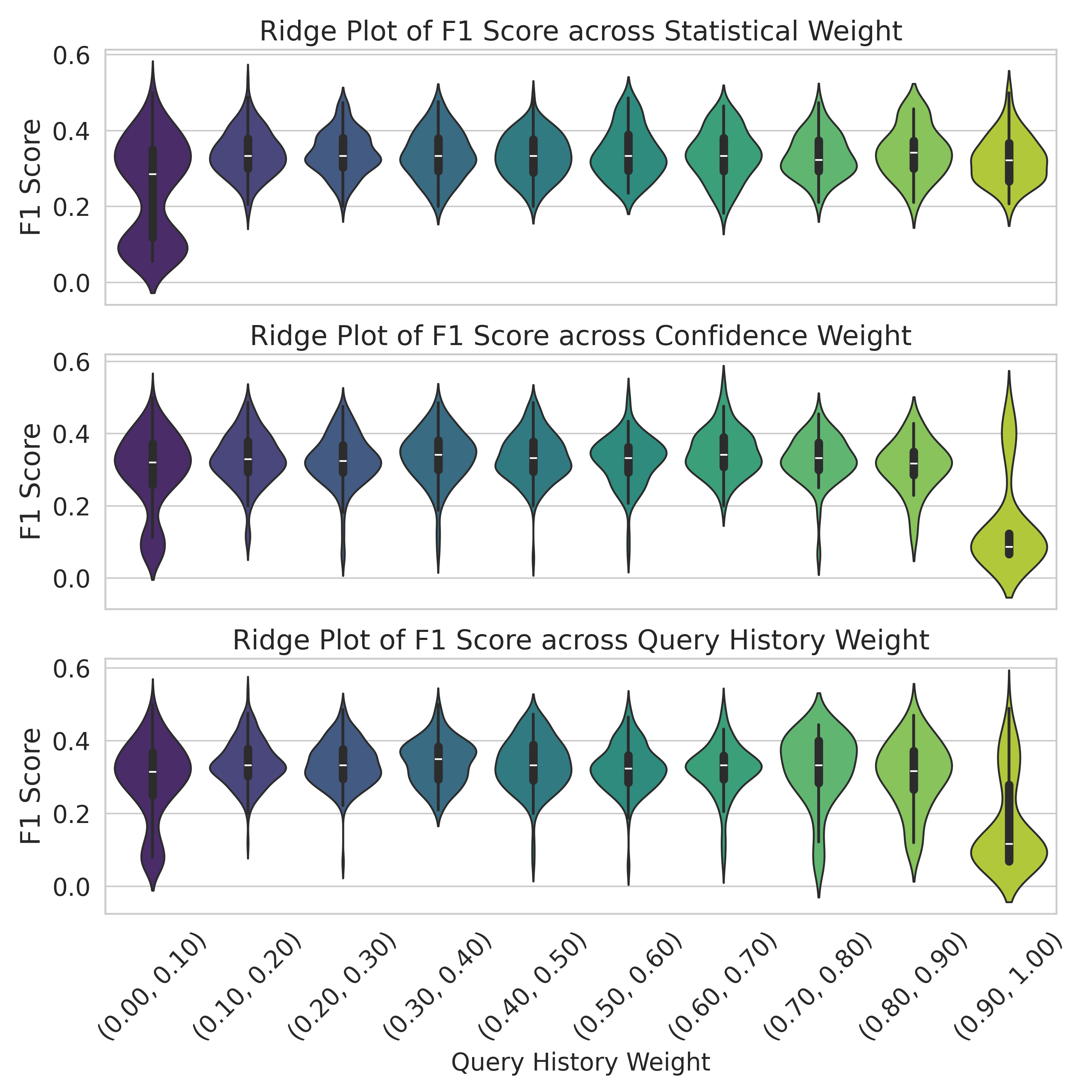
## Ridge Plots: F1 Score vs. Weighting Schemes
### Overview
The image presents three ridge plots, each displaying the distribution of F1 scores across different weighting schemes: Statistical Weight, Confidence Weight, and Query History Weight. Each plot shows how the F1 score varies as the weight assigned to each scheme changes from (0.00, 0.10) to (0.90, 1.00). The distributions are represented as violin plots, with color gradients indicating the shift in weight.
### Components/Axes
* **Y-axis (F1 Score):** All three plots share the same y-axis, labeled "F1 Score," ranging from 0.0 to 0.6 in increments of 0.2.
* **X-axis (Weight):** The x-axis represents the weight assigned to each scheme. The categories are discrete, with labels indicating the weight range: (0.00, 0.10), (0.10, 0.20), (0.20, 0.30), (0.30, 0.40), (0.40, 0.50), (0.50, 0.60), (0.60, 0.70), (0.70, 0.80), (0.80, 0.90), and (0.90, 1.00).
* **Plot Titles:**
* Top Plot: "Ridge Plot of F1 Score across Statistical Weight"
* Middle Plot: "Ridge Plot of F1 Score across Confidence Weight"
* Bottom Plot: "Ridge Plot of F1 Score across Query History Weight"
* **Violin Plot Colors:** The color of each violin plot transitions from dark purple on the left to yellow-green on the right, corresponding to the increasing weight ranges.
### Detailed Analysis
**1. Ridge Plot of F1 Score across Statistical Weight:**
* **Trend:** The distribution of F1 scores appears to shift slightly upwards as the statistical weight increases. The median F1 score seems to improve with higher statistical weight.
* **(0.00, 0.10):** The violin plot is dark purple, with a wide distribution centered around F1 score of approximately 0.3, with a long tail extending down to 0.0.
* **(0.10, 0.20):** The violin plot is dark blue, with a distribution centered around F1 score of approximately 0.35.
* **(0.20, 0.30):** The violin plot is blue, with a distribution centered around F1 score of approximately 0.35.
* **(0.30, 0.40):** The violin plot is teal, with a distribution centered around F1 score of approximately 0.35.
* **(0.40, 0.50):** The violin plot is teal, with a distribution centered around F1 score of approximately 0.35.
* **(0.50, 0.60):** The violin plot is green, with a distribution centered around F1 score of approximately 0.35.
* **(0.60, 0.70):** The violin plot is green, with a distribution centered around F1 score of approximately 0.35.
* **(0.70, 0.80):** The violin plot is light green, with a distribution centered around F1 score of approximately 0.35.
* **(0.80, 0.90):** The violin plot is yellow-green, with a distribution centered around F1 score of approximately 0.35.
* **(0.90, 1.00):** The violin plot is yellow, with a distribution centered around F1 score of approximately 0.35.
**2. Ridge Plot of F1 Score across Confidence Weight:**
* **Trend:** Similar to the Statistical Weight plot, the F1 score distribution tends to shift upwards with increasing confidence weight. The rightmost violin plot shows a more pronounced upward shift.
* **(0.00, 0.10):** The violin plot is dark purple, with a wide distribution centered around F1 score of approximately 0.3, with a long tail extending down to 0.0.
* **(0.10, 0.20):** The violin plot is dark blue, with a distribution centered around F1 score of approximately 0.35.
* **(0.20, 0.30):** The violin plot is blue, with a distribution centered around F1 score of approximately 0.35.
* **(0.30, 0.40):** The violin plot is teal, with a distribution centered around F1 score of approximately 0.35.
* **(0.40, 0.50):** The violin plot is teal, with a distribution centered around F1 score of approximately 0.35.
* **(0.50, 0.60):** The violin plot is green, with a distribution centered around F1 score of approximately 0.35.
* **(0.60, 0.70):** The violin plot is green, with a distribution centered around F1 score of approximately 0.35.
* **(0.70, 0.80):** The violin plot is light green, with a distribution centered around F1 score of approximately 0.35.
* **(0.80, 0.90):** The violin plot is yellow-green, with a distribution centered around F1 score of approximately 0.35.
* **(0.90, 1.00):** The violin plot is yellow, with a distribution centered around F1 score of approximately 0.4.
**3. Ridge Plot of F1 Score across Query History Weight:**
* **Trend:** The F1 score distribution shows a more noticeable upward shift as the query history weight increases. The rightmost violin plot exhibits a distinct peak at a higher F1 score.
* **(0.00, 0.10):** The violin plot is dark purple, with a wide distribution centered around F1 score of approximately 0.25, with a long tail extending down to 0.0.
* **(0.10, 0.20):** The violin plot is dark blue, with a distribution centered around F1 score of approximately 0.3.
* **(0.20, 0.30):** The violin plot is blue, with a distribution centered around F1 score of approximately 0.3.
* **(0.30, 0.40):** The violin plot is teal, with a distribution centered around F1 score of approximately 0.3.
* **(0.40, 0.50):** The violin plot is teal, with a distribution centered around F1 score of approximately 0.3.
* **(0.50, 0.60):** The violin plot is green, with a distribution centered around F1 score of approximately 0.3.
* **(0.60, 0.70):** The violin plot is green, with a distribution centered around F1 score of approximately 0.3.
* **(0.70, 0.80):** The violin plot is light green, with a distribution centered around F1 score of approximately 0.3.
* **(0.80, 0.90):** The violin plot is yellow-green, with a distribution centered around F1 score of approximately 0.3.
* **(0.90, 1.00):** The violin plot is yellow, with a distribution centered around F1 score of approximately 0.4.
### Key Observations
* The F1 score distributions generally shift upwards as the weight assigned to each scheme (Statistical, Confidence, and Query History) increases.
* The Query History Weight plot shows the most pronounced improvement in F1 score as the weight increases, particularly at the highest weight range (0.90, 1.00).
* The Statistical Weight and Confidence Weight plots show similar trends, with a gradual improvement in F1 score as the weight increases.
### Interpretation
The ridge plots suggest that increasing the weight assigned to each scheme (Statistical, Confidence, and Query History) generally leads to an improvement in the F1 score. This indicates that incorporating these factors into the model can enhance its performance. The most significant improvement is observed when assigning a higher weight to the Query History, suggesting that past user queries are a strong predictor of future relevance and can significantly boost the model's accuracy. The plots demonstrate the impact of different weighting strategies on the model's ability to correctly classify and retrieve relevant information, with Query History appearing to be the most influential factor among the three.
DECODING INTELLIGENCE...