## Histogram Comparison: Progress Ratio vs. Noise Ratio
### Overview
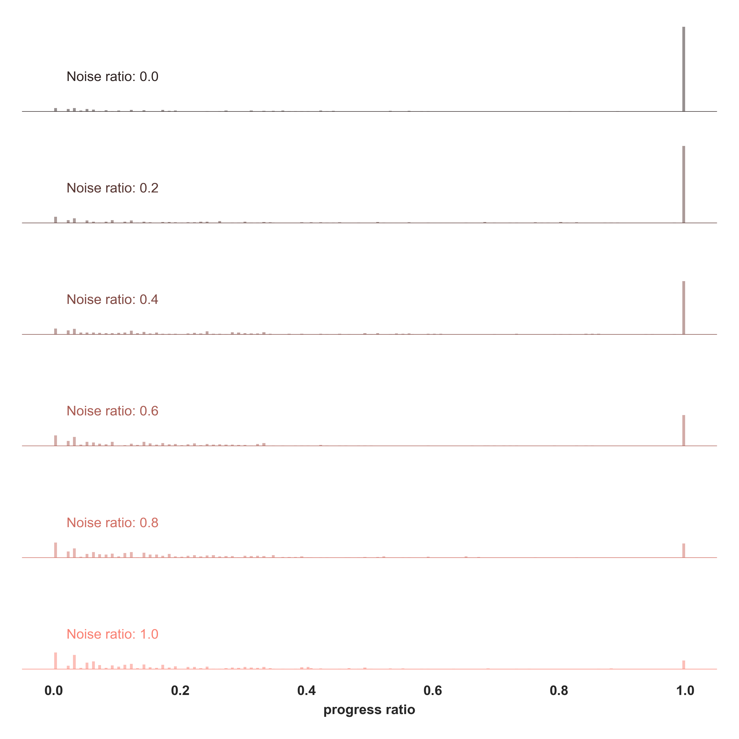
The image presents a series of histograms arranged vertically, each representing the distribution of a "progress ratio" for a different "noise ratio." The noise ratios range from 0.0 to 1.0 in increments of 0.2. Each histogram displays the frequency of different progress ratio values, with the x-axis representing the progress ratio (from 0.0 to 1.0) and the y-axis implicitly representing frequency or count.
### Components/Axes
* **X-axis:** "progress ratio" with markers at 0.0, 0.2, 0.4, 0.6, 0.8, and 1.0.
* **Y-axis:** Implicitly represents frequency or count, but no explicit scale is provided.
* **Histograms:** Six histograms, each corresponding to a different "Noise ratio."
* **Noise Ratio Labels:** Text labels indicating the noise ratio for each histogram: "Noise ratio: 0.0", "Noise ratio: 0.2", "Noise ratio: 0.4", "Noise ratio: 0.6", "Noise ratio: 0.8", and "Noise ratio: 1.0". The color of the text label matches the color of the histogram bars.
### Detailed Analysis
Each histogram is analyzed individually:
* **Noise ratio: 0.0** (Gray): The distribution is concentrated towards lower progress ratio values, with several small bars between 0.0 and 0.2. There is a very tall bar at 1.0.
* **Noise ratio: 0.2** (Brownish-Gray): Similar to the previous histogram, the distribution is skewed towards lower progress ratio values, with small bars between 0.0 and 0.2. There is a tall bar at 1.0, but it is shorter than the bar in the "Noise ratio: 0.0" histogram.
* **Noise ratio: 0.4** (Light Brown): The distribution continues to show a concentration at lower progress ratio values, with small bars between 0.0 and 0.2. The bar at 1.0 is present but shorter than in the previous histograms.
* **Noise ratio: 0.6** (Light Brown): The distribution is more spread out compared to the previous histograms. There are still small bars between 0.0 and 0.2, but they are less prominent. The bar at 1.0 is even shorter.
* **Noise ratio: 0.8** (Light Red): The distribution is even more spread out. The bars between 0.0 and 0.2 are smaller. The bar at 1.0 is very small.
* **Noise ratio: 1.0** (Red): The distribution is the most spread out. The bars between 0.0 and 0.2 are the smallest. The bar at 1.0 is the smallest of all the histograms.
### Key Observations
* As the noise ratio increases from 0.0 to 1.0, the distribution of the progress ratio becomes more spread out.
* The height of the bar at progress ratio 1.0 decreases as the noise ratio increases.
* The concentration of values at lower progress ratios (0.0 to 0.2) decreases as the noise ratio increases.
### Interpretation
The histograms suggest that as the "noise ratio" increases, the "progress ratio" becomes less likely to be concentrated at lower values and at 1.0. A higher noise ratio seems to introduce more variability or randomness into the progress ratio, resulting in a more uniform distribution. The decreasing height of the bar at 1.0 indicates that a high progress ratio becomes less probable as noise increases. The data implies an inverse relationship between noise and the predictability or concentration of the progress ratio.