## Line Chart: Noise Ratio vs. Progress Ratio
### Overview
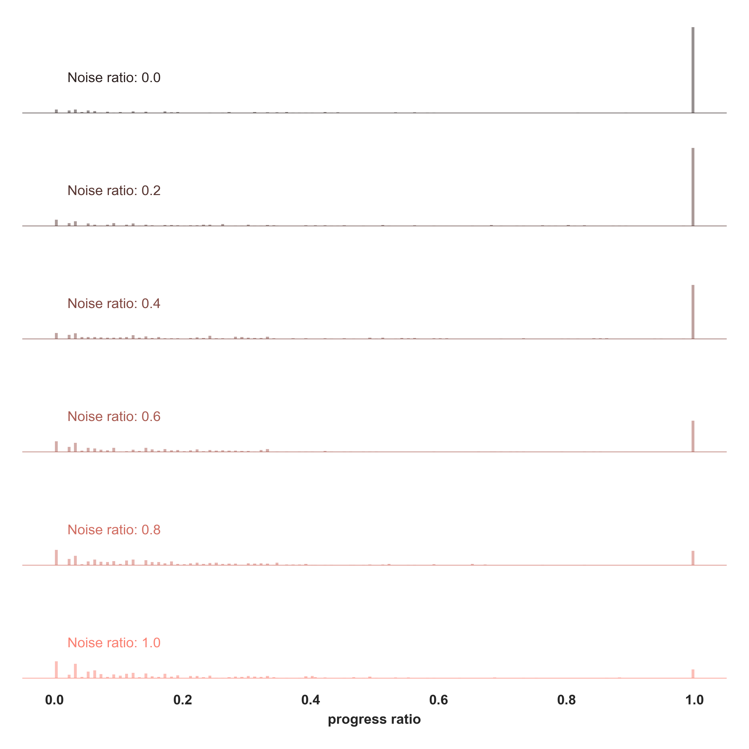
The image presents a line chart illustrating the relationship between "progress ratio" (x-axis) and "noise ratio" (represented by separate lines). The chart displays six lines, each corresponding to a different noise ratio value, ranging from 0.0 to 1.0. Each line shows a relatively flat distribution until the progress ratio reaches approximately 1.0, where a sharp vertical increase is observed.
### Components/Axes
* **X-axis:** "progress ratio", ranging from 0.0 to 1.0, with markers at 0.2, 0.4, 0.6, and 0.8.
* **Y-axis:** Not explicitly labeled, but represents the value being measured. The scale is not provided.
* **Lines:** Six lines, each representing a different "noise ratio".
* Noise ratio: 0.0 (Black)
* Noise ratio: 0.2 (Dark Gray)
* Noise ratio: 0.4 (Gray)
* Noise ratio: 0.6 (Light Gray)
* Noise ratio: 0.8 (Reddish-Orange)
* Noise ratio: 1.0 (Orange)
* **Labels:** Each line is labeled with its corresponding "noise ratio" value, positioned to the left of the chart.
### Detailed Analysis
Each line exhibits a similar pattern: a nearly flat horizontal line for progress ratios less than 1.0, followed by a near-vertical increase at a progress ratio of approximately 1.0.
* **Noise ratio: 0.0 (Black):** The line remains close to zero until progress ratio = 1.0, then increases sharply. Approximate value at progress ratio 1.0 is 2.0.
* **Noise ratio: 0.2 (Dark Gray):** The line remains close to zero until progress ratio = 1.0, then increases sharply. Approximate value at progress ratio 1.0 is 2.5.
* **Noise ratio: 0.4 (Gray):** The line remains close to zero until progress ratio = 1.0, then increases sharply. Approximate value at progress ratio 1.0 is 3.0.
* **Noise ratio: 0.6 (Light Gray):** The line remains close to zero until progress ratio = 1.0, then increases sharply. Approximate value at progress ratio 1.0 is 3.5.
* **Noise ratio: 0.8 (Reddish-Orange):** The line remains close to zero until progress ratio = 1.0, then increases sharply. Approximate value at progress ratio 1.0 is 4.0.
* **Noise ratio: 1.0 (Orange):** The line remains close to zero until progress ratio = 1.0, then increases sharply. Approximate value at progress ratio 1.0 is 4.5.
The increase at progress ratio = 1.0 appears to be linear with respect to the noise ratio.
### Key Observations
* The lines are nearly flat for progress ratios less than 1.0, indicating a minimal change in the measured value.
* There is a consistent, sharp increase in the measured value at a progress ratio of approximately 1.0 for all noise ratios.
* The magnitude of the increase at progress ratio = 1.0 is directly proportional to the noise ratio. Higher noise ratios result in larger increases.
* The lines are spaced evenly vertically, suggesting a linear relationship between noise ratio and the magnitude of the increase.
### Interpretation
The chart likely represents a system where a process is progressing (indicated by the "progress ratio"). The "noise ratio" represents some form of interference or error. The data suggests that the system remains stable (low measured value) until the process reaches completion (progress ratio = 1.0). At completion, the impact of the noise becomes apparent, causing a sharp increase in the measured value. The higher the noise ratio, the greater the impact at completion.
This could be interpreted in several ways:
* **Error Accumulation:** The system accumulates errors (noise) during the process, but these errors only manifest significantly upon completion.
* **Threshold Effect:** The system has a threshold (progress ratio = 1.0) beyond which noise begins to have a substantial effect.
* **Sensitivity Analysis:** The chart demonstrates the sensitivity of the system to noise at the point of completion.
The linear relationship between noise ratio and the magnitude of the increase suggests that the noise has a predictable and proportional impact on the system's outcome. The lack of a y-axis label makes it difficult to determine the exact units of measurement, but the overall trend is clear.