## Scatter Plot Comparison: Max Softmax Probability vs. Negative Perplexity
### Overview
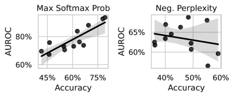
The image displays two side-by-side scatter plots comparing the relationship between model **Accuracy** (x-axis) and **AUROC** (y-axis) under two different evaluation metrics: **Max Softmax Probability** (left chart) and **Negative Perplexity** (right chart). Each plot contains approximately 15-20 data points (black dots), a linear regression trend line (solid black), and a shaded gray area representing the confidence interval.
### Components/Axes
**Common Elements:**
* **Y-Axis Label (Both Charts):** `AUROC`
* **X-Axis Label (Both Charts):** `Accuracy`
* **Data Representation:** Black circular markers for individual data points.
* **Trend Line:** Solid black line representing a linear fit.
* **Uncertainty Band:** Shaded gray area around the trend line, indicating the confidence interval.
**Left Chart: "Max Softmax Prob"**
* **Title:** `Max Softmax Prob`
* **Y-Axis Scale:** Ranges from 60% to 80%, with major ticks at 60%, 70%, and 80%.
* **X-Axis Scale:** Ranges from 45% to 75%, with major ticks at 45%, 60%, and 75%.
**Right Chart: "Neg. Perplexity"**
* **Title:** `Neg. Perplexity`
* **Y-Axis Scale:** Ranges from 60% to 65%, with major ticks at 60% and 65%.
* **X-Axis Scale:** Ranges from 40% to 60%, with major ticks at 40%, 50%, and 60%.
### Detailed Analysis
**Left Chart (Max Softmax Prob):**
* **Trend Verification:** The data points and trend line show a clear **positive correlation**. As Accuracy increases, AUROC also increases.
* **Data Point Distribution:** Points are scattered around the trend line. The lowest accuracy point is near (45%, ~65% AUROC). The highest accuracy point is near (75%, ~78% AUROC). The cluster is densest between 55%-65% Accuracy and 70%-75% AUROC.
* **Trend Line:** The line has a steep positive slope, starting near (45%, 66%) and ending near (75%, 78%).
* **Confidence Interval:** The shaded band is relatively narrow, suggesting a stronger correlation and more consistent relationship between the variables in this metric.
**Right Chart (Neg. Perplexity):**
* **Trend Verification:** The data points and trend line show a **slight negative correlation**. As Accuracy increases, AUROC shows a very mild decrease.
* **Data Point Distribution:** Points are more widely scattered compared to the left chart. There is a notable outlier at approximately (55%, 57% AUROC), which is the lowest point on the graph. The highest AUROC point is near (50%, 65%).
* **Trend Line:** The line has a shallow negative slope, starting near (40%, 64%) and ending near (60%, 62%).
* **Confidence Interval:** The shaded band is wider, especially at the extremes of the x-axis, indicating greater uncertainty in the trend, likely due to the higher variance and the outlier.
### Key Observations
1. **Divergent Trends:** The most significant observation is the opposing relationship between Accuracy and AUROC under the two metrics. Max Softmax Probability shows a strong positive link, while Negative Perplexity shows a weak negative link.
2. **Scale Difference:** The AUROC range for the "Neg. Perplexity" chart (60-65%) is much narrower than for the "Max Softmax Prob" chart (60-80%), compressing the visual spread of data.
3. **Data Consistency:** The data in the left chart is more tightly clustered around its trend line, suggesting a more predictable relationship. The right chart's data is noisier.
4. **Outlier:** The data point at ~55% Accuracy and ~57% AUROC in the "Neg. Perplexity" chart is a clear outlier, pulling the trend line down and widening the confidence interval.
### Interpretation
This comparison suggests that the choice of evaluation metric fundamentally changes the perceived relationship between a model's classification **Accuracy** and its discriminative ability as measured by **AUROC**.
* **Max Softmax Prob (Left):** This metric likely uses the confidence of the model's top prediction. The strong positive trend indicates that models which are both more accurate *and* more confident in their correct predictions achieve a higher AUROC. This is an intuitive and desirable alignment of metrics.
* **Neg. Perplexity (Right):** Perplexity measures how well a probability model predicts a sample. Using its negative flips the scale. The weak negative trend is counter-intuitive and suggests a potential trade-off or a different aspect of model behavior. It might indicate that models optimized for raw accuracy (perhaps via techniques like label smoothing) could have slightly worse AUROC when evaluated via this specific probabilistic metric. The outlier highlights that this relationship is not stable across all models or training conditions.
**Conclusion:** The data demonstrates that AUROC is not a monolithic metric; its correlation with accuracy is highly dependent on the underlying probabilistic output used for evaluation. For technical reporting, it is crucial to specify the exact method (e.g., max softmax vs. negative perplexity) when presenting AUROC results alongside accuracy, as they can tell very different stories about model performance.