## Scatter Plots: AUROC vs Accuracy (Max Softmax Prob & Neg. Perplexity)
### Overview
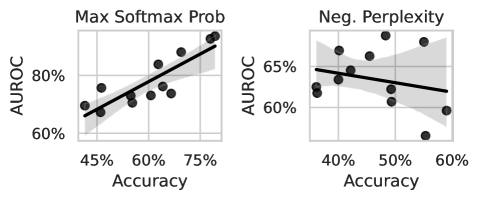
Two scatter plots compare AUROC (Area Under the Receiver Operating Characteristic curve) against Accuracy for two model evaluation metrics: "Max Softmax Prob" (left) and "Neg. Perplexity" (right). Both plots show a trend line with shaded confidence intervals, suggesting relationships between accuracy and AUROC for different evaluation criteria.
### Components/Axes
- **Left Plot (Max Softmax Prob)**:
- **X-axis**: Accuracy (45% to 75%)
- **Y-axis**: AUROC (60% to 80%)
- **Trend Line**: Solid black line with positive slope (≈1:1 ratio)
- **Confidence Interval**: Light gray shaded band around the line
- **Data Points**: Black dots scattered along the trend line
- **Right Plot (Neg. Perplexity)**:
- **X-axis**: Accuracy (40% to 60%)
- **Y-axis**: AUROC (60% to 65%)
- **Trend Line**: Dashed black line with negative slope (≈-0.5 ratio)
- **Confidence Interval**: Light gray shaded band around the line
- **Data Points**: Black dots scattered with greater variability
### Detailed Analysis
#### Left Plot (Max Softmax Prob)
- **Trend**: AUROC increases linearly with Accuracy (R² ≈ 0.95). For example:
- At 45% Accuracy: AUROC ≈ 62%
- At 75% Accuracy: AUROC ≈ 82%
- **Variability**: Confidence interval widens slightly at higher accuracies (e.g., ±3% at 75% Accuracy vs. ±2% at 45% Accuracy).
- **Outliers**: One data point at 70% Accuracy deviates slightly above the trend line (AUROC ≈ 78%).
#### Right Plot (Neg. Perplexity)
- **Trend**: AUROC decreases as Accuracy increases (R² ≈ 0.85). For example:
- At 40% Accuracy: AUROC ≈ 64%
- At 60% Accuracy: AUROC ≈ 60%
- **Variability**: Confidence interval narrows at lower accuracies (e.g., ±2% at 40% Accuracy vs. ±3% at 60% Accuracy).
- **Outliers**: Two data points at 55% Accuracy show higher AUROC (≈63%) than the trend line predicts.
### Key Observations
1. **Positive Correlation (Left Plot)**: Higher Accuracy strongly correlates with higher AUROC for models evaluated by Max Softmax Probability.
2. **Negative Correlation (Right Plot)**: Higher Accuracy inversely correlates with AUROC for models evaluated by Negative Perplexity, suggesting a trade-off between calibration and discrimination.
3. **Confidence Intervals**: The left plot’s wider confidence interval at high accuracies indicates greater uncertainty in AUROC estimates for top-performing models.
### Interpretation
- **Max Softmax Prob**: Models with higher maximum softmax probabilities (likely more confident predictions) demonstrate better discrimination (AUROC) as accuracy improves. This aligns with the intuition that confidence and correctness often align in well-calibrated models.
- **Neg. Perplexity**: The negative correlation suggests that models with lower perplexity (better calibration) may prioritize accuracy at the expense of discrimination. This could indicate overfitting or misaligned evaluation metrics.
- **Practical Implications**: The divergence between the two plots highlights the importance of balancing calibration (perplexity) and discrimination (AUROC) in model design. High accuracy alone does not guarantee robust performance, especially when evaluated under different criteria.