## Log-Log Plot: Scaled Log Probability vs. Number of Layers
### Overview
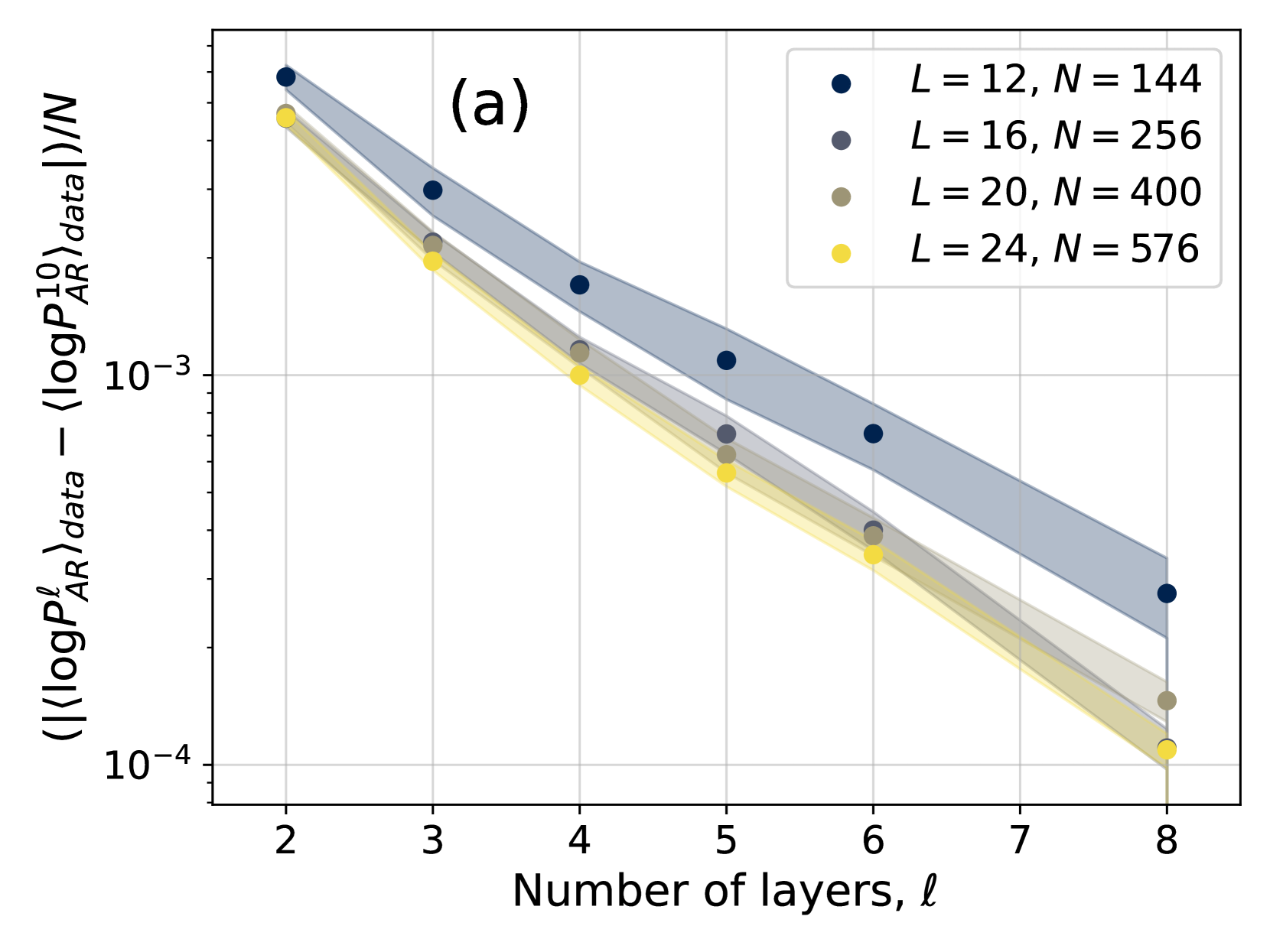
The image is a log-log plot showing the relationship between a scaled log probability difference and the number of layers in a system. There are four data series, each representing a different system size (L), with corresponding number of elements (N). The plot shows a decreasing trend for all series as the number of layers increases. Shaded regions around each line indicate uncertainty.
### Components/Axes
* **Title:** Implicit, but the plot explores the relationship between scaled log probability and number of layers.
* **X-axis:** "Number of layers, l". Linear scale, with tick marks at integers from 2 to 8.
* **Y-axis:** "(|<log P^(l)_AR>_data - <log P^(10)_AR>_data|)/N". Logarithmic scale, with tick marks at 10^-4 and 10^-3.
* **Legend:** Located in the top-right corner.
* Blue: L = 12, N = 144
* Dark Gray: L = 16, N = 256
* Light Gray: L = 20, N = 400
* Yellow: L = 24, N = 576
* **(a):** Located in the top-center of the plot.
### Detailed Analysis
* **Data Series:**
* **Blue (L=12, N=144):** Decreasing trend.
* l=2: y ≈ 6.3e-3
* l=3: y ≈ 3.5e-3
* l=4: y ≈ 2.0e-3
* l=5: y ≈ 1.2e-3
* l=6: y ≈ 0.7e-3
* l=8: y ≈ 0.3e-3
* **Dark Gray (L=16, N=256):** Decreasing trend.
* l=2: y ≈ 5.0e-3
* l=4: y ≈ 1.5e-3
* l=5: y ≈ 0.8e-3
* l=6: y ≈ 0.5e-3
* l=8: y ≈ 0.15e-3
* **Light Gray (L=20, N=400):** Decreasing trend.
* l=2: y ≈ 4.5e-3
* l=4: y ≈ 1.2e-3
* l=5: y ≈ 0.7e-3
* l=6: y ≈ 0.4e-3
* l=8: y ≈ 0.12e-3
* **Yellow (L=24, N=576):** Decreasing trend.
* l=2: y ≈ 4.0e-3
* l=4: y ≈ 1.0e-3
* l=5: y ≈ 0.5e-3
* l=6: y ≈ 0.3e-3
* l=8: y ≈ 0.1e-3
### Key Observations
* All data series show a decreasing trend, indicating that the scaled log probability difference decreases as the number of layers increases.
* The blue series (L=12, N=144) consistently has the highest values for a given number of layers.
* The yellow series (L=24, N=576) consistently has the lowest values for a given number of layers.
* The shaded regions indicate uncertainty, which appears to increase as the number of layers increases.
### Interpretation
The plot suggests that as the number of layers increases, the difference between the average log probability and a reference log probability (at 10 layers), scaled by N, decreases. The different system sizes (L and N) show a clear separation, with larger systems exhibiting lower scaled log probability differences. This could indicate that larger systems converge to the reference log probability more quickly as the number of layers increases, or that the reference log probability is more representative of larger systems. The increasing uncertainty with more layers might reflect the challenges in accurately estimating log probabilities for deeper networks.