## Bar Chart: Intermittent Fault Activation Across Training Steps
### Overview
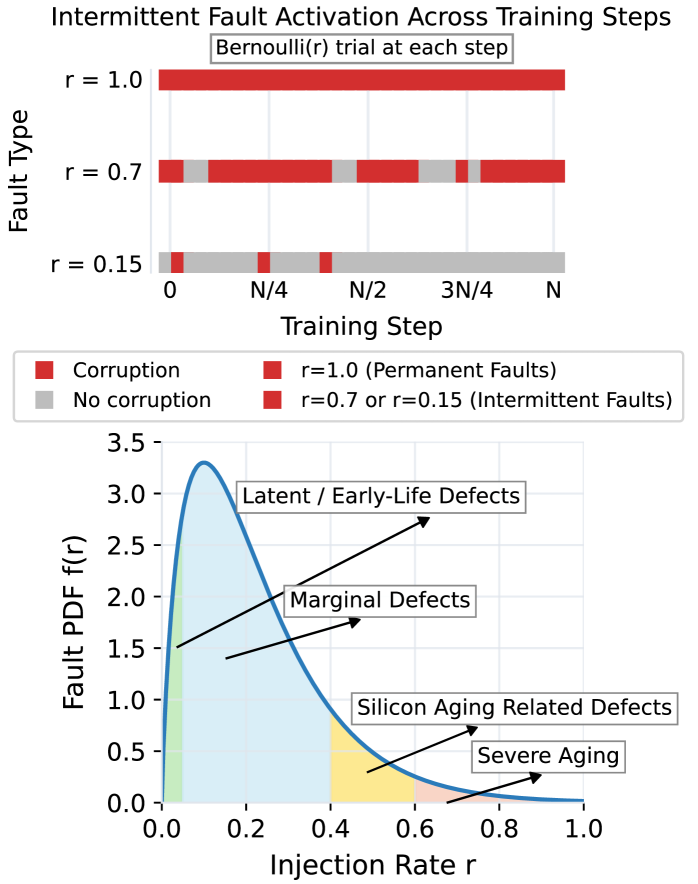
The top chart visualizes fault activation patterns during training steps for three fault types (r=1.0, r=0.7, r=0.15). Each fault type is represented by horizontal bars segmented into red (corruption) and gray (no corruption), with a legend clarifying fault permanence.
### Components/Axes
- **Y-Axis (Fault Type)**:
- Labels: `r = 1.0`, `r = 0.7`, `r = 0.15`
- Legend:
- Red: Corruption (Permanent faults for r=1.0; Intermittent for r=0.7/0.15)
- Gray: No corruption
- **X-Axis (Training Step)**:
- Markers: `0`, `N/4`, `N/2`, `3N/4`, `N`
- Scale: Discrete intervals representing training progress.
### Detailed Analysis
- **r = 1.0 (Permanent Faults)**:
- Entire bar is red, indicating continuous corruption across all training steps.
- **r = 0.7 (Intermittent Faults)**:
- Segments: Red (corruption) and gray (no corruption) alternate.
- Example: At `N/2`, ~25% of the bar is gray (no corruption).
- **r = 0.15 (Intermittent Faults)**:
- Segments: Red dominates early steps (`0`, `N/4`), with increasing gray segments later (`N/2`, `3N/4`, `N`).
### Key Observations
- Higher `r` values correlate with greater persistent corruption.
- Lower `r` values show intermittent fault activation, with corruption decreasing as training progresses.
### Interpretation
The chart demonstrates that fault permanence (`r=1.0`) leads to unmitigated corruption, while lower `r` values allow partial recovery during training. This suggests adaptive training mechanisms may reduce intermittent faults over time.
---
## Line Graph: Fault PDF vs. Injection Rate
### Overview
The bottom graph plots fault probability density function (PDF) against injection rate (`r`), with shaded regions indicating defect categories.
### Components/Axes
- **Y-Axis (Fault PDF f(r))**:
- Range: 0.0 to 3.5
- **X-Axis (Injection Rate r)**:
- Range: 0.0 to 1.0
- **Legend**:
- Blue line: Fault PDF curve
- Shaded regions:
- Green: Latent/Early-Life Defects
- Yellow: Marginal Defects
- Pink: Silicon Aging Related Defects
- Dark pink: Severe Aging
### Detailed Analysis
- **Fault PDF Curve**:
- Peaks at ~0.2 injection rate (~3.0 PDF value).
- Declines sharply as `r` increases beyond 0.4.
- **Shaded Regions**:
- **Green (Latent/Early-Life Defects)**: Dominates low `r` (0.0–0.4).
- **Yellow (Marginal Defects)**: Overlaps with green at mid `r` (0.4–0.6).
- **Pink (Silicon Aging)**: Emerges at `r > 0.6`.
- **Dark Pink (Severe Aging)**: Minimal contribution (<0.8 `r`).
### Key Observations
- Highest fault probability occurs at low injection rates (`r ≈ 0.2`).
- Severe aging defects are negligible except at very high `r` (>0.8).
### Interpretation
The data implies that low injection rates exacerbate early-life defects, while higher rates shift failure modes toward silicon aging. This aligns with semiconductor reliability models where early stress dominates at low operational thresholds.
---
## Cross-Referenced Insights
1. **Top Chart + Bottom Graph**:
- Permanent faults (`r=1.0`) in the top chart may correspond to "Severe Aging" in the bottom graph, as both represent unmitigated failure modes.
- Intermittent faults (`r=0.7/0.15`) align with "Marginal Defects" and "Silicon Aging," suggesting partial recovery mechanisms.
2. **Training vs. Operational Context**:
- The top chart focuses on training-phase fault dynamics, while the bottom graph models operational defect distributions.
## Final Notes
- All legend colors match chart elements (e.g., red = corruption in both charts).
- No textual data in non-English languages detected.
- Spatial grounding: Legends are positioned at the bottom-left (top chart) and right (bottom graph), ensuring clarity without obscuring data.