## Histogram: Unlabeled Distribution
### Overview
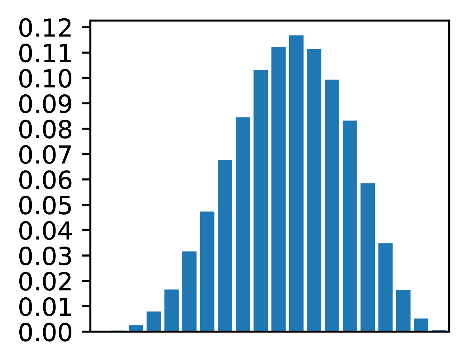
The image displays a vertical bar chart (histogram) showing a symmetric, unimodal distribution of data. The chart consists of 21 blue bars of varying heights arranged along an unlabeled horizontal axis. The vertical axis represents a numerical scale, likely frequency, probability density, or proportion.
### Components/Axes
* **Vertical Axis (Y-axis):**
* **Label:** None visible.
* **Scale:** Linear scale ranging from 0.00 to 0.12.
* **Tick Marks & Values:** Major tick marks are present at intervals of 0.01, with numerical labels for every tick: 0.00, 0.01, 0.02, 0.03, 0.04, 0.05, 0.06, 0.07, 0.08, 0.09, 0.10, 0.11, 0.12.
* **Horizontal Axis (X-axis):**
* **Label:** None visible.
* **Scale:** Unlabeled categorical or binned numerical scale. The axis is divided into 21 discrete positions, each occupied by a single bar.
* **Data Series:**
* **Color:** All bars are a uniform shade of blue.
* **Legend:** No legend is present.
* **Spatial Layout:** The chart is contained within a black rectangular border. The y-axis labels are positioned to the left of the axis line. The bars are centered on their respective x-axis positions.
### Detailed Analysis
The distribution is symmetric and bell-shaped, peaking at the center. Below are the approximate heights of each bar, listed from left to right. Values are estimated based on visual alignment with the y-axis grid.
1. Bar 1 (far left): ~0.002
2. Bar 2: ~0.008
3. Bar 3: ~0.017
4. Bar 4: ~0.032
5. Bar 5: ~0.048
6. Bar 6: ~0.068
7. Bar 7: ~0.085
8. Bar 8: ~0.103
9. Bar 9: ~0.113
10. **Bar 10 (Center, Peak): ~0.118**
11. Bar 11: ~0.113
12. Bar 12: ~0.100
13. Bar 13: ~0.084
14. Bar 14: ~0.059
15. Bar 15: ~0.035
16. Bar 16: ~0.017
17. Bar 17: ~0.005
18. Bars 18-21: Heights are very low, tapering to near zero. (Bar 18: ~0.003, Bar 19: ~0.001, Bars 20 & 21: ~0.000).
**Trend Verification:** The data series forms a clear, symmetric peak. The trend slopes upward from the left, reaches a maximum at the 10th bar, and then slopes downward symmetrically to the right.
### Key Observations
1. **Symmetry:** The distribution is highly symmetric around the central (10th) bar.
2. **Unimodal:** There is a single, clear peak.
3. **Peak Value:** The maximum value is approximately 0.118, located at the center of the distribution.
4. **Range:** The data spans from near 0.000 at the extremes to ~0.118 at the peak.
5. **Missing Context:** The complete absence of labels for both axes and any title or legend makes it impossible to determine what the data represents (e.g., test scores, measurement errors, signal strength).
### Interpretation
The chart visually demonstrates a classic **normal (Gaussian) distribution** or a very close approximation. The data suggests that the measured variable is most frequently found near the central value, with frequencies decreasing symmetrically as one moves away from the center in either direction.
The **key investigative insight** is the profound lack of context. While the *shape* of the data is clear and informative (indicating a process governed by random variation or central tendency), the *meaning* is entirely absent. To make this chart useful, one must answer: What is on the X-axis? (e.g., "Height in cm," "Voltage Deviation"). What is on the Y-axis? (e.g., "Relative Frequency," "Probability Density"). Without this information, the chart is a pure mathematical form without real-world application. The next logical step for an investigator would be to locate the source of this image to obtain the missing metadata.