## Bar Chart: Frequency Distribution of Values
### Overview
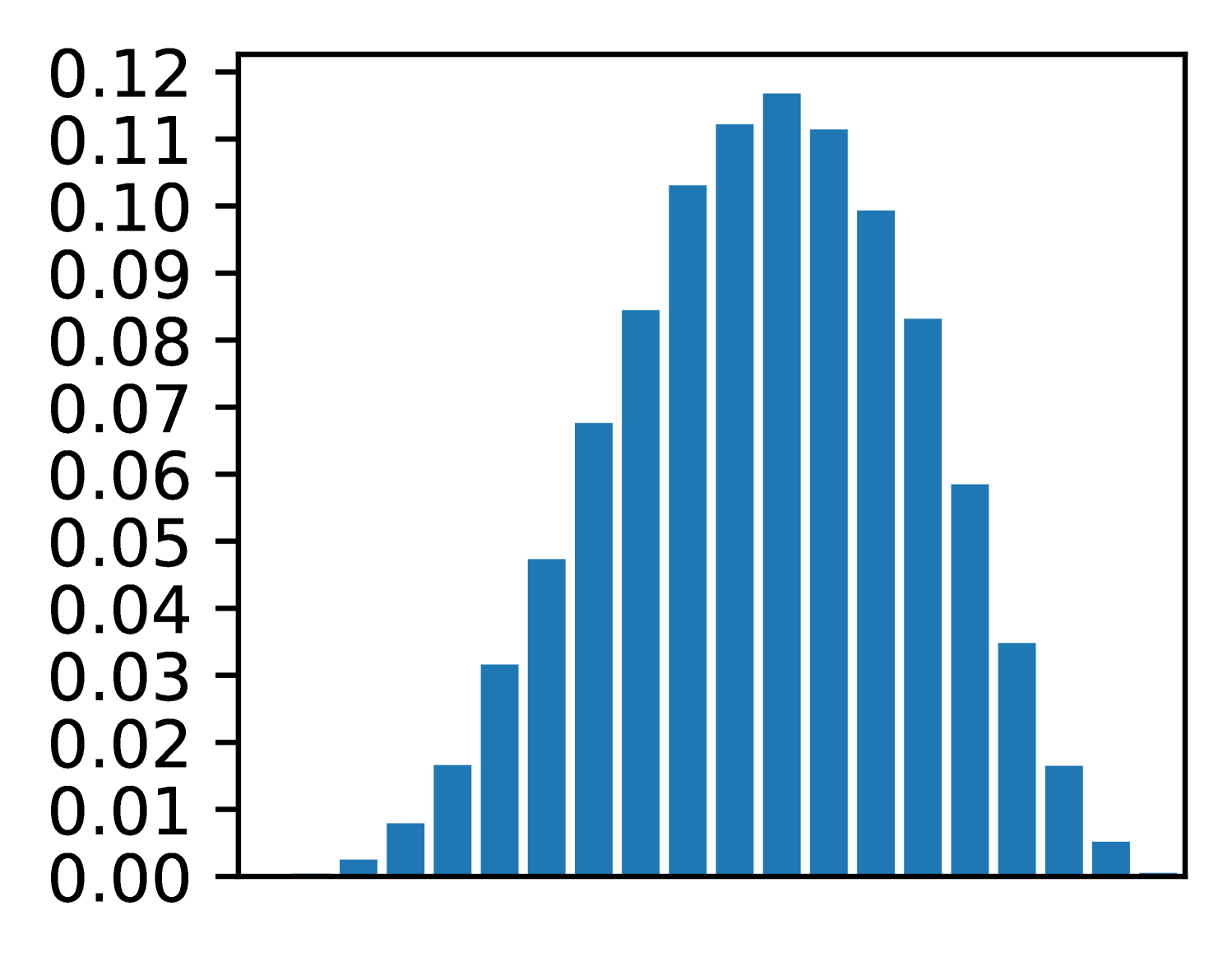
The image displays a bar chart representing a frequency distribution of numerical values. The x-axis shows a range of values from 0.00 to 0.12, while the y-axis represents frequency (count) with values from 0.00 to 0.12. The bars are uniformly blue, and the distribution follows a bell-shaped curve, suggesting a normal distribution.
### Components/Axes
- **X-axis**: Labeled with numerical values from 0.00 to 0.12 in increments of 0.01.
- **Y-axis**: Labeled with frequency values from 0.00 to 0.12 in increments of 0.01.
- **Bars**: Blue-colored vertical bars representing frequency counts. No legend or explicit title is present.
### Detailed Analysis
- **Bar Heights**:
- The tallest bar is centered at approximately 0.06 on the x-axis, with a frequency of ~0.115.
- Bars decrease symmetrically on either side of the peak.
- Left tail (x < 0.06): Frequencies increase from ~0.001 (x=0.00) to ~0.03 (x=0.05).
- Right tail (x > 0.06): Frequencies decrease from ~0.03 (x=0.07) to ~0.001 (x=0.12).
- **Notable Values**:
- x=0.06: ~0.115 (peak).
- x=0.05 and x=0.07: ~0.08.
- x=0.04 and x=0.08: ~0.06.
- x=0.03 and x=0.09: ~0.04.
- x=0.02 and x=0.10: ~0.02.
- x=0.01 and x=0.11: ~0.01.
- x=0.00 and x=0.12: ~0.001.
### Key Observations
1. **Symmetry**: The distribution is approximately symmetric around x=0.06.
2. **Peak Frequency**: The highest frequency (~0.115) occurs at x=0.06.
3. **Tails**: Frequencies taper off sharply at the extremes (x=0.00 and x=0.12).
4. **No Outliers**: No bars deviate significantly from the bell curve.
### Interpretation
The chart depicts a normal distribution, where most data points cluster around the mean (x=0.06) with decreasing frequency toward the extremes. This pattern is typical in natural phenomena (e.g., measurement errors, biological traits). The absence of a legend or title limits contextual interpretation, but the symmetry and bell shape strongly suggest a Gaussian distribution. The y-axis values (frequencies) are unusually high (up to 0.12), which may indicate a non-standardized scale or a mislabeling of the axis (e.g., frequency vs. probability density). Further clarification on the data source or units would improve accuracy.