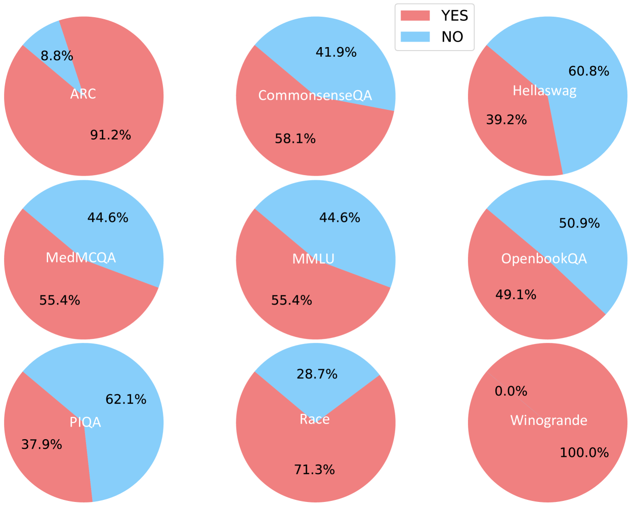
## Pie Chart Grid: Performance on Different Datasets
### Overview
The image presents a grid of nine pie charts, each representing the performance (YES/NO) on a different dataset. The pie charts are arranged in a 3x3 grid. The legend indicates that the coral color represents "YES" and the light blue color represents "NO". Each pie chart is labeled with the dataset name and displays the percentage breakdown for "YES" and "NO" responses.
### Components/Axes
* **Legend:** Located at the top of the image, indicating "YES" (coral) and "NO" (light blue).
* **Pie Charts:** Nine pie charts, each representing a different dataset.
* **Labels:** Each pie chart is labeled with the dataset name: ARC, CommonsenseQA, Hellaswag, MedMCQA, MMLU, OpenbookQA, PIQA, Race, and Winogrande.
* **Percentages:** Each pie chart segment displays the percentage of "YES" and "NO" responses.
### Detailed Analysis
Here's a breakdown of each pie chart:
1. **ARC:**
* YES (coral): 91.2%
* NO (light blue): 8.8%
2. **CommonsenseQA:**
* YES (coral): 58.1%
* NO (light blue): 41.9%
3. **Hellaswag:**
* YES (coral): 39.2%
* NO (light blue): 60.8%
4. **MedMCQA:**
* YES (coral): 55.4%
* NO (light blue): 44.6%
5. **MMLU:**
* YES (coral): 55.4%
* NO (light blue): 44.6%
6. **OpenbookQA:**
* YES (coral): 49.1%
* NO (light blue): 50.9%
7. **PIQA:**
* YES (coral): 37.9%
* NO (light blue): 62.1%
8. **Race:**
* YES (coral): 71.3%
* NO (light blue): 28.7%
9. **Winogrande:**
* YES (coral): 100.0%
* NO (light blue): 0.0%
### Key Observations
* **Winogrande** has the highest "YES" percentage (100%).
* **ARC** has the second highest "YES" percentage (91.2%).
* **PIQA** has the lowest "YES" percentage (37.9%).
* **Hellaswag** has the highest "NO" percentage (60.8%).
* **Winogrande** has the lowest "NO" percentage (0.0%).
### Interpretation
The pie charts illustrate the performance of a system or model across various datasets. The "YES" and "NO" responses likely represent correct and incorrect answers, respectively. The significant variation in performance across datasets suggests that the system's effectiveness is highly dependent on the specific task or domain represented by each dataset.
Winogrande stands out as the dataset where the system performs perfectly, while performance on PIQA and Hellaswag is notably lower. This could indicate that the system struggles with the types of reasoning or knowledge required by these particular datasets. The other datasets show a more balanced performance, with "YES" percentages ranging from approximately 49% to 58%.