## Pie Charts: QA Dataset Response Distribution
### Overview
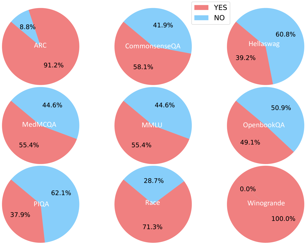
The image displays nine pie charts arranged in a 3x3 grid, each representing response distributions ("YES" and "NO") for different question-answering (QA) datasets. The charts use a consistent color scheme: red for "YES" and blue for "NO", with percentages labeled directly on the slices.
### Components/Axes
- **Legend**: Located in the top-right corner, with:
- Red square labeled "YES"
- Blue square labeled "NO"
- **Datasets**: Each pie chart is labeled with a QA dataset name in its center:
1. ARC
2. CommonsenseQA
3. Hellaswag
4. MedMCQA
5. MMLU
6. OpenbookQA
7. PIQA
8. Race
9. Winogrande
### Detailed Analysis
1. **ARC**:
- YES: 91.2% (red)
- NO: 8.8% (blue)
2. **CommonsenseQA**:
- YES: 58.1% (red)
- NO: 41.9% (blue)
3. **Hellaswag**:
- YES: 39.2% (red)
- NO: 60.8% (blue)
4. **MedMCQA**:
- YES: 55.4% (red)
- NO: 44.6% (blue)
5. **MMLU**:
- YES: 55.4% (red)
- NO: 44.6% (blue)
6. **OpenbookQA**:
- YES: 49.1% (red)
- NO: 50.9% (blue)
7. **PIQA**:
- YES: 37.9% (red)
- NO: 62.1% (blue)
8. **Race**:
- YES: 71.3% (red)
- NO: 28.7% (blue)
9. **Winogrande**:
- YES: 100.0% (red)
- NO: 0.0% (blue)
### Key Observations
- **Majority YES**: 6/9 datasets show >50% "YES" responses (ARC, CommonsenseQA, MedMCQA, MMLU, Race, Winogrande).
- **Majority NO**: 3/9 datasets show >50% "NO" responses (Hellaswag, OpenbookQA, PIQA).
- **Extreme Values**:
- Winogrande has 100% "YES" (no "NO" responses).
- PIQA has the lowest "YES" percentage (37.9%).
- **Balanced Distribution**: OpenbookQA shows near-equal "YES" (49.1%) and "NO" (50.9%) responses.
### Interpretation
The data suggests significant variability in QA dataset characteristics:
- **High "YES" percentages** (e.g., ARC, Winogrande) may indicate datasets with clearer, more consensus-driven answers or simpler question structures.
- **High "NO" percentages** (e.g., Hellaswag, PIQA) could reflect datasets with ambiguous questions, cultural biases, or complex reasoning requirements.
- **Balanced distributions** (OpenbookQA) might represent datasets designed to test nuanced understanding or debate-like scenarios.
- Winogrande's 100% "YES" response rate is anomalous and warrants investigation into dataset design or evaluation methodology.
The consistent color coding across all charts ensures easy cross-dataset comparison, though the lack of a shared scale complicates direct percentage comparisons. The spatial arrangement in a grid format facilitates visual scanning but does not encode any hierarchical relationships between datasets.