## Line Chart: Cosine Similarity
### Overview
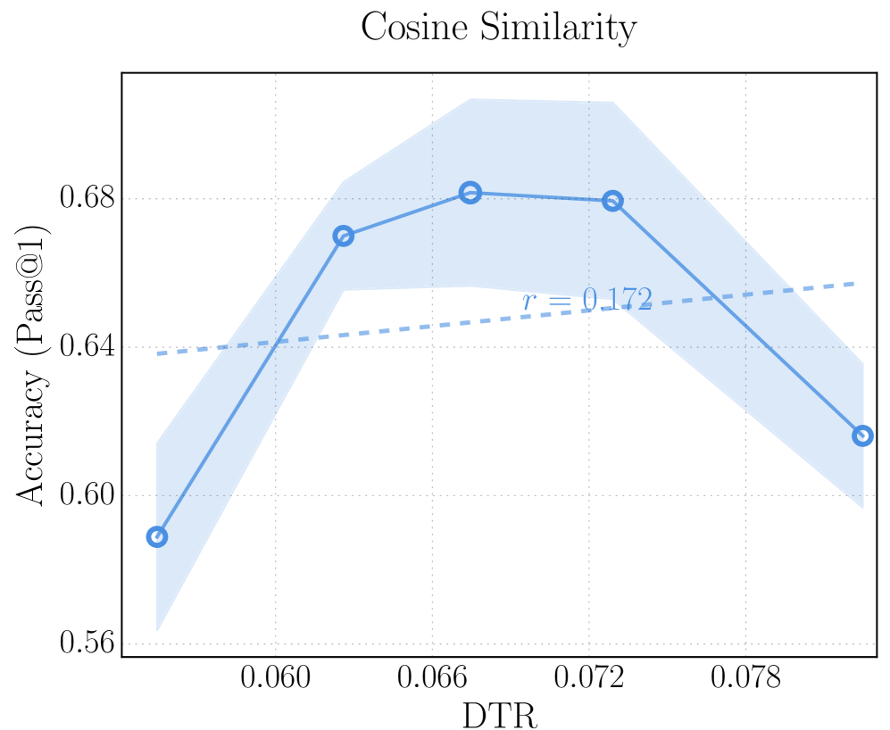
The image is a line chart titled "Cosine Similarity". It plots "Accuracy (Pass@1)" on the y-axis against "DTR" on the x-axis. The chart displays a primary data series represented by a solid blue line with circular markers, along with a shaded blue region indicating uncertainty. A secondary, dashed blue line represents a linear trend with a correlation coefficient (r) of 0.172.
### Components/Axes
* **Title:** Cosine Similarity
* **X-axis:**
* Label: DTR
* Scale: 0.060, 0.066, 0.072, 0.078
* **Y-axis:**
* Label: Accuracy (Pass@1)
* Scale: 0.56, 0.60, 0.64, 0.68
* **Data Series 1:** Solid blue line with circular markers and shaded uncertainty region.
* **Data Series 2:** Dashed blue line, representing a linear trend.
* **Correlation Coefficient:** r = 0.172, positioned near the dashed blue line.
### Detailed Analysis
* **Data Series 1 (Solid Blue Line):**
* Trend: Initially increases, plateaus, then decreases.
* Data Points:
* DTR = 0.054, Accuracy = 0.59 (approximate)
* DTR = 0.063, Accuracy = 0.67 (approximate)
* DTR = 0.069, Accuracy = 0.68 (approximate)
* DTR = 0.073, Accuracy = 0.68 (approximate)
* DTR = 0.082, Accuracy = 0.62 (approximate)
* **Data Series 2 (Dashed Blue Line):**
* Trend: Slightly increasing linear trend.
* Start Point: Approximately (0.054, 0.64)
* End Point: Approximately (0.082, 0.65)
* **Uncertainty Region:** Shaded blue region around the solid blue line, indicating the variability or confidence interval associated with the primary data series. The width of the shaded region varies, suggesting differing levels of uncertainty at different DTR values.
### Key Observations
* The accuracy peaks around a DTR value of 0.069 to 0.073.
* The uncertainty (shaded region) is wider at the beginning and end of the DTR range.
* The linear trend line (dashed blue) has a weak positive correlation (r = 0.172).
### Interpretation
The chart illustrates the relationship between DTR and accuracy, as measured by Pass@1. The primary data series suggests that there is an optimal DTR value for maximizing accuracy, with performance decreasing beyond that point. The shaded region highlights the uncertainty in the accuracy measurements, which is greater at the extremes of the DTR range. The weak positive correlation indicated by the dashed line suggests a slight overall tendency for accuracy to increase with DTR, but this trend is not strongly supported by the data. The peak in accuracy suggests that a balance must be struck in the DTR value to achieve optimal performance.