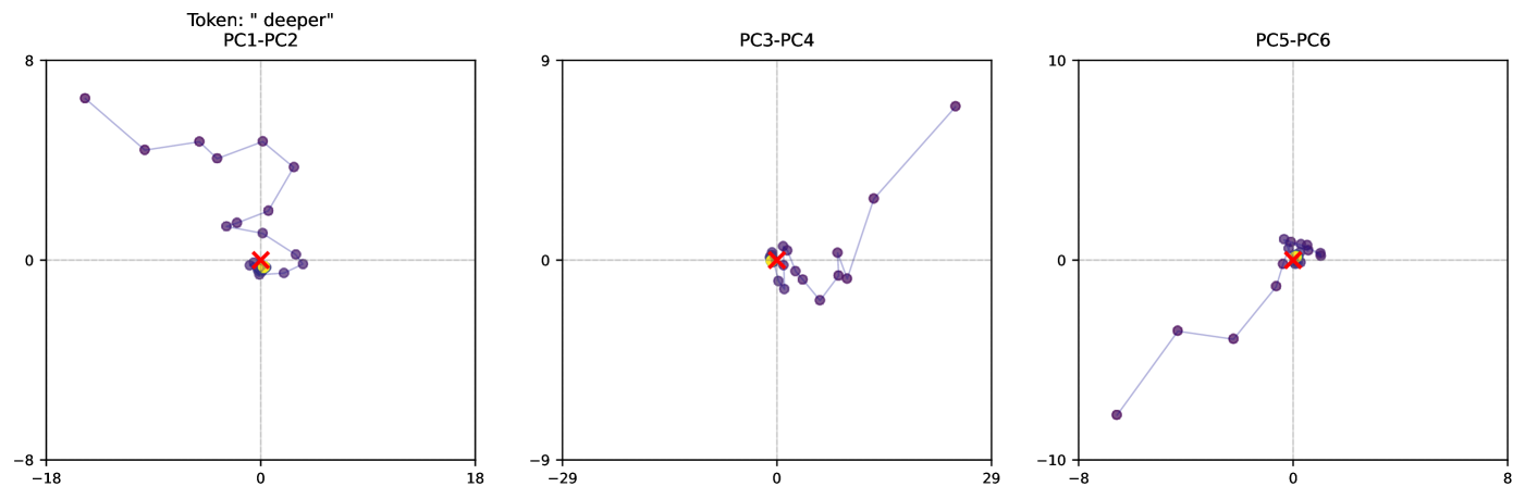
## Scatter Plots: Principal Component Analysis (PCA) for Token "deeper"
### Overview
The image presents three scatter plots, each representing a Principal Component Analysis (PCA) projection for the token "deeper". Each plot displays the relationship between two principal components (PCs). The plots are arranged horizontally, showing PC1-PC2, PC3-PC4, and PC5-PC6 respectively. Each plot has a horizontal axis and a vertical axis, both scaled with numerical values. Data points are represented as colored circles. There are four distinct colors used to represent different data points.
### Components/Axes
* **Titles:**
* PC1-PC2
* PC3-PC4
* PC5-PC6
* **Token:** "deeper" (displayed above PC1-PC2)
* **Axes:** Each plot has a horizontal (x-axis) and vertical (y-axis) with numerical scales.
* PC1-PC2: x-axis ranges from approximately -18 to 8; y-axis ranges from approximately -8 to 8.
* PC3-PC4: x-axis ranges from approximately -29 to 18; y-axis ranges from approximately -9 to 9.
* PC5-PC6: x-axis ranges from approximately -8 to 8; y-axis ranges from approximately -10 to 10.
* **Data Points:** Four distinct colors are used to represent different data points:
* Purple
* Red
* Orange
* Blue
### Detailed Analysis or Content Details
**PC1-PC2:**
* The purple data series shows a generally downward sloping trend from left to right, starting at approximately (-18, 6) and ending at approximately (6, -2). There are approximately 10 purple data points.
* The red data point is located at approximately (0, 1).
* The orange data point is located at approximately (1, -1).
* The blue data points are clustered around the origin, with values ranging from approximately (-1, -1) to (1, 1). There are approximately 6 blue data points.
**PC3-PC4:**
* The purple data series shows an upward sloping trend from left to right, starting at approximately (-28, -2) and ending at approximately (16, 7). There are approximately 8 purple data points.
* The red data point is located at approximately (0, 0).
* The orange data point is located at approximately (0, -1).
* The blue data point is located at approximately (1, 1).
**PC5-PC6:**
* The purple data series shows a generally flat trend, with values ranging from approximately (-6, 2) to (4, 2). There are approximately 6 purple data points.
* The red data series shows an upward sloping trend, starting at approximately (-2, -2) and ending at approximately (2, 2). There are approximately 4 red data points.
* The orange data point is located at approximately (0, -2).
* The blue data points are clustered around the origin, with values ranging from approximately (-2, 2) to (2, 2). There are approximately 6 blue data points.
### Key Observations
* The purple data series dominates each plot, suggesting it represents the majority of the data.
* The red, orange, and blue data points appear to be outliers or represent smaller subsets of the data.
* The trends observed in each plot vary, indicating different relationships between the principal components.
* The data points are not evenly distributed, suggesting potential clustering or non-linearity in the data.
### Interpretation
These PCA plots visualize the distribution of the token "deeper" across the first six principal components. Each plot represents a two-dimensional projection of the high-dimensional data, allowing for visual inspection of the data's structure. The purple data series likely represents the core meaning or context of the token, as it is the most prominent in each plot. The other colored data points may represent different nuances, variations, or related concepts associated with the token.
The varying trends in each plot suggest that different combinations of principal components capture different aspects of the token's meaning. For example, the upward sloping trend in PC3-PC4 might indicate a positive correlation between those components, while the downward sloping trend in PC1-PC2 might indicate a negative correlation.
The clustering of data points in some plots suggests that the data is not uniformly distributed, and there may be underlying patterns or groupings within the data. Further analysis would be needed to determine the significance of these patterns and their relationship to the token's meaning. The plots provide a visual summary of the data's variance and relationships, which can be used to gain insights into the token's semantic properties.