## Scatter Plot: Music Genre Distribution
### Overview
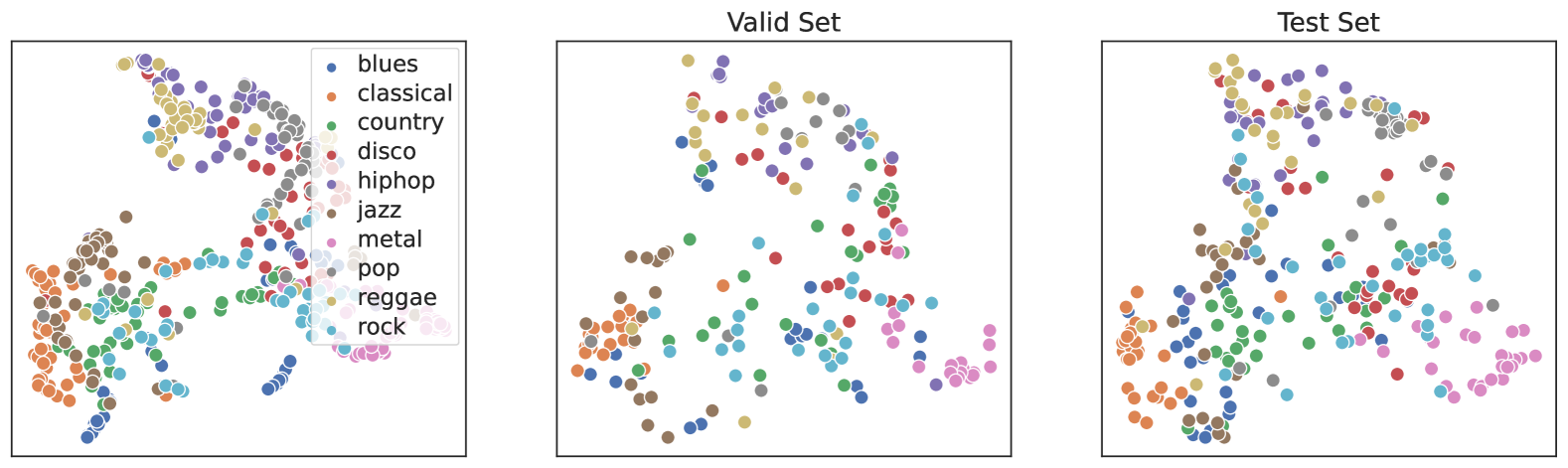
The scatter plot displays the distribution of various music genres across a dataset. Each genre is represented by a different color, and the points are plotted on a two-dimensional plane with the x-axis representing one feature and the y-axis representing another feature.
### Components/Axes
- **X-axis**: Represents one feature, possibly the tempo or energy level of the music.
- **Y-axis**: Represents another feature, possibly the complexity or emotional intensity of the music.
- **Legend**: Color-coded legend indicating the different music genres.
- **Data Points**: Each point represents a single music genre, with its color corresponding to the legend.
### Detailed Analysis or ### Content Details
- **Genres**: The genres included are blues, classical, country, disco, hip hop, jazz, metal, pop, reggae, and rock.
- **Distribution**: The data points are spread across the plot, with no clear clustering of genres.
- **Trends**: There is no clear trend or pattern in the distribution of genres, suggesting that the features used to plot the data do not have a strong correlation with the genre classification.
### Key Observations
- **Variability**: There is significant variability in the distribution of genres, indicating that the features used to plot the data do not strongly differentiate between genres.
- **Outliers**: There are no outliers in the data, suggesting that the dataset is relatively balanced in terms of genre representation.
### Interpretation
The scatter plot suggests that the features used to plot the data do not have a strong correlation with the genre classification. This could indicate that the dataset is not well-suited for genre classification or that the features used are not informative enough to distinguish between genres. The lack of clustering and the variability in the distribution of genres suggest that the dataset may need to be preprocessed or that the features used need to be re-evaluated.