\n
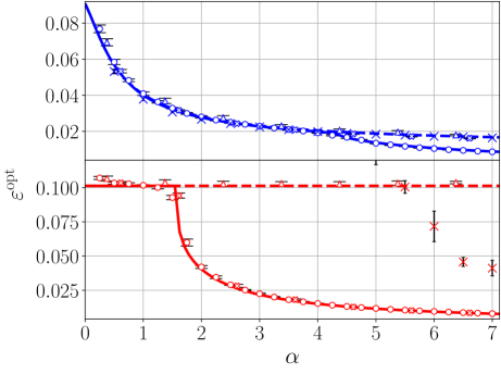
## Chart: εopt vs. α
### Overview
The image presents a line chart displaying the relationship between two variables: εopt (on the y-axis) and α (on the x-axis). Two distinct data series are plotted, each represented by a different color and marker style, with error bars indicating uncertainty. The chart appears to explore how an optimal error (εopt) changes as a parameter α varies.
### Components/Axes
* **X-axis:** Labeled "α", ranging from approximately 0 to 7. The scale is linear.
* **Y-axis:** Labeled "εopt", ranging from approximately 0 to 0.11. The scale is linear.
* **Data Series 1 (Blue):** Represented by a solid blue line with 'x' markers. Error bars are present.
* **Data Series 2 (Red):** Represented by a dashed red line with 'o' markers. Error bars are present.
### Detailed Analysis
**Data Series 1 (Blue):**
The blue line exhibits a decreasing trend from α = 0 to approximately α = 4, after which it plateaus and fluctuates.
* At α ≈ 0, εopt ≈ 0.08.
* At α ≈ 1, εopt ≈ 0.06.
* At α ≈ 2, εopt ≈ 0.035.
* At α ≈ 3, εopt ≈ 0.025.
* At α ≈ 4, εopt ≈ 0.02.
* At α ≈ 5, εopt ≈ 0.018.
* At α ≈ 6, εopt ≈ 0.016.
* At α ≈ 7, εopt ≈ 0.017.
**Data Series 2 (Red):**
The red line shows a sharp decrease from α = 0 to approximately α = 2, then stabilizes around εopt ≈ 0.1.
* At α ≈ 0, εopt ≈ 0.105.
* At α ≈ 1, εopt ≈ 0.10.
* At α ≈ 2, εopt ≈ 0.05.
* At α ≈ 3, εopt ≈ 0.03.
* At α ≈ 4, εopt ≈ 0.025.
* At α ≈ 5, εopt ≈ 0.025.
* At α ≈ 6, εopt ≈ 0.08.
* At α ≈ 7, εopt ≈ 0.06.
The error bars for both series indicate varying degrees of uncertainty in the measurements. The error bars are relatively small for the blue line, especially at higher α values, suggesting more precise measurements. The error bars for the red line are larger, particularly around α = 6 and 7, indicating greater uncertainty.
### Key Observations
* The blue line consistently shows lower εopt values compared to the red line across most of the α range.
* The red line exhibits a significant drop in εopt between α = 1 and α = 2.
* The blue line plateaus after α = 4, indicating that further increases in α do not significantly reduce εopt.
* The red line shows a large increase in εopt at α = 6 and 7, with large error bars.
### Interpretation
The chart suggests that the optimal error (εopt) is strongly dependent on the parameter α. For the blue data series, increasing α initially leads to a substantial reduction in εopt, but this effect diminishes beyond α = 4. The red data series shows a different behavior, with a rapid decrease in εopt at lower α values, followed by stabilization. The divergence between the two series suggests that different mechanisms or conditions may be influencing the optimal error for different ranges of α.
The large error bars for the red line at higher α values could indicate instability or limitations in the measurement process. The increase in εopt at α = 6 and 7 for the red line might signify a transition to a different regime or a breakdown of the optimization process.
The chart could be representing the optimization of a model or algorithm, where α is a tuning parameter and εopt is a measure of the error or loss function. The results suggest that there is an optimal range for α that minimizes the error, and that the optimal value may depend on the specific characteristics of the system being optimized.