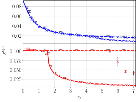
## Line Plot with Error Bars: Optimal Error (ε_opt) vs. Parameter α
### Overview
The image is a scientific line plot displaying two distinct data series, each plotted with error bars. The plot shows how an optimal error metric, ε_opt, changes as a function of a parameter α. The data suggests a relationship where ε_opt generally decreases with increasing α, but the two series exhibit markedly different behaviors.
### Components/Axes
* **X-Axis:**
* **Label:** `α` (Greek letter alpha).
* **Scale:** Linear scale from 0 to 7.
* **Major Tick Marks:** At integer values: 0, 1, 2, 3, 4, 5, 6, 7.
* **Y-Axis:**
* **Label:** `ε_opt` (Greek letter epsilon with subscript "opt").
* **Scale:** Linear scale.
* **Major Tick Marks:** Labeled at 0, 0.025, 0.050, 0.075, 0.100. The topmost visible tick is at 0.08, indicating the axis extends slightly beyond the labeled 0.100.
* **Legend:**
* **Placement:** Top-right corner of the plot area.
* **Content:** Two entries without explicit text labels, differentiated by color and marker style.
1. **Blue Series:** Represented by a blue line with open circle markers (`o`) and a blue line with 'x' markers (`x`).
2. **Red Series:** Represented by a red line with open circle markers (`o`) and a red line with plus sign markers (`+`).
* **Grid:** A light gray grid is present, aligned with the major tick marks on both axes.
### Detailed Analysis
The plot contains two primary data series, each consisting of two sub-series distinguished by marker type.
**1. Blue Data Series (Upper Curve):**
* **Trend:** Shows a steep, monotonic decrease from left to right. The slope is very high for low α and gradually flattens as α increases.
* **Data Points & Values (Approximate):**
* At α ≈ 0: ε_opt ≈ 0.085 (highest point on the plot).
* At α ≈ 1: ε_opt ≈ 0.040.
* At α ≈ 2: ε_opt ≈ 0.030.
* At α ≈ 4: ε_opt ≈ 0.020.
* At α ≈ 7: ε_opt ≈ 0.015 (lowest point for this series).
* **Error Bars:** Vertical error bars are present on all data points. The bars appear relatively consistent in size across the α range, suggesting similar uncertainty for each measurement.
* **Sub-series:** The 'x' markers and circle markers follow the same trend line very closely, indicating they represent measurements from the same condition or model, possibly with slight variations.
**2. Red Data Series (Lower, Bifurcated Curve):**
* **Trend:** Exhibits a dramatic, non-monotonic behavior. It has two distinct segments.
* **Segment 1 (α ≈ 0 to 1.5):** A nearly horizontal line at ε_opt ≈ 0.100.
* **Segment 2 (α > 1.5):** A sharp, near-vertical drop at α ≈ 1.5, followed by a steady decrease that parallels the blue curve but at lower ε_opt values.
* **Data Points & Values (Approximate):**
* **Horizontal Segment:** From α=0 to α≈1.5, ε_opt holds steady at ~0.100.
* **Transition:** At α ≈ 1.5, the value plummets from ~0.100 to ~0.050.
* **Decreasing Segment:**
* At α ≈ 2: ε_opt ≈ 0.040.
* At α ≈ 4: ε_opt ≈ 0.015.
* At α ≈ 7: ε_opt ≈ 0.005 (lowest point on the entire plot).
* **Error Bars:** Error bars are visible on all points. They appear slightly larger on the horizontal segment and during the sharp transition.
* **Outliers/Anomalies:** There are three isolated red data points with error bars located at α ≈ 6.0, 6.5, and 7.0, with ε_opt values of approximately 0.075, 0.050, and 0.040, respectively. These points lie significantly above the main red trend line and are marked with '+' symbols. Their placement suggests they may represent failed runs, alternative solutions, or a different experimental condition.
### Key Observations
1. **Divergent Behavior:** The two series start at very different ε_opt values (Blue ~0.085 vs. Red ~0.100 at α=0) and follow completely different paths until α > 1.5.
2. **Threshold Effect in Red Series:** The red series demonstrates a clear critical threshold or phase transition at α ≈ 1.5, where its performance (lower ε_opt is better) dramatically improves.
3. **Convergence at High α:** For α > 4, both main series show a decreasing trend, with the red series achieving a lower final ε_opt than the blue series.
4. **Anomalous Red Points:** The three high-ε_opt red points at α ≥ 6 are clear outliers from the primary red trend, indicating instability or the existence of multiple solution types at high α for that condition.
### Interpretation
This plot likely compares the performance of two different algorithms, models, or system configurations (Blue vs. Red) as a function of a control parameter α. The metric ε_opt is probably an error or cost function where lower values are better.
* **Blue Series:** Represents a configuration that is sensitive to α from the start. Its performance improves smoothly and predictably as α increases, suggesting a stable, gradient-based optimization landscape.
* **Red Series:** Represents a configuration with a bistable or threshold-dependent behavior. For low α (α < 1.5), it is trapped in a high-error state (ε_opt ≈ 0.100). At a critical α value (~1.5), it undergoes a sudden transition to a much lower-error state, after which its performance improves steadily. This is characteristic of systems with phase transitions, symmetry breaking, or non-convex optimization landscapes where a parameter must overcome a barrier.
* **Anomalous Points:** The outlier red points at high α suggest that while the primary low-error solution exists, the system can occasionally converge to a much poorer solution, indicating potential instability or sensitivity to initial conditions in that regime.
**In summary, the data demonstrates that the "Red" condition has a superior ultimate performance (lower ε_opt at high α) but requires a minimum threshold value of α (≈1.5) to activate its effective regime. The "Blue" condition offers more consistent, gradual improvement across the entire range of α.**