## Diagram: Coalition Structure and Primary User Positioning
### Overview
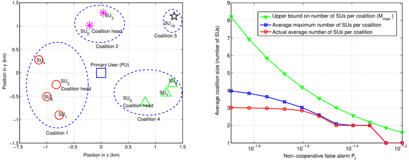
The left diagram illustrates a spatial distribution of coalitions and a primary user (PU) in a 2D coordinate system. Four coalitions are defined by dashed blue circles, each containing coalition heads (red circles) and members (green triangles). The PU is marked with a blue square.
### Components/Axes
- **X-axis**: Position in x (km), ranging from -1.5 to 1.5.
- **Y-axis**: Position in y (km), ranging from -1.5 to 1.5.
- **Legend**: Located on the right side of the diagram.
- **Red circles**: Coalition heads (e.g., SU₁, SU₂, SU₃, SU₄, SU₅, SU₆, SU₇, SU₈, SU₉, SU₁₀).
- **Green triangles**: Coalition members (e.g., SU₇, SU₈, SU₉).
- **Blue square**: Primary User (PU).
- **Star symbols**: Coalition heads with special notation (e.g., SU₃, SU₅, SU₁₀).
### Detailed Analysis
- **Coalition 1**: Centered at (-1, 0) with coalition head SU₁ and members SU₆, SU₅.
- **Coalition 2**: Centered at (0, 1) with coalition head SU₂ and members SU₃, SU₄.
- **Coalition 3**: Centered at (1, 0) with coalition head SU₉ and members SU₇, SU₈.
- **Coalition 4**: Centered at (0, -1) with coalition head SU₆ and members SU₁, SU₂.
- **PU**: Positioned at (0, 0.5).
### Key Observations
- Coalition heads are marked with red circles, while members are green triangles.
- The PU is centrally located but offset slightly upward.
- Coalition 3 has the most members (2), while others have 1–2 members.
### Interpretation
The diagram suggests a distributed network where coalitions are spatially separated, with the PU acting as a central reference point. The use of distinct symbols (red circles for heads, green triangles for members) implies hierarchical roles within coalitions. The PU’s position near Coalition 2 may indicate prioritized access or resource allocation.
---
## Line Graph: Average Coalition Size vs. Non-Cooperative False Alarm Probability
### Overview
The right graph plots the relationship between non-cooperative false alarm probability (P_f) and average coalition size, with three data series: upper bound, average maximum, and actual average.
### Components/Axes
- **X-axis**: Non-cooperative false alarm probability (P_f), logarithmic scale from 10⁻¹⁸ to 10⁻¹².
- **Y-axis**: Average coalition size (number of SUs), ranging from 1 to 9.
- **Legend**: Located at the top right.
- **Green triangles**: Upper bound on number of SUs per coalition (M_max).
- **Blue squares**: Average maximum number of SUs per coalition.
- **Red circles**: Actual average number of SUs per coalition.
### Detailed Analysis
- **Upper Bound (Green)**:
- At P_f = 10⁻¹⁸: ~8.5 SUs.
- At P_f = 10⁻¹²: ~1.5 SUs.
- **Average Maximum (Blue)**:
- At P_f = 10⁻¹⁸: ~4 SUs.
- At P_f = 10⁻¹²: ~2 SUs.
- **Actual Average (Red)**:
- At P_f = 10⁻¹⁸: ~3 SUs.
- At P_f = 10⁻¹²: ~1 SU.
### Key Observations
- All three lines show a decreasing trend as P_f increases.
- The upper bound (green) decreases most steeply, while the actual average (red) plateaus at lower P_f values.
- The actual average (red) closely follows the average maximum (blue) until P_f ≈ 10⁻¹⁴, after which it drops sharply.
### Interpretation
The graph demonstrates that as non-cooperative false alarms increase (lower P_f), coalition sizes shrink due to stricter resource constraints. The upper bound represents theoretical limits, while the actual average reflects real-world performance. The divergence between the actual average and upper bound at lower P_f suggests inefficiencies or practical limitations in coalition formation under high false alarm conditions.
---
**Note**: No non-English text is present in the image. All labels and annotations are in English.