\n
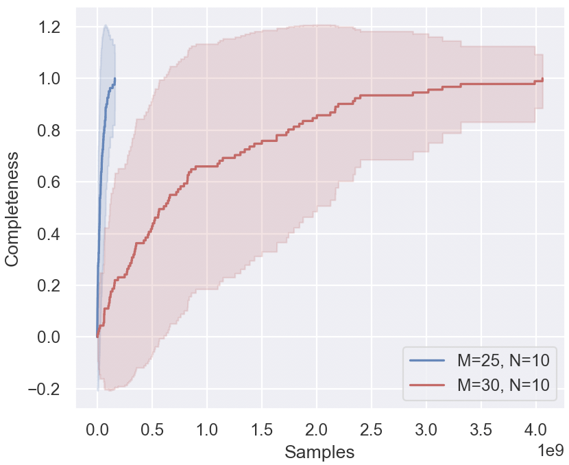
## Chart: Completeness vs. Samples
### Overview
The image presents a chart illustrating the relationship between the number of samples and the completeness of a process, likely a data collection or model training process. Two curves are plotted, representing different parameter settings (M and N). The chart uses a shaded area to represent the variance or confidence interval around each curve.
### Components/Axes
* **X-axis:** Labeled "Samples", with a scale ranging from approximately 0 to 4.0 x 10<sup>9</sup> (4 billion).
* **Y-axis:** Labeled "Completeness", with a scale ranging from approximately -0.2 to 1.2.
* **Legend:** Located in the bottom-right corner.
* Blue Line: "M=25, N=10"
* Red Line: "M=30, N=10"
* **Shaded Areas:** Light red and light blue areas surrounding the respective lines, representing a confidence interval or standard deviation.
### Detailed Analysis
**Red Line (M=30, N=10):**
The red line starts at approximately (0, -0.15) and initially slopes upward. Around 0.5 x 10<sup>9</sup> samples, the curve flattens, exhibiting a plateau between approximately 0.6 and 0.8 completeness. From approximately 2.0 x 10<sup>9</sup> samples, the line increases more steadily, approaching a completeness of approximately 1.0 at 4.0 x 10<sup>9</sup> samples. The shaded area around the red line is wider at the beginning, indicating greater variance, and narrows as the number of samples increases.
**Blue Line (M=25, N=10):**
The blue line starts at approximately (0, 0.0) and rises sharply, reaching a completeness of approximately 0.8 at around 0.3 x 10<sup>9</sup> samples. After this point, the curve plateaus, remaining relatively stable around a completeness of 0.8 to 0.9 until approximately 3.5 x 10<sup>9</sup> samples, where it begins to slightly increase towards 1.0. The shaded area around the blue line is relatively narrow throughout, suggesting less variance compared to the red line.
### Key Observations
* The red line (M=30, N=10) generally exhibits a slower initial increase in completeness compared to the blue line (M=25, N=10).
* The red line reaches a higher maximum completeness (approximately 1.0) than the blue line (approaching 1.0).
* The variance (as indicated by the shaded areas) is higher for the red line, especially at lower sample counts.
* Both curves demonstrate diminishing returns in completeness as the number of samples increases beyond a certain point.
### Interpretation
The chart likely represents the convergence of a process as more data (samples) are processed. The parameters M and N likely control some aspect of the process, such as the model complexity or the number of iterations.
The fact that M=30, N=10 achieves a higher completeness suggests that increasing M (while keeping N constant) improves the process's ability to reach a complete state. However, this comes at the cost of increased initial variance. The diminishing returns observed in both curves indicate that there is a point beyond which adding more samples provides only marginal improvements in completeness.
The negative completeness values at the beginning of the red line are unusual and could indicate an initial period of instability or negative impact before the process begins to converge. This could be due to the model needing to "unlearn" initial biases or incorrect assumptions.
The chart suggests a trade-off between speed of convergence (blue line) and ultimate completeness (red line). Choosing the appropriate parameter settings (M and N) depends on the specific requirements of the application – whether rapid initial progress or maximum completeness is more important.