## Scatter Plot: Mean Pass Rate vs. Mean Number of Tokens Generated
### Overview
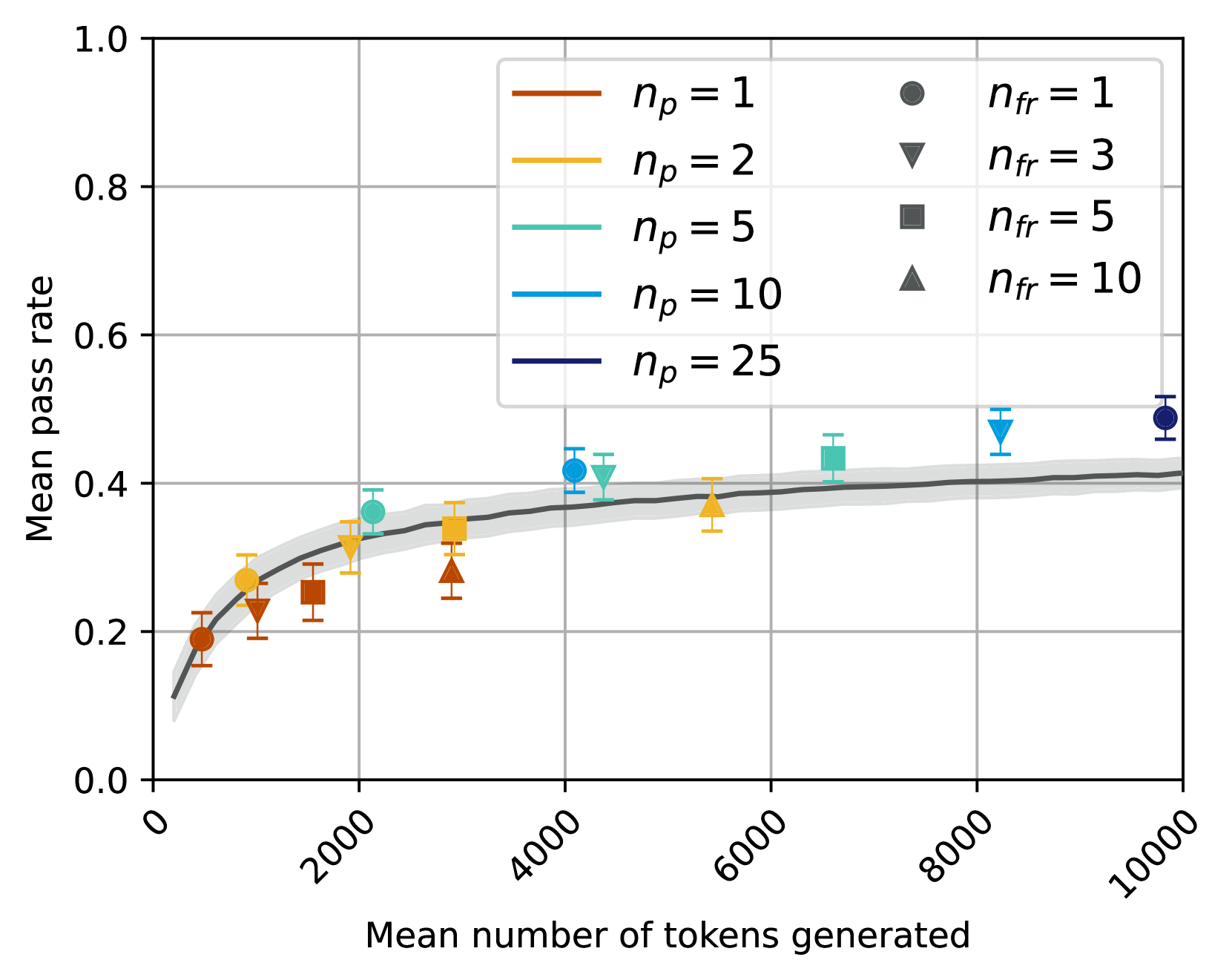
The image is a scatter plot showing the relationship between the mean pass rate and the mean number of tokens generated. The plot includes data for different values of `np` (represented by lines) and `nfr` (represented by markers). A gray shaded region indicates a confidence interval or standard deviation around a central trend line.
### Components/Axes
* **X-axis:** Mean number of tokens generated, with ticks at 0, 2000, 4000, 6000, 8000, and 10000.
* **Y-axis:** Mean pass rate, with ticks at 0.0, 0.2, 0.4, 0.6, 0.8, and 1.0.
* **Legend (Top-Left):**
* Brown line: `np = 1`
* Yellow line: `np = 2`
* Teal line: `np = 5`
* Light Blue line: `np = 10`
* Dark Blue line: `np = 25`
* **Legend (Top-Right):**
* Gray circle: `nfr = 1`
* Gray inverted triangle: `nfr = 3`
* Gray square: `nfr = 5`
* Gray triangle: `nfr = 10`
### Detailed Analysis
**Data Series Trends and Values:**
* **General Trend:** The mean pass rate generally increases as the mean number of tokens generated increases, approaching a plateau. A dark gray line with a light gray confidence interval represents this overall trend.
* **`np` Series (Lines):**
* **`np = 1` (Brown):** Starts at approximately (0, 0.12) and increases to approximately (2000, 0.25).
* **`np = 2` (Yellow):** Starts at approximately (0, 0.10) and increases to approximately (2000, 0.30).
* **`np = 5` (Teal):** Starts at approximately (0, 0.11) and increases to approximately (2000, 0.35).
* **`np = 10` (Light Blue):** Starts at approximately (0, 0.13) and increases to approximately (4000, 0.42).
* **`np = 25` (Dark Blue):** Not clearly distinguishable from the trend line. Appears to reach approximately 0.5 at 10000.
* **`nfr` Series (Markers):**
* **`nfr = 1` (Gray Circle):** Data point at approximately (10000, 0.50).
* **`nfr = 3` (Gray Inverted Triangle):** Data points at approximately (2000, 0.25) and (8000, 0.47).
* **`nfr = 5` (Gray Square):** Data points at approximately (2000, 0.28) and (6000, 0.35).
* **`nfr = 10` (Gray Triangle):** Data points at approximately (2000, 0.24) and (6000, 0.30).
### Key Observations
* The mean pass rate increases rapidly initially and then plateaus as the mean number of tokens generated increases.
* The `np` values seem to influence the initial rate of increase, with higher `np` values showing a slightly faster increase in the mean pass rate.
* The `nfr` values are scattered and do not show a clear trend.
* Error bars are present on the data points, indicating the uncertainty in the measurements.
### Interpretation
The data suggests that increasing the mean number of tokens generated improves the mean pass rate, but only up to a certain point. The parameter `np` may influence the initial rate of improvement. The parameter `nfr` does not appear to have a strong or consistent effect on the mean pass rate. The gray shaded region around the trend line indicates the variability or uncertainty in the data. The plot demonstrates diminishing returns, where increasing the number of tokens generated beyond a certain point yields little improvement in the pass rate.