\n
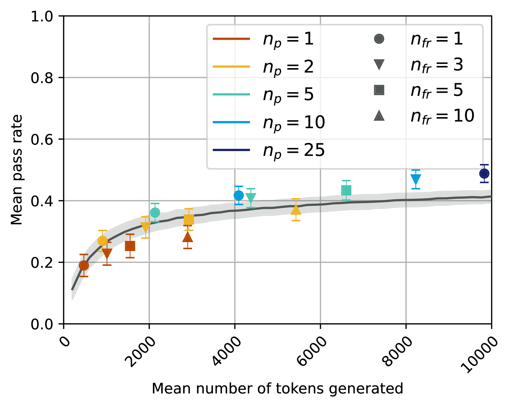
## Scatter Plot with Trend Line: Mean Pass Rate vs. Mean Number of Tokens Generated
### Overview
The image is a technical scatter plot chart displaying the relationship between the "Mean number of tokens generated" (x-axis) and the "Mean pass rate" (y-axis). The chart includes multiple data series differentiated by color and marker shape, representing different values of two parameters: \( n_p \) and \( n_{fr} \). A dark gray trend line with a shaded confidence interval runs through the data points.
### Components/Axes
* **X-Axis:** Labeled "Mean number of tokens generated". The scale runs from 0 to 10000, with major tick marks at 0, 2000, 4000, 6000, 8000, and 10000. The labels are rotated approximately 45 degrees.
* **Y-Axis:** Labeled "Mean pass rate". The scale runs from 0.0 to 1.0, with major tick marks at 0.0, 0.2, 0.4, 0.6, 0.8, and 1.0.
* **Legend (Top-Right Quadrant):** The legend is contained within a light gray box and is split into two columns.
* **Left Column (Color Key for \( n_p \)):**
* Orange line: \( n_p = 1 \)
* Yellow line: \( n_p = 2 \)
* Teal line: \( n_p = 5 \)
* Light Blue line: \( n_p = 10 \)
* Dark Blue line: \( n_p = 25 \)
* **Right Column (Marker Key for \( n_{fr} \)):**
* Circle (●): \( n_{fr} = 1 \)
* Downward Triangle (▼): \( n_{fr} = 3 \)
* Square (■): \( n_{fr} = 5 \)
* Upward Triangle (▲): \( n_{fr} = 10 \)
* **Trend Line:** A dark gray, solid line representing a fitted model or average trend. It is surrounded by a light gray shaded region, likely indicating a confidence interval or standard deviation band.
* **Data Points:** Each point is a colored marker (corresponding to an \( n_p \) value) with a specific shape (corresponding to an \( n_{fr} \) value). Each point includes vertical error bars.
### Detailed Analysis
**Data Point Extraction (Approximate Values):**
The following table lists each visible data point, identified by its color (\( n_p \)) and marker shape (\( n_{fr} \)), with approximate coordinates and error bar ranges.
| \( n_p \) (Color) | \( n_{fr} \) (Marker) | Approx. Mean Tokens (X) | Approx. Mean Pass Rate (Y) | Approx. Error Bar Range (Y) |
| :--- | :--- | :--- | :--- | :--- |
| 1 (Orange) | 1 (Circle) | 500 | 0.19 | 0.16 - 0.22 |
| 1 (Orange) | 3 (Down Triangle) | 1000 | 0.23 | 0.19 - 0.27 |
| 1 (Orange) | 5 (Square) | 1500 | 0.25 | 0.22 - 0.28 |
| 1 (Orange) | 10 (Up Triangle) | 3000 | 0.27 | 0.24 - 0.30 |
| 2 (Yellow) | 1 (Circle) | 1000 | 0.27 | 0.25 - 0.29 |
| 2 (Yellow) | 3 (Down Triangle) | 2000 | 0.32 | 0.28 - 0.36 |
| 2 (Yellow) | 5 (Square) | 3000 | 0.34 | 0.31 - 0.37 |
| 2 (Yellow) | 10 (Up Triangle) | 5500 | 0.37 | 0.34 - 0.40 |
| 5 (Teal) | 1 (Circle) | 2000 | 0.36 | 0.33 - 0.39 |
| 5 (Teal) | 3 (Down Triangle) | 4500 | 0.41 | 0.38 - 0.44 |
| 5 (Teal) | 5 (Square) | 6500 | 0.42 | 0.40 - 0.44 |
| 10 (Light Blue) | 1 (Circle) | 4000 | 0.42 | 0.39 - 0.45 |
| 10 (Light Blue) | 3 (Down Triangle) | 8000 | 0.47 | 0.44 - 0.50 |
| 25 (Dark Blue) | 1 (Circle) | 9800 | 0.49 | 0.47 - 0.51 |
**Trend Line Description:**
The dark gray trend line shows a logarithmic or diminishing returns relationship. It rises steeply from near (0, 0.1) and begins to plateau around x=4000, y=0.38. The slope becomes very shallow after x=6000, approaching a pass rate of approximately 0.41 at x=10000. The shaded confidence interval is narrowest in the middle range (x=2000 to 6000) and widens slightly at the extremes.
### Key Observations
1. **Positive Correlation:** There is a clear positive correlation between the mean number of tokens generated and the mean pass rate. As token count increases, pass rate increases.
2. **Diminishing Returns:** The rate of improvement in pass rate slows significantly as token count increases. The largest gains occur below 4000 tokens.
3. **Parameter Influence:**
* **Effect of \( n_p \):** For a given token count, higher \( n_p \) values (cooler colors: teal, blue) are associated with higher pass rates. For example, at ~4000 tokens, the light blue point (\( n_p=10 \)) is higher than the teal point (\( n_p=5 \)), which is higher than the yellow point (\( n_p=2 \)).
* **Effect of \( n_{fr} \):** For a given \( n_p \) color, points with higher \( n_{fr} \) values (different markers) tend to be located further to the right (higher token count) and often slightly higher on the y-axis (higher pass rate). This suggests that increasing \( n_{fr} \) also increases token generation.
4. **Data Distribution:** Data points are clustered more densely in the lower-left region (lower tokens, lower pass rate) and become sparser towards the upper-right. The highest pass rate observed is just below 0.5.
### Interpretation
This chart likely illustrates the performance of a generative model (e.g., for code, text, or reasoning) where "pass rate" is a success metric. The data suggests a fundamental trade-off or resource relationship: achieving a higher success rate requires generating more tokens (i.e., using more computational effort or producing longer outputs).
The parameters \( n_p \) and \( n_{fr} \) appear to be hyperparameters controlling the generation process. The trends indicate that:
* Increasing \( n_p \) improves the efficiency of the model, yielding a higher pass rate for the same token budget.
* Increasing \( n_{fr} \) leads to longer generations (more tokens) and a modest boost in pass rate, but its primary effect seems to be on output length.
The plateau in the trend line implies a performance ceiling; beyond a certain point (~6000 tokens), simply generating more text yields minimal improvement in success rate. This could indicate a limit of the model's capability or that the evaluation task has a inherent difficulty that cannot be overcome by longer generation alone. The widening confidence interval at high token counts suggests greater variability or uncertainty in outcomes when the model generates very long sequences.