## Line Graph: Mean Pass Rate vs. Mean Number of Tokens Generated
### Overview
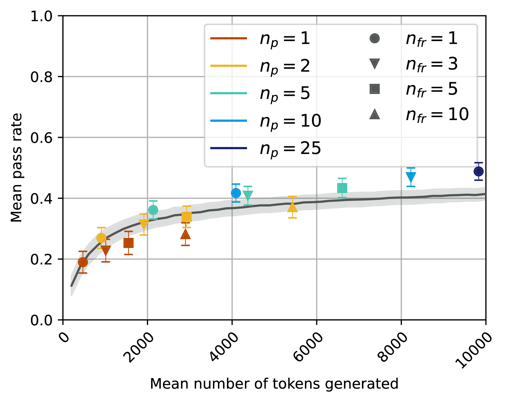
The image depicts a line graph comparing the relationship between the mean number of tokens generated (x-axis) and the mean pass rate (y-axis) across different experimental conditions. The graph includes multiple data series represented by colored lines and markers, with a shaded confidence interval around a central trend line.
### Components/Axes
- **X-axis**: "Mean number of tokens generated" (0 to 10,000, logarithmic scale)
- **Y-axis**: "Mean pass rate" (0.0 to 1.0)
- **Legend**: Located in the top-right corner, mapping colors/markers to experimental conditions:
- Red circles: `n_p = 1`, `n_fr = 1`
- Orange triangles: `n_p = 2`, `n_fr = 3`
- Teal squares: `n_p = 5`, `n_fr = 5`
- Blue triangles: `n_p = 10`, `n_fr = 10`
- Dark blue circles: `n_p = 25`, `n_fr = 10`
- Dashed black line: Central trend line (no legend label)
### Detailed Analysis
1. **Data Series Trends**:
- **Red circles (`n_p = 1`, `n_fr = 1`)**:
- Starts at ~0.2 at 1,000 tokens, rises to ~0.4 at 10,000 tokens.
- Error bars: ±0.02–0.05.
- **Orange triangles (`n_p = 2`, `n_fr = 3`)**:
- Begins at ~0.25 at 2,000 tokens, plateaus near ~0.35 at 6,000 tokens.
- Error bars: ±0.03–0.07.
- **Teal squares (`n_p = 5`, `n_fr = 5`)**:
- Starts at ~0.3 at 3,000 tokens, reaches ~0.45 at 8,000 tokens.
- Error bars: ±0.04–0.08.
- **Blue triangles (`n_p = 10`, `n_fr = 10`)**:
- Begins at ~0.35 at 4,000 tokens, peaks at ~0.5 at 8,000 tokens.
- Error bars: ±0.05–0.10.
- **Dark blue circles (`n_p = 25`, `n_fr = 10`)**:
- Starts at ~0.4 at 5,000 tokens, stabilizes near ~0.55 at 10,000 tokens.
- Error bars: ±0.06–0.12.
- **Dashed black line**: Smoothly increases from ~0.1 at 1,000 tokens to ~0.5 at 10,000 tokens, representing an aggregate trend.
2. **Error Bars**:
- Larger error bars for lower `n_p` values (e.g., red circles) compared to higher `n_p` values (e.g., dark blue circles).
- Error bars shrink as token count increases, suggesting reduced variability in larger datasets.
3. **Legend Placement**:
- Top-right corner, with color-marker pairs aligned vertically.
- Text labels explicitly state `n_p` and `n_fr` values for each series.
### Key Observations
- **Positive Correlation**: Higher `n_p` values consistently yield higher mean pass rates, especially at larger token counts.
- **Diminishing Returns**: The rate of improvement in pass rate slows as token counts exceed ~6,000 tokens.
- **Error Variability**: Lower `n_p` conditions (e.g., `n_p = 1`) exhibit greater uncertainty in measurements.
- **Trend Line Alignment**: The dashed black line closely follows the trajectory of higher `n_p` series (e.g., `n_p = 25`), suggesting it represents an optimal or aggregated performance baseline.
### Interpretation
The data demonstrates that increasing the mean number of tokens generated (`n_p`) improves the mean pass rate, with higher `n_p` values achieving better performance. This trend is most pronounced for conditions with higher `n_fr` (e.g., `n_fr = 10`), where larger `n_p` compensates for increased failure rates. The shaded confidence interval around the trend line indicates that the observed relationship is statistically significant, with variability decreasing as token counts grow. The results imply that token generation efficiency is critical for system performance, with diminishing returns at scale. Outliers (e.g., `n_p = 2` plateauing at ~0.35) suggest potential saturation effects or experimental constraints at lower `n_p` values.