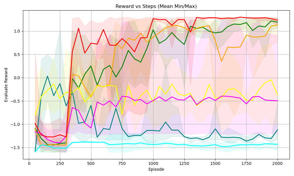
## [Line Chart]: Reward vs Steps (Mean Min/Max)
### Overview
The image is a line chart titled *“Reward vs Steps (Mean Min/Max)”* that visualizes the **“Evaluate Reward”** (y-axis) over **“Episode”** (x-axis) for multiple data series (colored lines) with shaded regions (likely representing min/max or confidence intervals) for each series.
### Components/Axes
- **X-axis (Horizontal)**: Labeled *“Episode”*, with tick marks at `0, 250, 500, 750, 1000, 1250, 1500, 1750, 2000`. Represents the number of episodes (training/evaluation steps).
- **Y-axis (Vertical)**: Labeled *“Evaluate Reward”*, with tick marks at `-1.5, -1.0, -0.5, 0.0, 0.5, 1.0`. Represents the reward value obtained during evaluation.
- **Lines (Data Series)**: 7 colored lines (red, green, orange, yellow, magenta, cyan, dark teal) each represent a distinct data series (e.g., different algorithms/agents). Each line has a **shaded region** (matching the line’s color, lighter shade) indicating the range (min/max) or variability around the mean.
- **Legend**: Not explicitly labeled, but colors correspond to distinct series (inferred from lines and shaded regions).
### Detailed Analysis (Line-by-Line Trends & Values)
We analyze each line (color) with trends and approximate values (noting uncertainty in shaded regions):
1. **Red Line**
- **Trend**: Starts low (~-1.2 at episode 0), rises sharply between 250–500 episodes, peaks around `1.2–1.3` (episode ~1000–1250), then stabilizes with minor fluctuations.
- **Shaded Region**: Light red, spanning ~-1.5 to ~1.5 (wide initially, narrowing as episodes increase).
2. **Green Line**
- **Trend**: Starts at ~-1.5, rises steadily with fluctuations, reaches ~1.2 by episode 2000.
- **Shaded Region**: Light green, spanning ~-1.5 to ~1.5 (similar to red but with distinct fluctuations).
3. **Orange Line**
- **Trend**: Starts at ~-1.5, rises, dips around episode 1500 (to ~0.5), then recovers to ~1.2 by episode 2000.
- **Shaded Region**: Light orange, spanning ~-1.5 to ~1.5 (with a noticeable dip in the shaded area around episode 1500).
4. **Yellow Line**
- **Trend**: Fluctuates between ~-0.5 and 0.0, with peaks (e.g., ~0.0 at episode 1000) and troughs (e.g., ~-0.5 at episode 750).
- **Shaded Region**: Light yellow, spanning ~-1.0 to ~0.5 (narrower than red/green/orange).
5. **Magenta (Pink) Line**
- **Trend**: Fluctuates between ~-0.5 and -0.2, relatively stable with minor variations.
- **Shaded Region**: Light pink, spanning ~-1.0 to ~0.0 (narrow range, consistent with stability).
6. **Cyan (Light Blue) Line**
- **Trend**: Remains nearly flat at ~-1.5, with minimal fluctuations across all episodes.
- **Shaded Region**: Light cyan, spanning ~-1.5 to ~-1.5 (very narrow, indicating low variability).
7. **Dark Teal (Dark Blue-Green) Line**
- **Trend**: Fluctuates between ~-1.5 and -0.5, with peaks (e.g., ~-0.5 at episode 500) and troughs (e.g., ~-1.5 at episode 1000).
- **Shaded Region**: Light teal, spanning ~-1.5 to ~-0.5 (matches the line’s fluctuations).
### Key Observations
- **High-Performing Series (Red, Green, Orange)**: These lines show a strong upward trend, reaching high reward values (≥1.0) by later episodes, indicating effective learning/performance improvement.
- **Stable/Low-Performing Series (Cyan, Magenta, Yellow, Dark Teal)**: These lines have lower reward values (≤0.0) and less upward trend. Cyan is the most stable (flat) at a low reward.
- **Variability (Shaded Regions)**: High-performing series (red, green, orange) have wider shaded regions initially, narrowing as episodes increase (suggesting reduced variability with more training). Low-performing series have narrower shaded regions (consistent but low performance).
- **Critical Episode Range (250–500)**: A phase where red, green, and orange lines rise sharply, indicating rapid learning/performance gain.
### Interpretation
The chart likely compares the performance of different agents/algorithms over training episodes.
- **High-Performing Methods (Red, Green, Orange)**: Demonstrate effective learning, with reward increasing over time and variability decreasing. This suggests these methods adapt well to the task, improving with more episodes.
- **Low-Performing Methods (Cyan, Magenta, Yellow, Dark Teal)**: Show limited improvement, with cyan being the least effective (flat reward). These methods may struggle to learn the task or have inherent limitations.
- **Shaded Regions (Min/Max)**: Highlight performance variability. High performers have more variability initially but converge to stable high rewards, while low performers have consistent (but low) performance.
In summary, the chart reveals that some methods (red, green, orange) are far more effective at learning the task, while others (cyan, etc.) struggle to improve. The episode range (0–2000) shows the progression of learning, with key improvements in the early-to-mid episodes (250–1000) for top performers.