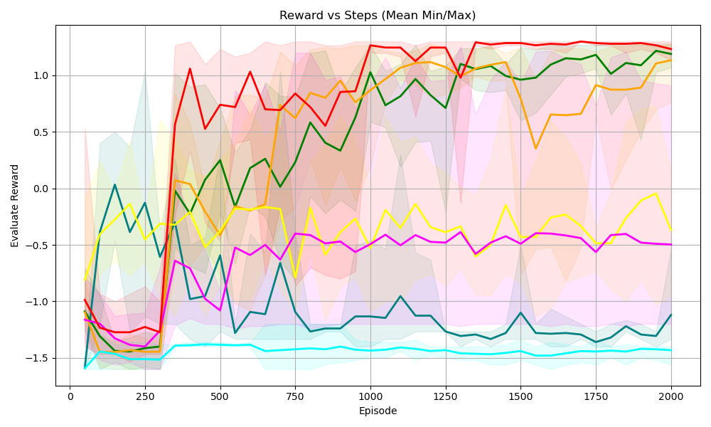
## Line Chart: Reward vs Steps (Mean Min/Max)
### Overview
The image is a line chart displaying the relationship between "Reward" and "Episode" (steps), showing multiple data series, each representing a different scenario or algorithm. The chart includes shaded regions around each line, indicating the min/max range for each series.
### Components/Axes
* **Title:** Reward vs Steps (Mean Min/Max)
* **X-axis:** Episode
* Scale: 0 to 2000, with markers at 0, 250, 500, 750, 1000, 1250, 1500, 1750, and 2000.
* **Y-axis:** Evaluate Reward
* Scale: -1.5 to 1.0, with markers at -1.5, -1.0, -0.5, 0.0, 0.5, and 1.0.
* **Data Series:** There are six distinct data series, each represented by a different color: red, orange, green, yellow, magenta, and cyan. Each series has a corresponding shaded region indicating the min/max range.
### Detailed Analysis
* **Red Line:**
* Trend: Starts around -1.25, drops slightly, then sharply increases around Episode 250 to reach a value near 1.0. It fluctuates slightly around 1.0 for the remainder of the episodes.
* Approximate Values:
* Episode 0: -1.25
* Episode 250: -1.3
* Episode 500: 0.9
* Episode 1000: 0.75
* Episode 1500: 0.9
* Episode 2000: 1.1
* **Orange Line:**
* Trend: Starts around -1.4, drops slightly, then increases sharply around Episode 250 to reach a value near 0.0. It then gradually increases to around 0.8 by Episode 2000.
* Approximate Values:
* Episode 0: -1.4
* Episode 250: -1.5
* Episode 500: -0.1
* Episode 1000: 0.3
* Episode 1500: 0.7
* Episode 2000: 0.8
* **Green Line:**
* Trend: Starts around 0.0, decreases, then increases sharply around Episode 250 to reach a value near 0.0. It then gradually increases to around 1.0 by Episode 2000.
* Approximate Values:
* Episode 0: 0.0
* Episode 250: -0.75
* Episode 500: 0.2
* Episode 1000: 0.3
* Episode 1500: 0.8
* Episode 2000: 1.0
* **Yellow Line:**
* Trend: Starts around -0.25, decreases, then increases sharply around Episode 250 to reach a value near -0.25. It then fluctuates around -0.25 to 0.0 by Episode 2000.
* Approximate Values:
* Episode 0: -0.25
* Episode 250: -0.75
* Episode 500: -0.3
* Episode 1000: -0.4
* Episode 1500: -0.3
* Episode 2000: -0.1
* **Magenta Line:**
* Trend: Starts around -1.25, decreases, then increases sharply around Episode 250 to reach a value near -1.0. It then fluctuates around -0.75 to -0.5 by Episode 2000.
* Approximate Values:
* Episode 0: -1.25
* Episode 250: -1.25
* Episode 500: -0.9
* Episode 1000: -0.5
* Episode 1500: -0.5
* Episode 2000: -0.5
* **Cyan Line:**
* Trend: Starts around -1.5, remains relatively flat around -1.5 for the duration of the episodes.
* Approximate Values:
* Episode 0: -1.5
* Episode 250: -1.5
* Episode 500: -1.4
* Episode 1000: -1.4
* Episode 1500: -1.4
* Episode 2000: -1.4
### Key Observations
* The red line consistently achieves the highest reward after the initial episodes.
* The cyan line consistently performs the worst, with a reward around -1.5.
* The shaded regions indicate significant variability in the min/max reward values, especially in the early episodes.
* Most lines show a significant increase in reward around Episode 250.
### Interpretation
The chart compares the performance of different algorithms or scenarios (represented by the different colored lines) in terms of reward gained over a series of episodes. The red line represents the most successful approach, consistently achieving high rewards. The cyan line represents the least successful approach. The shaded regions indicate the range of possible outcomes for each approach, suggesting the stability or variability of each method. The sharp increase in reward around Episode 250 for most lines suggests a learning phase or a critical point in the training process. The data suggests that some algorithms are significantly more effective than others in maximizing reward within the given environment or task.