TECHNICAL ASSET FINGERPRINT
cd01b0c4123ded32d92b4e59
Click to view fullscreen
Press ESC or click to close
FOUND IN PAPERS
EXPERT: gemini-2.0-flash VERSION 1
RUNTIME: nugit/gemini/gemini-2.0-flash
INTEL_VERIFIED
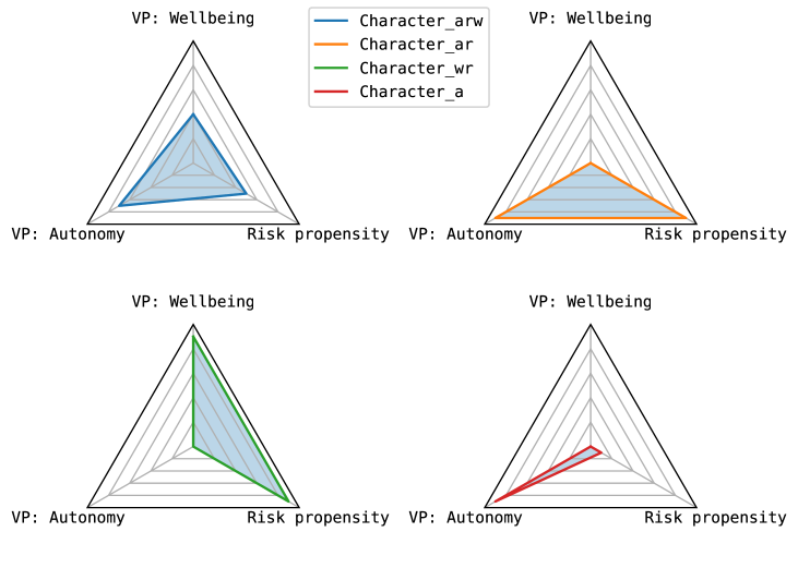
## Radar Charts: Character Profiles
### Overview
The image presents four radar charts, each representing a different character profile based on three variables: Wellbeing, Autonomy, and Risk Propensity. The charts are arranged in a 2x2 grid. Each chart displays a single character's profile, with the area enclosed by the profile line shaded in light blue.
### Components/Axes
* **Chart Type:** Radar Chart (also known as a spider chart or star chart)
* **Axes:** The charts have three axes radiating from the center, forming an equilateral triangle.
* Top vertex: "VP: Wellbeing"
* Bottom-left vertex: "VP: Autonomy"
* Bottom-right vertex: "Risk propensity"
* **Scale:** Each axis has 6 concentric gray lines, indicating increasing values from the center outwards. The outermost line represents the maximum value.
* **Legend:** Located at the top-center of the image.
* Blue line: "Character_arw"
* Orange line: "Character_ar"
* Green line: "Character_wr"
* Red line: "Character_a"
### Detailed Analysis
**Chart 1 (Top-Left): Character_arw (Blue)**
* **Trend:** The blue line indicates a relatively balanced profile, with high scores in all three categories.
* **Values:**
* Wellbeing: Approximately 0.75 of the maximum value.
* Autonomy: Approximately 0.65 of the maximum value.
* Risk Propensity: Approximately 0.65 of the maximum value.
**Chart 2 (Top-Right): Character_ar (Orange)**
* **Trend:** The orange line indicates a profile with moderate Wellbeing, and low Autonomy and Risk Propensity.
* **Values:**
* Wellbeing: Approximately 0.5 of the maximum value.
* Autonomy: Approximately 0.2 of the maximum value.
* Risk Propensity: Approximately 0.2 of the maximum value.
**Chart 3 (Bottom-Left): Character_wr (Green)**
* **Trend:** The green line indicates a profile with low Wellbeing and Autonomy, and moderate Risk Propensity.
* **Values:**
* Wellbeing: Approximately 0.2 of the maximum value.
* Autonomy: Approximately 0.2 of the maximum value.
* Risk Propensity: Approximately 0.5 of the maximum value.
**Chart 4 (Bottom-Right): Character_a (Red)**
* **Trend:** The red line indicates a profile with very low Wellbeing, Autonomy, and Risk Propensity.
* **Values:**
* Wellbeing: Approximately 0.1 of the maximum value.
* Autonomy: Approximately 0.1 of the maximum value.
* Risk Propensity: Approximately 0.1 of the maximum value.
### Key Observations
* Character_arw (blue) exhibits the highest scores across all three variables, indicating a well-rounded profile.
* Character_a (red) has the lowest scores across all three variables.
* Character_wr (green) has a higher Risk Propensity compared to Wellbeing and Autonomy.
* Character_ar (orange) has a higher Wellbeing compared to Autonomy and Risk Propensity.
### Interpretation
The radar charts provide a visual representation of the different character profiles based on Wellbeing, Autonomy, and Risk Propensity. The charts allow for easy comparison of the characters' strengths and weaknesses across these three dimensions. Character_arw appears to be the most balanced and potentially successful character, while Character_a may face challenges due to low scores in all areas. The other two characters, Character_ar and Character_wr, have distinct profiles with specific strengths and weaknesses. The data suggests that these characters have different priorities and approaches to life, as reflected in their varying scores on the three variables.
DECODING INTELLIGENCE...
EXPERT: gemma-3-27b-it-free VERSION 1
RUNTIME: google-free/gemma-3-27b-it
INTEL_VERIFIED
\n
## Radar Charts: Character Value Profiles
### Overview
The image presents four radar charts, each representing a character's profile based on three value propositions (VPs): Wellbeing, Autonomy, and Risk Propensity. Each chart displays the values for four different characters: Character_arw, Character_ar, Character_wr, and Character_a, represented by different colored lines. The charts are arranged in a 2x2 grid.
### Components/Axes
* **Axes:** Each radar chart has three axes, radiating from the center.
* VP: Wellbeing (Top vertex)
* VP: Autonomy (Left vertex)
* Risk Propensity (Right vertex)
* **Legend:** Located in the top-left corner of the image, the legend maps colors to characters:
* Blue: Character_arw
* Orange: Character_ar
* Green: Character_wr
* Red: Character_a
* **Charts:** Four individual radar charts, arranged in a 2x2 grid. Each chart has a gray background representing a baseline or average.
### Detailed Analysis or Content Details
**Chart 1 (Top-Left):**
* **Character_arw (Blue):** Starts at approximately 60% Wellbeing, decreases to approximately 30% Autonomy, and increases to approximately 70% Risk Propensity.
* **Character_ar (Orange):** Starts at approximately 40% Wellbeing, decreases to approximately 20% Autonomy, and increases to approximately 60% Risk Propensity.
* **Character_wr (Green):** Starts at approximately 50% Wellbeing, decreases to approximately 30% Autonomy, and increases to approximately 60% Risk Propensity.
* **Character_a (Red):** Starts at approximately 30% Wellbeing, decreases to approximately 10% Autonomy, and increases to approximately 40% Risk Propensity.
**Chart 2 (Top-Right):**
* **Character_arw (Blue):** Starts at approximately 60% Wellbeing, decreases to approximately 40% Autonomy, and increases to approximately 70% Risk Propensity.
* **Character_ar (Orange):** Starts at approximately 80% Wellbeing, decreases to approximately 60% Autonomy, and increases to approximately 80% Risk Propensity.
* **Character_wr (Green):** Starts at approximately 50% Wellbeing, decreases to approximately 40% Autonomy, and increases to approximately 60% Risk Propensity.
* **Character_a (Red):** Starts at approximately 30% Wellbeing, decreases to approximately 20% Autonomy, and increases to approximately 40% Risk Propensity.
**Chart 3 (Bottom-Left):**
* **Character_arw (Blue):** Starts at approximately 50% Wellbeing, decreases to approximately 30% Autonomy, and increases to approximately 50% Risk Propensity.
* **Character_ar (Orange):** Starts at approximately 40% Wellbeing, decreases to approximately 20% Autonomy, and increases to approximately 40% Risk Propensity.
* **Character_wr (Green):** Starts at approximately 70% Wellbeing, decreases to approximately 50% Autonomy, and increases to approximately 70% Risk Propensity.
* **Character_a (Red):** Starts at approximately 30% Wellbeing, decreases to approximately 10% Autonomy, and increases to approximately 30% Risk Propensity.
**Chart 4 (Bottom-Right):**
* **Character_arw (Blue):** Starts at approximately 40% Wellbeing, decreases to approximately 20% Autonomy, and increases to approximately 40% Risk Propensity.
* **Character_ar (Orange):** Starts at approximately 30% Wellbeing, decreases to approximately 10% Autonomy, and increases to approximately 30% Risk Propensity.
* **Character_wr (Green):** Starts at approximately 50% Wellbeing, decreases to approximately 30% Autonomy, and increases to approximately 50% Risk Propensity.
* **Character_a (Red):** Starts at approximately 70% Wellbeing, decreases to approximately 50% Autonomy, and increases to approximately 70% Risk Propensity.
### Key Observations
* The characters generally exhibit an inverse relationship between Wellbeing and Autonomy, with higher Wellbeing scores often corresponding to lower Autonomy scores, and vice versa.
* Risk Propensity varies significantly between characters.
* Character_ar consistently shows a higher Risk Propensity compared to Character_a.
* The gray background suggests a common baseline or average profile, against which individual character profiles are compared.
* There is significant variation in the profiles across the four charts, suggesting different contexts or scenarios.
### Interpretation
The radar charts provide a visual representation of character value profiles across three key dimensions. The differences in profiles suggest distinct personalities or behavioral tendencies. The inverse relationship between Wellbeing and Autonomy could indicate a trade-off between these values – characters prioritizing Wellbeing may be less inclined to seek autonomy, and vice versa. The varying levels of Risk Propensity suggest different levels of comfort with uncertainty and potential negative consequences.
The four charts likely represent different scenarios or conditions, as the profiles for each character change across them. This could be due to external factors influencing their values, or internal changes in their priorities. The gray background serves as a reference point, allowing for easy comparison of individual character profiles to a common baseline.
The data suggests a nuanced understanding of character development, where values are not fixed but rather dynamic and context-dependent. The charts could be used to analyze character arcs, predict behavior, or design interactions within a narrative or game.
DECODING INTELLIGENCE...
EXPERT: healer-alpha-free VERSION 1
RUNTIME: free/openrouter/healer-alpha
INTEL_VERIFIED
## Radar Charts of Character Profiles
### Overview
The image displays four triangular radar charts (also known as spider charts or star plots) arranged in a 2x2 grid. Each chart visualizes a different character profile across three common axes. A single legend is positioned at the top center of the entire image, above the charts.
### Components/Axes
* **Chart Type:** Triangular Radar Chart.
* **Axes (Identical for all four charts):**
* **Top Vertex:** "VP: Wellbeing"
* **Bottom-Left Vertex:** "VP: Autonomy"
* **Bottom-Right Vertex:** "Risk propensity"
* **Grid:** Each chart features concentric triangular grid lines radiating from the center, representing incremental scale levels from the center (low) to the outer edge (high).
* **Legend (Top Center):**
* A blue line corresponds to "Character_arw"
* An orange line corresponds to "Character_ar"
* A green line corresponds to "Character_wr"
* A red line corresponds to "Character_a"
* **Spatial Layout:**
* **Top-Left Chart:** Contains the blue line ("Character_arw").
* **Top-Right Chart:** Contains the orange line ("Character_ar").
* **Bottom-Left Chart:** Contains the green line ("Character_wr").
* **Bottom-Right Chart:** Contains the red line ("Character_a").
### Detailed Analysis
Each chart is analyzed independently. Values are approximate, estimated from the grid lines where the outermost triangle represents the maximum (100%) and the center represents the minimum (0%).
**1. Top-Left Chart: Character_arw (Blue Line)**
* **Visual Trend:** The blue line forms a relatively balanced, equilateral triangle, indicating moderate to high scores across all three axes.
* **Approximate Values:**
* VP: Wellbeing: ~75% (extends about three-quarters of the way to the outer vertex).
* VP: Autonomy: ~70%.
* Risk propensity: ~65%.
**2. Top-Right Chart: Character_ar (Orange Line)**
* **Visual Trend:** The orange line forms a triangle skewed heavily towards the "Risk propensity" axis, with lower scores on the other two.
* **Approximate Values:**
* VP: Wellbeing: ~40%.
* VP: Autonomy: ~35%.
* Risk propensity: ~85% (extends very close to the outer vertex).
**3. Bottom-Left Chart: Character_wr (Green Line)**
* **Visual Trend:** The green line forms a triangle skewed heavily towards the "VP: Wellbeing" axis, with a very low score on "Risk propensity".
* **Approximate Values:**
* VP: Wellbeing: ~90% (extends almost to the outer vertex).
* VP: Autonomy: ~60%.
* Risk propensity: ~10% (very close to the center).
**4. Bottom-Right Chart: Character_a (Red Line)**
* **Visual Trend:** The red line forms a very narrow, elongated triangle pointing strongly towards the "VP: Autonomy" axis, with minimal scores on the other two axes.
* **Approximate Values:**
* VP: Wellbeing: ~15%.
* VP: Autonomy: ~80%.
* Risk propensity: ~5% (extremely close to the center).
### Key Observations
* **Profile Specialization:** Each character profile shows a distinct specialization: `Character_arw` is balanced, `Character_ar` is risk-oriented, `Character_wr` is wellbeing-oriented, and `Character_a` is autonomy-oriented.
* **Inverse Relationships:** There appears to be an inverse relationship between "Risk propensity" and "VP: Wellbeing" when comparing the `Character_ar` (high risk, low wellbeing) and `Character_wr` (low risk, high wellbeing) profiles.
* **Extreme Specialization:** The `Character_a` profile is the most extreme, with a very high score in one dimension (Autonomy) and negligible scores in the other two.
* **Naming Convention:** The suffixes in the character names (`_arw`, `_ar`, `_wr`, `_a`) likely correspond to the axes they emphasize: **a**utonomy, **r**isk, **w**ellbeing.
### Interpretation
This set of charts likely represents a typology or classification system for characters, personas, or agents within a model (e.g., for game design, psychological profiling, or AI behavior modeling). The three axes—Wellbeing, Autonomy, and Risk Propensity—form a foundational "value profile" (VP) triangle.
The data suggests a design space where characters are defined by trade-offs between these three core values. A character cannot maximize all three simultaneously within this model. The profiles demonstrate clear archetypes:
* The **Generalist (`Character_arw`)** maintains moderate levels of all traits.
* The **Risk-Taker (`Character_ar`)** sacrifices wellbeing and autonomy for high risk propensity.
* The **Well-Being Seeker (`Character_wr`)** avoids risk to maximize wellbeing, with moderate autonomy.
* The **Autonomist (`Character_a`)** prioritizes independence above all else, with little regard for wellbeing or risk.
The visualization effectively communicates that these are distinct, non-overlapping profiles. The use of separate charts for each profile, rather than overlaying all lines on one chart, emphasizes their individuality and prevents visual clutter, making the specialized shape of each profile immediately apparent. The naming convention provides a direct mnemonic link between the character's label and its dominant traits.
DECODING INTELLIGENCE...
EXPERT: nemotron-free VERSION 1
RUNTIME: free/nvidia/nemotron-nano-12b-v2-vl:free
INTEL_VERIFIED
## Radar Charts: Character Traits vs. Three Variables
### Overview
The image contains four radar charts arranged in a 2x2 grid. Each chart visualizes relationships between three variables: **VP: Wellbeing**, **VP: Autonomy**, and **Risk propensity**. Four character variables are represented by distinct colored lines: **Character_arw** (blue), **Character_ar** (orange), **Character_wr** (green), and **Character_a** (red). The charts emphasize trade-offs between these variables, with axes scaled logarithmically (implied by concentric rings).
---
### Components/Axes
1. **Axes**:
- **VP: Wellbeing** (top axis)
- **VP: Autonomy** (left axis)
- **Risk propensity** (right axis)
- All axes share identical scaling (0–100% in 10% increments).
2. **Legend**:
- Located in the top-left corner of the grid.
- Colors:
- Blue: **Character_arw**
- Orange: **Character_ar**
- Green: **Character_wr**
- Red: **Character_a**
3. **Chart Structure**:
- Each chart has a triangular (radar) shape with six concentric rings (0–100%).
- Lines connect data points across the three axes, forming polygons.
---
### Detailed Analysis
#### Top-Left Chart
- **Character_arw** (blue): Dominates **VP: Wellbeing** (~80%), with moderate **Autonomy** (~60%) and low **Risk propensity** (~30%).
- **Character_ar** (orange): Balanced across all axes (~50–60%).
- **Character_wr** (green): Peaks at **Risk propensity** (~70%), with lower **Wellbeing** (~40%) and **Autonomy** (~50%).
- **Character_a** (red): Strongest in **Autonomy** (~70%), with moderate **Wellbeing** (~50%) and low **Risk propensity** (~20%).
#### Top-Right Chart
- **Character_ar** (orange): Highest in **Autonomy** (~80%), with moderate **Wellbeing** (~60%) and low **Risk propensity** (~30%).
- **Character_arw** (blue): Peaks at **Wellbeing** (~70%), with lower **Autonomy** (~50%) and **Risk propensity** (~40%).
- **Character_wr** (green): Moderate across all axes (~50–60%).
- **Character_a** (red): Strongest in **Risk propensity** (~60%), with lower **Wellbeing** (~40%) and **Autonomy** (~50%).
#### Bottom-Left Chart
- **Character_wr** (green): Dominates **Risk propensity** (~90%), with low **Wellbeing** (~30%) and **Autonomy** (~40%).
- **Character_arw** (blue): Moderate **Wellbeing** (~60%), with lower **Autonomy** (~50%) and **Risk propensity** (~40%).
- **Character_ar** (orange): Balanced (~50–60% across all axes).
- **Character_a** (red): Peaks at **Autonomy** (~70%), with moderate **Wellbeing** (~50%) and low **Risk propensity** (~30%).
#### Bottom-Right Chart
- **Character_a** (red): Highest in **Risk propensity** (~80%), with low **Wellbeing** (~30%) and **Autonomy** (~40%).
- **Character_wr** (green): Moderate **Risk propensity** (~60%), with lower **Wellbeing** (~40%) and **Autonomy** (~50%).
- **Character_arw** (blue): Peaks at **Wellbeing** (~70%), with lower **Autonomy** (~50%) and **Risk propensity** (~40%).
- **Character_ar** (orange): Balanced (~50–60% across all axes).
---
### Key Observations
1. **Character_arw** (blue) consistently prioritizes **Wellbeing** across all charts.
2. **Character_wr** (green) maximizes **Risk propensity** in the bottom-left chart but shows moderate values elsewhere.
3. **Character_a** (red) exhibits the highest **Autonomy** in the top-left and bottom-right charts.
4. **Character_ar** (orange) maintains the most balanced distribution across variables.
5. **Risk propensity** is inversely correlated with **Wellbeing** in most cases (e.g., Character_wr and Character_a).
---
### Interpretation
The charts suggest a trade-off framework where:
- **Wellbeing** and **Risk propensity** are often inversely related (e.g., high Wellbeing correlates with low Risk propensity).
- **Autonomy** acts as a mediator, with some characters (e.g., Character_a) prioritizing it at the expense of other variables.
- **Character_ar** (orange) represents a generalist profile, while others specialize in specific variables.
- The logarithmic scaling implies exponential differences in trait expression, though exact magnitudes are approximate.
These visualizations could model decision-making strategies, personality archetypes, or behavioral archetypes in a simulated environment. The absence of numerical labels necessitates reliance on relative positioning and legend alignment for interpretation.
DECODING INTELLIGENCE...