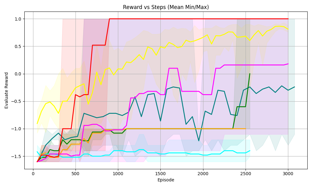
## Line Chart: Reward vs Steps (Mean Min/Max)
### Overview
The image is a line chart displaying the relationship between "Reward" and "Steps" (represented as "Episode"). The chart includes multiple data series, each representing a different scenario or algorithm, along with shaded regions indicating the min/max range for each series. The x-axis represents the "Episode" (steps), and the y-axis represents the "Evaluate Reward".
### Components/Axes
* **Title:** Reward vs Steps (Mean Min/Max)
* **X-axis:**
* Label: Episode
* Scale: 0 to 3000, with major ticks at 0, 500, 1000, 1500, 2000, 2500, and 3000.
* **Y-axis:**
* Label: Evaluate Reward
* Scale: -1.5 to 1.0, with major ticks at -1.5, -1.0, -0.5, 0.0, 0.5, and 1.0.
* **Data Series:** There are multiple data series represented by different colored lines, each with a shaded region around it. The colors are red, yellow, magenta, teal, dark green, orange, and light blue. There is no explicit legend.
### Detailed Analysis
**Red Line:**
* Trend: The red line starts at approximately -1.5 and quickly rises to 1.0 around episode 750, where it remains constant for the rest of the episodes.
* Data Points: Starts at approximately -1.5, rises to 0.5 around episode 500, and reaches 1.0 around episode 750.
**Yellow Line:**
* Trend: The yellow line starts at approximately -0.6 and gradually increases with fluctuations, reaching approximately 0.9 by episode 3000.
* Data Points: Starts at approximately -0.6, reaches -0.3 around episode 500, fluctuates between 0.3 and 0.7 between episodes 1000 and 2000, and reaches approximately 0.9 by episode 3000.
**Magenta Line:**
* Trend: The magenta line starts at approximately -1.5, increases to approximately -0.9 around episode 1000, and then gradually increases to approximately 0.2 by episode 3000.
* Data Points: Starts at approximately -1.5, reaches -1.0 around episode 500, -0.9 around episode 1000, and approximately 0.2 by episode 3000.
**Teal Line:**
* Trend: The teal line starts at approximately -1.2, decreases to approximately -1.5, and then fluctuates around -0.5, ending at approximately -0.2.
* Data Points: Starts at approximately -1.2, decreases to approximately -1.5 around episode 250, fluctuates around -0.5 between episodes 1000 and 2500, and ends at approximately -0.2.
**Dark Green Line:**
* Trend: The dark green line starts at approximately -1.3, fluctuates, and ends at approximately -0.2.
* Data Points: Starts at approximately -1.3, reaches -1.0 around episode 500, fluctuates between -0.8 and -0.3 between episodes 1000 and 2500, and ends at approximately -0.2.
**Orange Line:**
* Trend: The orange line starts at approximately -1.5, increases to approximately -1.1, and then remains relatively constant at approximately -1.0.
* Data Points: Starts at approximately -1.5, increases to approximately -1.1 around episode 500, and then remains relatively constant at approximately -1.0.
**Light Blue Line:**
* Trend: The light blue line starts at approximately -1.6 and remains relatively constant at approximately -1.5.
* Data Points: Starts at approximately -1.6 and remains relatively constant at approximately -1.5.
### Key Observations
* The red line shows the most rapid and significant increase in reward, reaching the maximum value of 1.0 and remaining there.
* The yellow line shows a gradual increase in reward with fluctuations.
* The magenta line shows a moderate increase in reward.
* The teal and dark green lines show fluctuations in reward.
* The orange and light blue lines show relatively constant and low reward values.
### Interpretation
The chart compares the performance of different algorithms or scenarios based on the "Evaluate Reward" achieved over a number of "Episodes". The red line represents the most successful algorithm, as it quickly reaches the maximum reward and maintains it. The other lines represent algorithms with varying degrees of success, with some showing gradual improvement and others remaining relatively constant. The shaded regions indicate the variability in the reward for each algorithm, providing insight into the consistency of their performance. The data suggests that the red line algorithm is the most effective, while the orange and light blue line algorithms are the least effective.