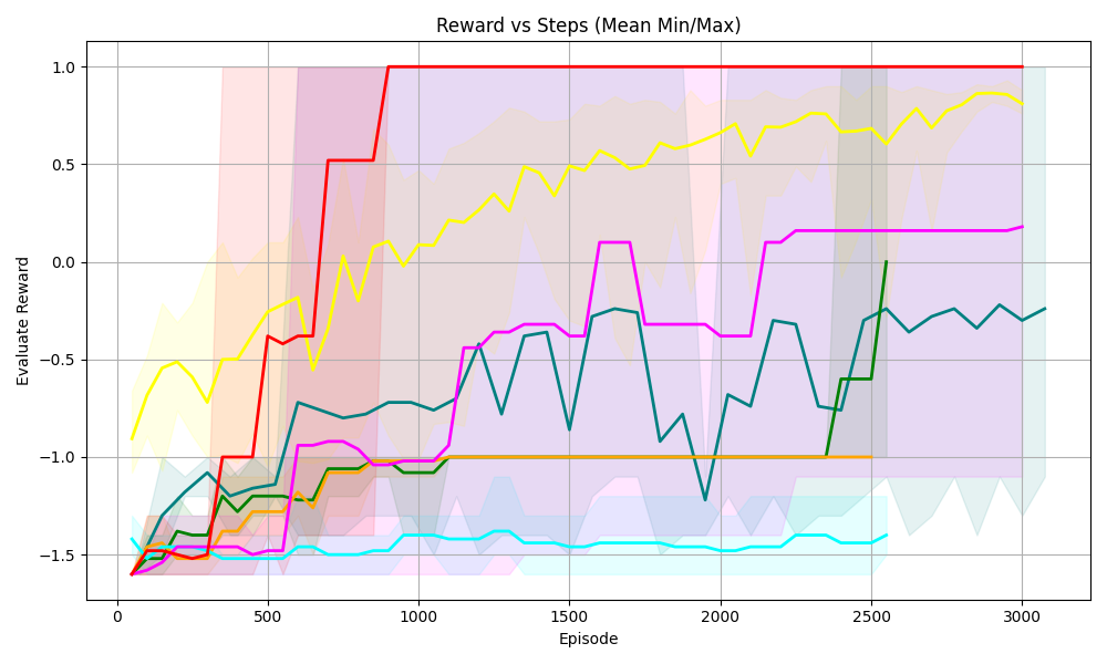
## Line Chart: Reward vs Steps (Mean Min/Max)
### Overview
The chart visualizes the relationship between "Episode" (x-axis) and "Evaluation Reward" (y-axis) across six distinct data series, represented by colored lines with shaded confidence intervals. The y-axis ranges from -1.5 to 1.0, while the x-axis spans 0 to 3000 episodes. Shaded regions around each line indicate variability (min/max bounds).
---
### Components/Axes
- **X-axis (Episode)**: Labeled "Episode," with ticks at 0, 500, 1000, 1500, 2000, 2500, and 3000.
- **Y-axis (Evaluation Reward)**: Labeled "Evaluation Reward," with ticks at -1.5, -1.0, -0.5, 0.0, 0.5, and 1.0.
- **Legend**: Positioned on the right, mapping colors to series:
- Red: "Series A"
- Yellow: "Series B"
- Pink: "Series C"
- Teal: "Series D"
- Green: "Series E"
- Blue: "Series F"
---
### Detailed Analysis
1. **Series A (Red)**:
- **Trend**: Sharp upward spike to 1.0 at ~500 episodes, then plateaus.
- **Shaded Area**: Narrowest variability (~±0.1), indicating high consistency.
2. **Series B (Yellow)**:
- **Trend**: Gradual ascent to ~0.8 by 3000 episodes, with minor fluctuations.
- **Shaded Area**: Moderate variability (~±0.2).
3. **Series C (Pink)**:
- **Trend**: Peaks at ~0.2 around 1500 episodes, then stabilizes.
- **Shaded Area**: Moderate variability (~±0.3).
4. **Series D (Teal)**:
- **Trend**: Oscillates between -0.2 and -0.6, with no clear upward trend.
- **Shaded Area**: Moderate variability (~±0.4).
5. **Series E (Green)**:
- **Trend**: Declines to ~-0.8 by 2500 episodes, then stabilizes.
- **Shaded Area**: Moderate variability (~±0.5).
6. **Series F (Blue)**:
- **Trend**: Consistently lowest, hovering near -1.2 with minor fluctuations.
- **Shaded Area**: Widest variability (~±0.6), indicating instability.
---
### Key Observations
- **Dominance of Series A**: Achieves maximum reward (1.0) early and maintains it, suggesting optimal performance.
- **Blue Line Anomaly**: Persistent low reward (-1.2) and high variability, indicating poor reliability.
- **Shaded Area Correlation**: Narrower bands (e.g., red) imply tighter confidence intervals, while wider bands (e.g., blue) suggest greater uncertainty.
---
### Interpretation
The data demonstrates a clear hierarchy in performance across episodes:
- **Series A** outperforms all others, achieving the highest reward with minimal variability.
- **Series F** underperforms consistently, with the widest variability, suggesting systemic issues.
- The shaded regions highlight the trade-off between reward magnitude and stability. For example, Series B’s moderate reward (~0.8) with moderate variability may indicate a balanced approach, whereas Series C’s lower reward (~0.2) with higher variability suggests inefficiency.
This chart likely evaluates reinforcement learning agents or optimization algorithms, where "Episode" represents training steps and "Evaluation Reward" quantifies performance. The red line’s early convergence to 1.0 implies rapid learning, while the blue line’s stagnation highlights potential flaws in its design or training process.