## Multi-figures, Scatter plot, Flowchart
### Overview
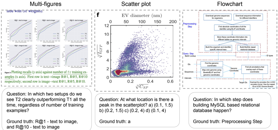
The image presents three distinct visual elements: a set of multi-figures (likely performance plots), a scatter plot, and a flowchart. Each element is accompanied by a question and its corresponding ground truth answer.
### Components/Axes
**Multi-figures:**
* **Title:** Multi-figures ("Tzeu with de weights").
* Six line plots arranged in a 2x3 grid.
* Each plot has the same axes:
* **x-axis:** Number of training examples.
* **y-axis:** Recalls.
* Each plot is titled as follows: R@1 - text to image, R@5 - text to image, R@10 - text to image, R@1 - image to text, R@5 - image to text, R@10 - image to text.
* Each plot contains three lines, labeled FS, T1, and T2.
**Scatter plot:**
* **Title:** Scatter plot
* **x-axis:** $\sqrt[3]{C_{SP}}$
* **y-axis:** $\sqrt[3]{I_{GFP}}$
* **Top x-axis:** EV diameter (nm) with markers at 0, 50, 100, 150, and 200.
* Data points are densely clustered, with a color gradient indicating density (red/yellow for high density, blue/purple for low density).
**Flowchart:**
* **Title:** Flowchart
* The flowchart depicts a multi-step process, starting with "Preprocessing Step" and "Query Step Batch Lookup".
* Key steps include downloading genome sequences, finding genomic coordinates, building a MySQL-based relational database, and finding overlapping annotations.
* The flow is generally top-to-bottom, with some lateral connections.
### Detailed Analysis
**Multi-figures:**
* **General Trend:** All lines in all plots show an upward trend, indicating that recall increases with the number of training examples.
* **Line Colors:**
* FS: Green
* T1: Blue
* T2: Purple
* **R@1 - text to image:** T2 is clearly outperforming T1.
* **R@10 - text to image:** T2 is clearly outperforming T1.
**Scatter plot:**
* **x-axis:** Ranges from 0 to 0.6.
* **y-axis:** Ranges from 0 to 12.
* **EV diameter (nm):** Ranges from 0 to 200.
* **Peak Density:** The highest density of points appears to be around (0.1, 1.5) on the main axes.
**Flowchart:**
* **Preprocessing Step:**
* Download genome sequences for organisms.
* Download sequence information for different identifiers.
* Find absolute coordinates of all the identifier using BLAT and Bowtie.
* Store these coordinate information into different tables as genomic intervals.
* Build the organism and identifier specific interval trees.
* Build MySQL based relational database.
* **Query Step Batch Lookup:**
* Find the genomic coordinates.
* Map onto genome using Bowtie/BLAT and find genomic coordinates.
* Find all annotations that overlap each of these coordinates.
* Download the annotation file in UCSC annotation format, View the mapped IDs at UCSC Genome Browser.
### Key Observations
* The multi-figures show the performance of different models (FS, T1, T2) in text-to-image and image-to-text tasks.
* The scatter plot visualizes the relationship between two variables, with a clear concentration of data points in the lower-left region.
* The flowchart outlines a complex bioinformatics workflow involving genome sequence processing and annotation.
### Interpretation
The multi-figures likely represent the performance of different machine learning models on retrieval tasks. The scatter plot could be visualizing some biological data, possibly related to cell characteristics. The flowchart describes a computational pipeline for genomic data analysis. The questions and ground truth answers serve as quick comprehension checks for the presented information. The fact that T2 outperforms T1 in R@1 and R@10 text-to-image tasks suggests that model T2 is better suited for these specific retrieval scenarios. The peak in the scatter plot indicates a common combination of the two measured variables. The flowchart highlights the steps involved in a typical genomic analysis workflow, emphasizing the importance of database construction and annotation.