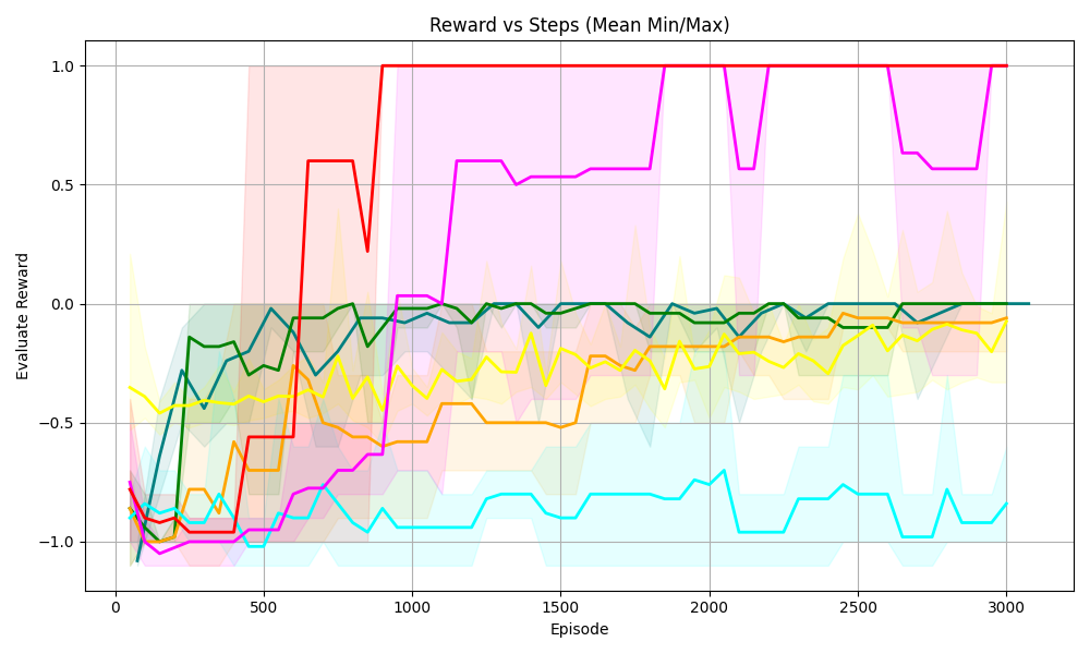
## Line Chart: Reward vs Steps (Mean Min/Max)
### Overview
The image is a line chart titled *“Reward vs Steps (Mean Min/Max)”* that plots **“Evaluate Reward”** (y-axis) against **“Episode”** (x-axis) for multiple data series (colored lines) with shaded regions (likely representing min/max ranges or confidence intervals). The x-axis spans 0–3000 episodes, and the y-axis spans -1.0 to 1.0 in evaluate reward.
### Components/Axes
- **Title**: *“Reward vs Steps (Mean Min/Max)”* (top-center).
- **X-axis**: Labeled *“Episode”*, with major ticks at 0, 500, 1000, 1500, 2000, 2500, 3000.
- **Y-axis**: Labeled *“Evaluate Reward”*, with major ticks at -1.0, -0.5, 0.0, 0.5, 1.0.
- **Data Series (Lines)**: Six distinct colored lines (red, magenta, green, yellow, orange, cyan) with corresponding shaded regions (e.g., red shaded area, magenta shaded area). The legend is not explicitly visible, but line colors and their shaded regions are distinguishable.
### Detailed Analysis
#### 1. Red Line
- **Trend**: Starts near -1.0 at episode 0, rises sharply around episodes 500–1000, reaches 1.0 by ~1000 episodes, and stabilizes at 1.0 for subsequent episodes.
- **Shaded Region**: Wide (spanning ~-1.0 to 1.0 initially), narrowing as the line stabilizes at 1.0.
#### 2. Magenta Line
- **Trend**: Starts near -1.0, rises gradually with fluctuations (e.g., dips around 2000–2500 episodes), reaches 1.0 by ~2500 episodes, and stabilizes.
- **Shaded Region**: Wide (similar to red) but with more fluctuations in the shaded area.
#### 3. Green Line
- **Trend**: Relatively stable, fluctuating around 0.0 (range: ~-0.5 to 0.5) across all episodes.
- **Shaded Region**: Narrow, centered around 0.0.
#### 4. Yellow Line
- **Trend**: Fluctuates around -0.5 to 0.0, with minor variations.
- **Shaded Region**: Narrow, centered around -0.5 to 0.0.
#### 5. Orange Line
- **Trend**: Similar to yellow but slightly lower, fluctuating around -0.5 to 0.0 (more negative than yellow).
- **Shaded Region**: Narrow, overlapping with yellow’s region.
#### 6. Cyan Line
- **Trend**: Lowest among all, fluctuating around -1.0 to -0.5, with minor dips/rises but remaining the most negative.
- **Shaded Region**: Narrow, centered around -1.0 to -0.5.
### Key Observations
- **Red/Magenta Lines**: Both reach the maximum reward (1.0) but at different episodes (red earlier, magenta later). Their wide shaded regions indicate higher variability in rewards.
- **Green/Yellow/Orange Lines**: Cluster around 0.0 to -0.5, with green being the most stable near 0.0.
- **Cyan Line**: Consistently the lowest, with the least improvement over episodes.
- **Shaded Regions**: Width correlates with variability—wider for red/magenta (more variable) and narrower for green/yellow/orange/cyan (less variable).
### Interpretation
This chart likely compares the performance of different reinforcement learning agents (or algorithms) over episodes, where *“Evaluate Reward”* measures success.
- **High-Performing Agents (Red/Magenta)**: Achieve the highest reward (1.0) but with more variability (wider shaded regions), suggesting they may be more exploratory or have higher policy variance.
- **Stable Agent (Green)**: Maintains consistent performance around 0.0, indicating moderate but reliable success.
- **Low-Performing Agents (Yellow/Orange/Cyan)**: Have lower rewards, with cyan being the least successful. Their narrow shaded regions suggest more consistent (but less successful) behavior.
The trade-off between performance (reward) and stability (shaded region width) implies that higher-performing agents may sacrifice consistency for exploration, while lower-performing agents prioritize stability over success. This could inform decisions about agent design (e.g., balancing exploration/exploitation in reinforcement learning).
(Note: No non-English text is present in the image.)