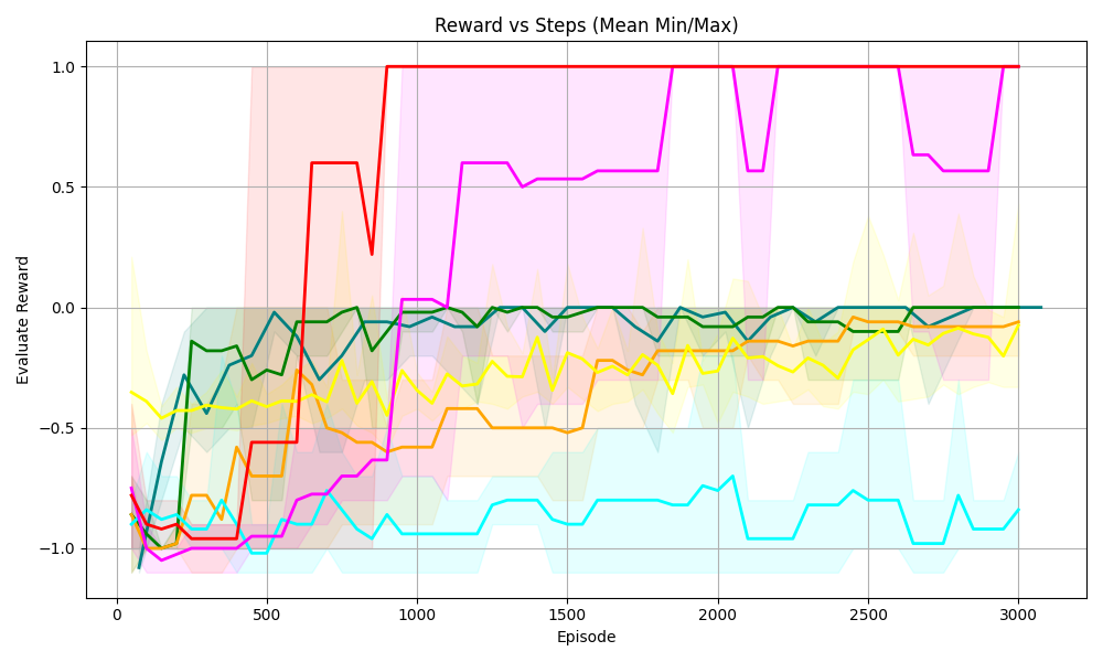
## Line Chart: Reward vs Steps (Mean Min/Max)
### Overview
The image is a line chart displaying the "Evaluate Reward" on the y-axis versus "Episode" (steps) on the x-axis. There are multiple lines, each representing a different data series, along with shaded regions indicating the min/max range for each series. The chart visualizes how the reward changes over the course of episodes for different scenarios or algorithms.
### Components/Axes
* **Title:** Reward vs Steps (Mean Min/Max)
* **X-axis:**
* Label: Episode
* Scale: 0 to 3000, with markers at 0, 500, 1000, 1500, 2000, 2500, and 3000.
* **Y-axis:**
* Label: Evaluate Reward
* Scale: -1.0 to 1.0, with markers at -1.0, -0.5, 0.0, 0.5, and 1.0.
* **Data Series:** There are six distinct data series, each represented by a different color line and a corresponding shaded region indicating the min/max range. The colors are red, magenta, green, teal, yellow, and orange.
### Detailed Analysis
* **Red Line:**
* Trend: Starts around -1.0, rapidly increases to approximately 0.6 by episode 500, then reaches 1.0 around episode 800, and remains at 1.0 for the rest of the episodes.
* Values:
* Episode 0: -1.0
* Episode 500: 0.6
* Episode 800: 1.0
* Episode 3000: 1.0
* **Magenta Line:**
* Trend: Starts around -1.0, increases to approximately -0.7 by episode 500, then gradually increases to around 0.5 by episode 1000, and fluctuates between 0.5 and 1.0 for the rest of the episodes.
* Values:
* Episode 0: -1.0
* Episode 500: -0.7
* Episode 1000: 0.5
* Episode 3000: 0.9
* **Green Line:**
* Trend: Starts around -0.8, increases to approximately 0.0 by episode 500, and then remains relatively stable around 0.0 for the rest of the episodes.
* Values:
* Episode 0: -0.8
* Episode 500: 0.0
* Episode 3000: 0.0
* **Teal Line:**
* Trend: Starts around -0.9, decreases to approximately -1.0 by episode 200, then fluctuates between -1.0 and -0.7 for the rest of the episodes.
* Values:
* Episode 0: -0.9
* Episode 200: -1.0
* Episode 3000: -0.8
* **Yellow Line:**
* Trend: Starts around -0.3, decreases to approximately -0.6 by episode 200, then gradually increases to around -0.1 by episode 3000.
* Values:
* Episode 0: -0.3
* Episode 200: -0.6
* Episode 3000: -0.1
* **Orange Line:**
* Trend: Starts around -0.9, increases to approximately -0.5 by episode 500, then gradually increases to around 0.0 by episode 3000.
* Values:
* Episode 0: -0.9
* Episode 500: -0.5
* Episode 3000: 0.0
### Key Observations
* The red line shows the most rapid and significant increase in reward, reaching the maximum value of 1.0 relatively quickly and maintaining it.
* The magenta line also shows a significant increase in reward, but it fluctuates more than the red line.
* The green line shows a moderate increase in reward and then stabilizes.
* The teal line shows the least improvement in reward, fluctuating around a negative value.
* The yellow and orange lines show gradual increases in reward over time.
* The shaded regions indicate the variability in reward for each series, with some series showing more variability than others.
### Interpretation
The chart compares the performance of different strategies or algorithms (represented by the different colored lines) in terms of reward earned over a series of episodes. The red line represents the most successful strategy, as it quickly achieves and maintains the maximum reward. The magenta line also performs well, but with more variability. The green line shows a moderate level of success, while the teal line struggles to achieve a positive reward. The yellow and orange lines show gradual improvements, suggesting a learning process. The shaded regions provide insight into the consistency of each strategy, with wider regions indicating more variability in performance. Overall, the chart demonstrates the relative effectiveness of different approaches to a reinforcement learning problem, highlighting the importance of selecting a strategy that can consistently achieve high rewards.