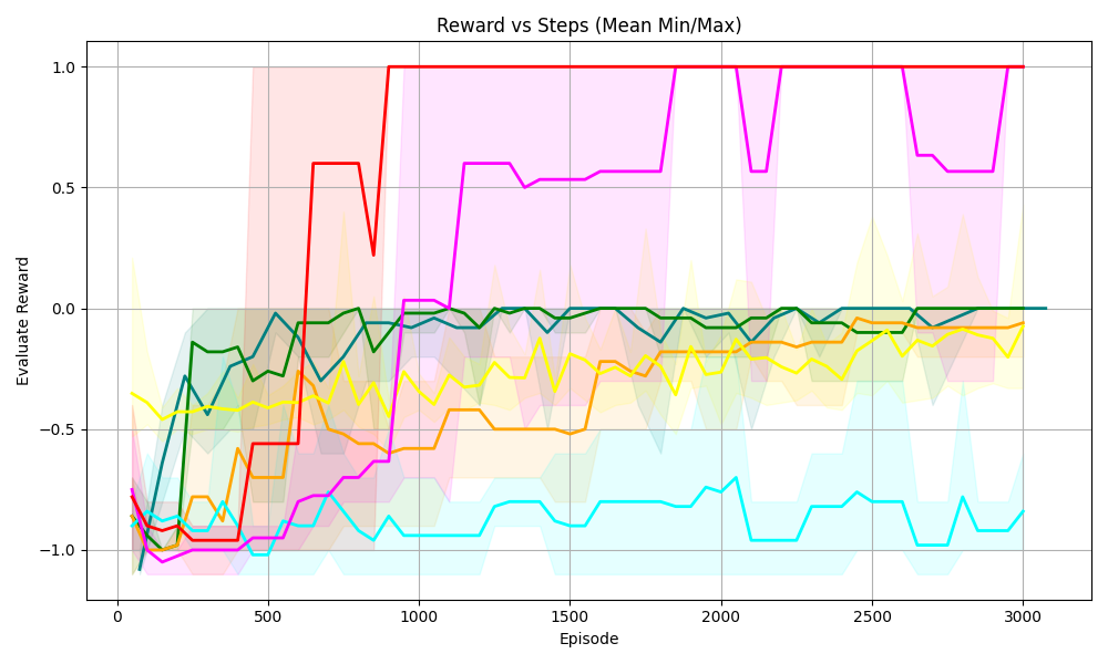
## Line Chart: Reward vs Steps (Mean Min/Max)
### Overview
The chart visualizes the evaluation reward performance of multiple algorithms across 3,000 episodes. Each line represents a distinct algorithm, with shaded regions indicating variability (likely confidence intervals or min/max bounds). The y-axis ranges from -1.0 to 1.0, while the x-axis spans 0 to 3,000 episodes.
### Components/Axes
- **Title**: "Reward vs Steps (Mean Min/Max)"
- **X-axis**: "Episode" (0 to 3,000, increments of 500)
- **Y-axis**: "Evaluation Reward" (-1.0 to 1.0, increments of 0.5)
- **Legend**: Located at the top-right, with six colors:
- Red
- Magenta
- Green
- Yellow
- Blue
- Cyan
### Detailed Analysis
1. **Red Line**:
- Starts at ~0.8 (Episode 0), drops sharply to ~-0.2 (Episode 500), then stabilizes at 1.0 (Episode 1,000 onward).
- Shaded region is narrow initially, widening slightly after Episode 500.
2. **Magenta Line**:
- Begins at ~-0.8 (Episode 0), rises sharply to ~0.6 (Episode 1,000), then fluctuates between 0.5 and 0.8.
- Shaded region expands significantly after Episode 1,000, indicating higher variability.
3. **Green Line**:
- Starts at ~-1.0 (Episode 0), rises to ~0.0 (Episode 500), then stabilizes at ~0.2 (Episode 1,000 onward).
- Shaded region remains narrow throughout.
4. **Yellow Line**:
- Begins at ~-0.6 (Episode 0), rises to ~-0.1 (Episode 1,000), then stabilizes near 0.0.
- Shaded region is moderately wide, suggesting consistent variability.
5. **Blue Line**:
- Starts at ~-0.8 (Episode 0), rises to ~-0.2 (Episode 1,000), then stabilizes near 0.0.
- Shaded region is narrow, indicating low variability.
6. **Cyan Line**:
- Begins at ~-1.0 (Episode 0), rises to ~-0.5 (Episode 1,000), then fluctuates between -0.5 and -0.2.
- Shaded region widens after Episode 1,000, reflecting increased variability.
### Key Observations
- **Red and Magenta Lines**: Exhibit high initial variability but achieve the highest rewards (1.0 and ~0.6, respectively) by Episode 1,000.
- **Green and Yellow Lines**: Show steady improvement with moderate rewards (~0.2 and ~0.0).
- **Blue and Cyan Lines**: Perform poorly initially but stabilize at lower rewards (~0.0 and ~-0.2).
- **Shaded Regions**: Wider regions (e.g., magenta post-1,000 episodes) suggest higher uncertainty or variability in those algorithms.
### Interpretation
The chart demonstrates divergent algorithm performance:
- **Red and Magenta**: Likely represent high-risk, high-reward strategies with significant early instability but eventual dominance.
- **Green and Yellow**: Indicate stable, incremental learning with moderate payoff.
- **Blue and Cyan**: Suggest suboptimal or inefficient strategies with limited reward potential.
- The shaded areas highlight the importance of considering variability when evaluating performance, as some algorithms (e.g., magenta) achieve high rewards but with greater risk.
The data implies that algorithm selection depends on the trade-off between reward magnitude and stability. Red and magenta may be suitable for environments prioritizing maximum reward, while green and yellow offer reliability.