\n
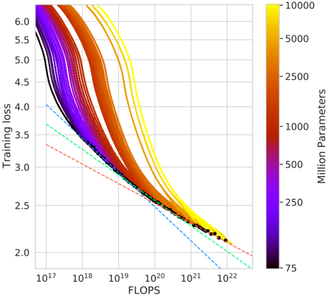
## Chart: Training Loss vs. FLOPS with Parameter Count Color Coding
### Overview
The image presents a chart illustrating the relationship between Training Loss and FLOPS (Floating Point Operations) for a series of machine learning model training runs. The color of each line represents the number of parameters in the model, indicated by a colorbar on the right side of the chart. Several lines are overlaid, showing the training loss decreasing as FLOPS increase. A few lines are highlighted with dashed lines.
### Components/Axes
* **X-axis:** FLOPS, labeled with a logarithmic scale ranging from 10<sup>17</sup> to 10<sup>22</sup>.
* **Y-axis:** Training Loss, labeled with a linear scale ranging from 2.0 to 6.0.
* **Colorbar:** Represents the number of parameters in millions, ranging from 75 to 10000. The color gradient transitions from dark purple (75 million parameters) to bright yellow (10000 million parameters).
* **Lines:** Multiple colored lines representing individual training runs. The color of each line corresponds to the number of parameters in the model.
* **Dashed Lines:** Three dashed lines are overlaid on the chart, each with a distinct color and pattern.
### Detailed Analysis
The chart displays numerous curves, each representing a training run. The lines generally exhibit a downward trend, indicating that training loss decreases as FLOPS increase. The steepness of the decline varies between lines.
* **Lines with Parameter Count:**
* Lines colored dark purple (approximately 75 million parameters) start at a training loss of around 5.5 and decrease relatively slowly.
* Lines colored blue (approximately 250 million parameters) start at a training loss of around 5.0 and decrease at a moderate rate.
* Lines colored green (approximately 500 million parameters) start at a training loss of around 4.5 and decrease at a moderate rate.
* Lines colored orange/red (approximately 2500-5000 million parameters) start at a training loss of around 4.0 and decrease rapidly.
* Lines colored yellow (approximately 10000 million parameters) start at a training loss of around 5.5 and decrease rapidly.
* **Dashed Lines:**
* **Blue Dashed Line:** Starts at approximately FLOPS = 10<sup>17</sup> and Training Loss = 3.8, and decreases linearly to approximately FLOPS = 10<sup>22</sup> and Training Loss = 2.1.
* **Green Dashed Line:** Starts at approximately FLOPS = 10<sup>17</sup> and Training Loss = 3.6, and decreases linearly to approximately FLOPS = 10<sup>22</sup> and Training Loss = 2.0.
* **Red Dashed Line:** Starts at approximately FLOPS = 10<sup>17</sup> and Training Loss = 3.4, and decreases linearly to approximately FLOPS = 10<sup>22</sup> and Training Loss = 1.9.
* **Black Dots:** A series of black dots are plotted along the lower portion of the curves, concentrated between approximately FLOPS = 10<sup>20</sup> and FLOPS = 10<sup>22</sup>, with Training Loss values between 2.0 and 2.5.
### Key Observations
* **Parameter Count and Loss:** Generally, models with more parameters (yellow lines) achieve lower training loss for a given FLOPS value, but also start with a higher initial loss.
* **Scaling:** The logarithmic scale on the x-axis (FLOPS) is crucial for visualizing the data, as the range of FLOPS values is very large.
* **Linear Approximation:** The dashed lines provide a linear approximation of the training loss reduction, potentially representing a theoretical or expected performance.
* **Convergence:** The black dots suggest a region of convergence where further increases in FLOPS yield diminishing returns in terms of training loss reduction.
### Interpretation
The chart demonstrates the trade-off between model size (number of parameters), computational cost (FLOPS), and training loss. Larger models (more parameters) generally require more FLOPS to achieve a given level of training loss, but can potentially reach lower loss values overall. The dashed lines suggest a baseline performance expectation, and the deviation of the individual training runs from these lines could indicate variations in training data, optimization algorithms, or model architecture. The black dots highlight a point of diminishing returns, where increasing FLOPS beyond a certain point does not significantly reduce training loss. This information is valuable for understanding the scaling behavior of machine learning models and optimizing training strategies. The chart suggests that there is a sweet spot in terms of model size and computational resources to achieve optimal performance.