\n
## Chart: Density Plot
### Overview
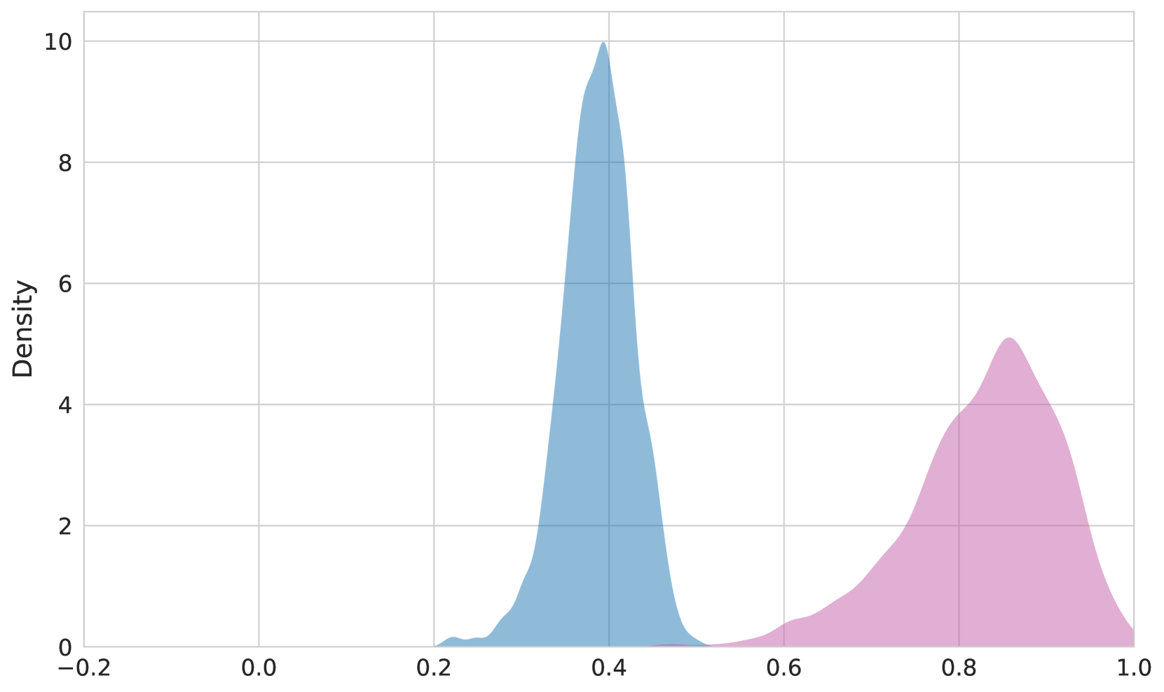
The image presents a density plot displaying the distribution of two datasets. The x-axis ranges from -0.2 to 1.0, and the y-axis represents density, ranging from 0 to 10. The plot shows two distinct distributions, one centered around 0.35 and the other around 0.85.
### Components/Axes
* **X-axis Title:** Not explicitly labeled, but represents a value ranging from -0.2 to 1.0.
* **Y-axis Title:** Density, ranging from 0 to 10.
* **Data Series 1:** Filled with a light blue color.
* **Data Series 2:** Filled with a light pink color.
* **Grid:** A light gray grid is present in the background, aiding in value estimation.
### Detailed Analysis
The first distribution (light blue) is unimodal, peaking at approximately 0.35 with a density of around 9.5. It starts to appear around 0.2, rises sharply to its peak, and then gradually declines towards 0.6.
The second distribution (light pink) is also unimodal, peaking at approximately 0.85 with a density of around 4.5. It begins to appear around 0.7, rises to its peak, and then declines towards 1.0.
Here's an approximate reconstruction of data points (estimated from the visual representation):
**Data Series 1 (Light Blue):**
* x = 0.2, Density ≈ 0.2
* x = 0.3, Density ≈ 2
* x = 0.35, Density ≈ 9.5
* x = 0.4, Density ≈ 8
* x = 0.5, Density ≈ 3
* x = 0.6, Density ≈ 0.5
**Data Series 2 (Light Pink):**
* x = 0.7, Density ≈ 0.5
* x = 0.75, Density ≈ 2
* x = 0.85, Density ≈ 4.5
* x = 0.9, Density ≈ 3
* x = 1.0, Density ≈ 0.2
### Key Observations
* The two distributions are clearly separated, suggesting they represent different underlying populations or variables.
* The first distribution (light blue) has a higher peak density and is more concentrated than the second distribution (light pink).
* There is no overlap between the two distributions.
### Interpretation
The chart demonstrates the presence of two distinct distributions. This could represent two different groups within a dataset, or the distribution of two different variables. The separation of the distributions suggests that these groups or variables are relatively independent. The higher peak density of the blue distribution indicates that values around 0.35 are more common than values around 0.85. Without further context, it's difficult to determine the specific meaning of these distributions, but the chart clearly illustrates a bimodal pattern. The data suggests a potential clustering or segmentation within the data. The lack of overlap could indicate a clear boundary or threshold between the two groups.