## Density Plot: Bimodal Distribution
### Overview
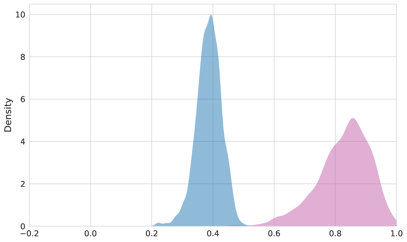
The image is a density plot showing a bimodal distribution. It displays two distinct peaks, one around x=0.4 and another around x=0.85, indicating two clusters of data points with different densities. The y-axis represents the density, while the x-axis represents the variable being measured.
### Components/Axes
* **X-axis:** Ranges from -0.2 to 1.0, with markers at -0.2, 0.0, 0.2, 0.4, 0.6, 0.8, and 1.0.
* **Y-axis:** Labeled "Density," ranges from 0 to 10, with markers at 0, 2, 4, 6, 8, and 10.
* **Data Series 1:** A blue-filled curve with a peak around x=0.4 and a density of approximately 10.
* **Data Series 2:** A pink-filled curve with a peak around x=0.85 and a density of approximately 5.
### Detailed Analysis
* **Blue Curve:** The blue curve starts near 0 at x=-0.2, rises sharply to a peak density of approximately 10 around x=0.4, and then decreases back to near 0 around x=0.6.
* **Pink Curve:** The pink curve starts near 0 at x=0.6, rises to a peak density of approximately 5 around x=0.85, and then decreases back to near 0 around x=1.0.
### Key Observations
* The blue curve has a higher peak density (approximately 10) compared to the pink curve (approximately 5).
* The blue curve is centered around x=0.4, while the pink curve is centered around x=0.85.
* There is a clear separation between the two curves, indicating two distinct clusters of data.
### Interpretation
The density plot suggests that the data being analyzed has two distinct modes or clusters. The blue curve represents a cluster with a higher density and a value centered around 0.4, while the pink curve represents a cluster with a lower density and a value centered around 0.85. This could indicate the presence of two different groups or categories within the dataset, each with its own characteristic value. The separation between the peaks suggests that these two groups are relatively distinct.