## Density Plot: Comparison of Two Distributions
### Overview
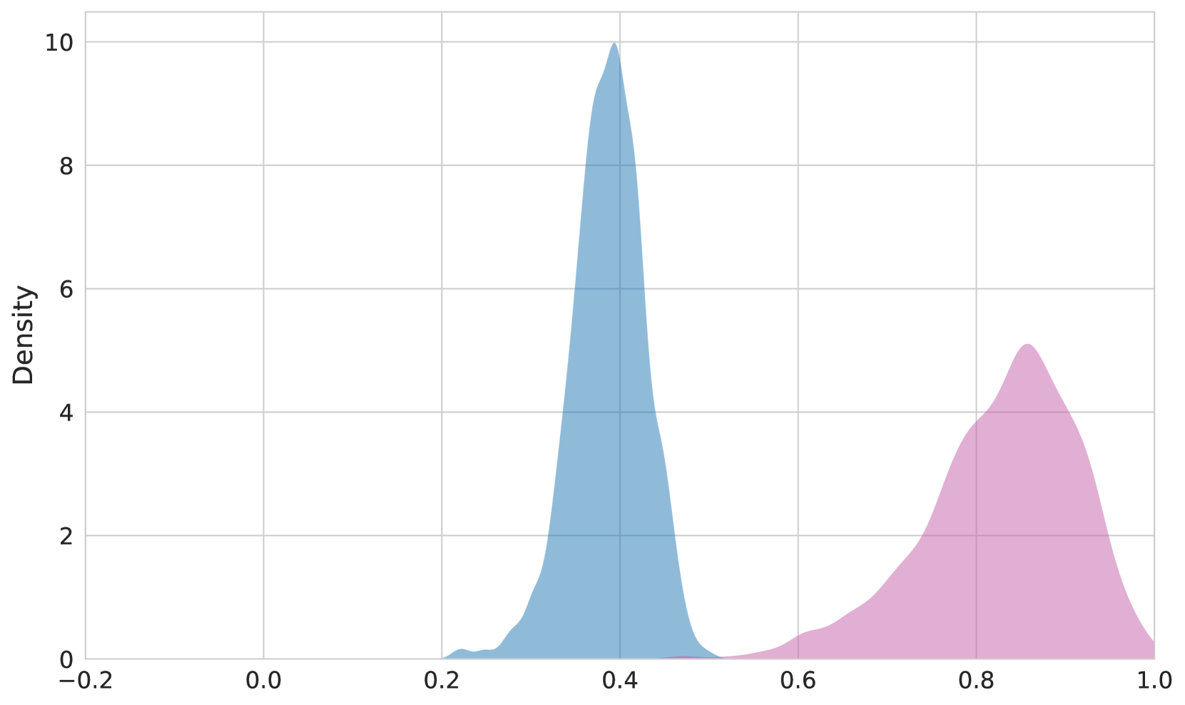
The image displays a density plot comparing two distributions, represented by blue and pink curves. The x-axis is labeled "Density" with values ranging from 0.2 to 1.0, while the y-axis is also labeled "Density" with values from 0 to 10. The blue curve (Group A) peaks sharply at approximately 0.4 on the x-axis, reaching a density of 10. The pink curve (Group B) has a broader, lower peak at approximately 0.8 on the x-axis, reaching a density of 5.
### Components/Axes
- **X-axis**: Labeled "Density" with values from 0.2 to 1.0.
- **Y-axis**: Labeled "Density" with values from 0 to 10.
- **Legend**: Located in the top-right corner, with:
- **Blue**: "Group A"
- **Pink**: "Group B"
- **Curves**:
- **Blue Curve (Group A)**: Centered at x ≈ 0.4, with a peak density of 10.
- **Pink Curve (Group B)**: Centered at x ≈ 0.8, with a peak density of 5.
### Detailed Analysis
- **Blue Curve (Group A)**:
- **Peak**: At x ≈ 0.4, with a density of 10.
- **Shape**: Narrow and tall, indicating a concentrated distribution around 0.4.
- **Spread**: The curve tapers off sharply on both sides of the peak.
- **Pink Curve (Group B)**:
- **Peak**: At x ≈ 0.8, with a density of 5.
- **Shape**: Broader and shorter, suggesting a more dispersed distribution around 0.8.
- **Spread**: The curve extends further along the x-axis compared to Group A.
### Key Observations
1. **Peak Differences**: Group A has a significantly higher peak density (10 vs. 5) at a lower x-value (0.4 vs. 0.8).
2. **Distribution Spread**: Group B’s distribution is wider, indicating greater variability or a more uniform spread.
3. **Axis Labels**: Both axes are labeled "Density," which may imply a mislabeling or unconventional scaling.
### Interpretation
The data suggests that Group A exhibits a highly concentrated distribution around 0.4, while Group B has a more spread-out distribution centered at 0.8. The higher peak of Group A implies a stronger concentration of values near 0.4, whereas Group B’s lower peak and broader spread suggest a more variable or less defined distribution. The identical axis labels ("Density") for both x and y axes may indicate a need for clarification, as this is atypical for standard density plots. The legend confirms the color coding, and the spatial placement of elements (e.g., legend in the top-right) aligns with standard chart conventions.