## Scatter Plot with Trend Lines: Mean Log-Likelihood vs. Text Length by Source
### Overview
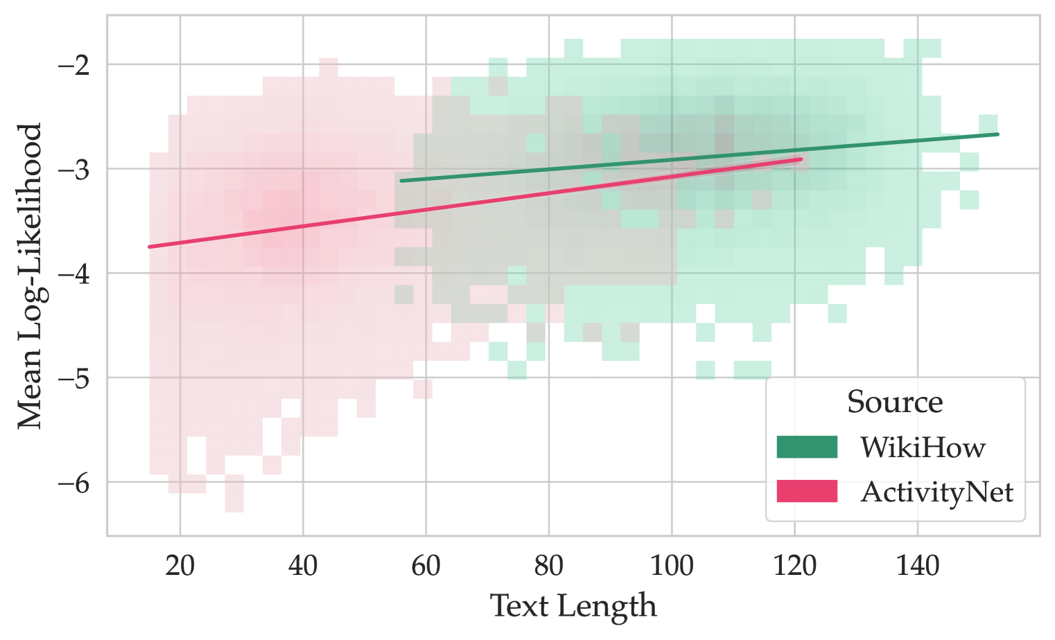
The image is a 2D scatter plot overlaid with two linear trend lines. It visualizes the relationship between the length of a text (x-axis) and the mean log-likelihood (y-axis) assigned to it by a model, with data points grouped by their source: WikiHow or ActivityNet. The plot uses semi-transparent, binned squares to represent the density of data points.
### Components/Axes
* **X-Axis:** Labeled "Text Length". The scale runs from approximately 15 to 150, with major tick marks at 20, 40, 60, 80, 100, 120, and 140.
* **Y-Axis:** Labeled "Mean Log-Likelihood". The scale runs from -6.5 to -1.5, with major tick marks at -6, -5, -4, -3, and -2. Values are negative, with higher (less negative) values indicating higher likelihood.
* **Legend:** Located in the bottom-right corner of the plot area. It is titled "Source" and contains two entries:
* A green square labeled "WikiHow".
* A pink/red square labeled "ActivityNet".
* **Data Representation:** Data points are shown as semi-transparent, binned squares (a 2D histogram or density plot). The color intensity indicates the density of points in that bin. Overlap between the two sources creates a grayish-brown color.
### Detailed Analysis
**1. Data Series - ActivityNet (Pink/Red):**
* **Spatial Distribution:** The pink squares are concentrated in the lower-left to middle region of the plot. They span a text length range from approximately 15 to 120.
* **Trend Line:** A solid pink/red line represents the linear trend for ActivityNet.
* **Trend Verification:** The line slopes upward from left to right, indicating that mean log-likelihood increases with text length for this source.
* **Approximate Points:** The line starts near (Text Length: 15, Mean Log-Likelihood: -3.75) and ends near (Text Length: 120, Mean Log-Likelihood: -2.9).
* **Data Density:** The highest density of ActivityNet points appears between text lengths of 20-60 and mean log-likelihoods of -5 to -3.
**2. Data Series - WikiHow (Green):**
* **Spatial Distribution:** The green squares are concentrated in the middle to upper-right region. They span a text length range from approximately 55 to 150.
* **Trend Line:** A solid green line represents the linear trend for WikiHow.
* **Trend Verification:** The line slopes upward from left to right, but with a shallower slope than the ActivityNet line.
* **Approximate Points:** The line starts near (Text Length: 55, Mean Log-Likelihood: -3.1) and ends near (Text Length: 150, Mean Log-Likelihood: -2.7).
* **Data Density:** The highest density of WikiHow points appears between text lengths of 80-130 and mean log-likelihoods of -3.5 to -2.0.
**3. Overlap Region:**
* There is a significant overlapping region between text lengths of approximately 60 and 110, where both pink (ActivityNet) and green (WikiHow) squares are present, creating a mixed, desaturated color.
### Key Observations
1. **Source Separation:** The two sources occupy largely distinct regions of the plot. ActivityNet dominates shorter texts (length < ~60), while WikiHow dominates longer texts (length > ~100). There is a transitional overlap zone in the middle.
2. **Overall Positive Correlation:** Both trend lines show a positive correlation between text length and mean log-likelihood. Longer texts tend to receive higher (less negative) likelihood scores from the model for both sources.
3. **Difference in Level and Slope:** The WikiHow trend line is consistently above the ActivityNet trend line across the overlapping range of text lengths. This indicates that, for texts of similar length, the model assigns a higher mean log-likelihood to WikiHow texts than to ActivityNet texts. The slope of the WikiHow line is also shallower.
4. **Variance:** The spread of data points (vertical dispersion) around each trend line appears substantial for both sources, indicating high variance in the mean log-likelihood for any given text length.
### Interpretation
This chart suggests a systematic difference in how a language model perceives or scores text from two different sources, WikiHow and ActivityNet, which is mediated by text length.
* **Source-Specific Patterns:** The model appears to have learned distinct statistical profiles for these sources. WikiHow texts, which are typically instructional and procedural, consistently receive higher likelihood scores than ActivityNet texts (which describe video activities) when compared at the same length. This could reflect differences in vocabulary, syntax, or narrative structure that the model finds more "predictable" or "typical" in WikiHow's style.
* **Length as a Confounding Variable:** The strong separation along the x-axis reveals that text length is a major confounding factor. ActivityNet samples are predominantly short, while WikiHow samples are predominantly long. Simply comparing average likelihoods between sources without controlling for length would be misleading, as the inherent length difference would dominate the comparison.
* **Model Behavior:** The positive slope for both lines indicates the model's log-likelihood scores are not length-normalized in this visualization; longer sequences naturally accumulate higher (less negative) total log-likelihoods. The difference in slopes suggests the rate at which likelihood increases with length differs between the two text genres.
* **Investigative Insight:** A researcher viewing this would conclude that any analysis comparing model performance on these datasets must account for text length as a primary covariate. The plot argues against treating these sources as directly comparable without normalization. The overlapping region is particularly interesting for deeper analysis, as it represents texts where the sources are most similar in length, allowing for a cleaner comparison of the source effect itself.