## Scatter Plot: Mean Log-Likelihood vs. Text Length by Source
### Overview
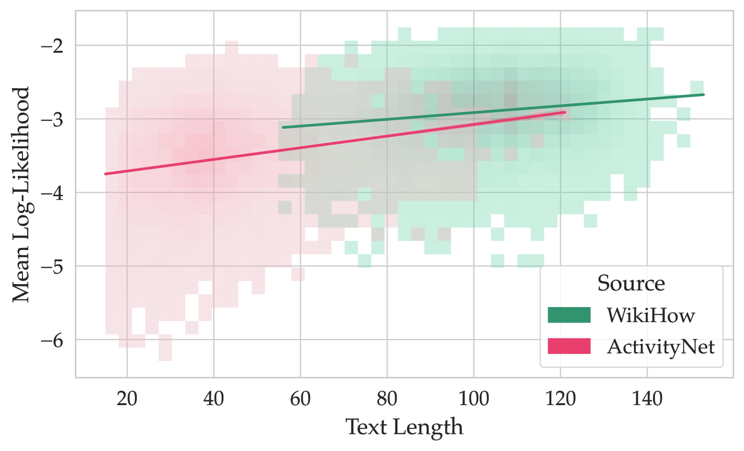
The image is a scatter plot showing the relationship between the mean log-likelihood and text length for two different sources: WikiHow and ActivityNet. The plot displays data points as a density map, with overlaid trend lines for each source.
### Components/Axes
* **X-axis:** Text Length, ranging from 20 to 140 in increments of 20.
* **Y-axis:** Mean Log-Likelihood, ranging from -6 to -2 in increments of 1.
* **Legend (bottom-right):**
* WikiHow (Green)
* ActivityNet (Pink)
### Detailed Analysis
* **WikiHow (Green):**
* The density map shows a cluster of points generally located in the top-right quadrant of the plot.
* The trend line slopes upward, starting at approximately (-3.1, 60) and ending at approximately (-2.5, 140).
* **ActivityNet (Pink):**
* The density map shows a cluster of points generally located in the bottom-left quadrant of the plot.
* The trend line slopes upward, starting at approximately (-3.8, 20) and ending at approximately (-3.0, 120).
### Key Observations
* WikiHow texts tend to have higher mean log-likelihoods and longer text lengths compared to ActivityNet texts.
* Both sources show a positive correlation between text length and mean log-likelihood.
* The density maps indicate the concentration of data points for each source, providing a visual representation of the distribution.
### Interpretation
The plot suggests that longer texts, particularly those from WikiHow, tend to have higher mean log-likelihoods. This could indicate that longer, well-structured texts (like those from WikiHow) are more predictable or conform better to the language model used to calculate the log-likelihood. ActivityNet texts, being shorter, may be more diverse or less predictable, resulting in lower log-likelihoods. The upward trend for both sources implies that, within each source, longer texts are generally associated with higher log-likelihoods, possibly due to increased context and reduced ambiguity.