\n
## Bar Chart: Ratio of Content Words to Function Words
### Overview
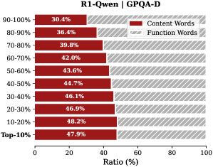
This is a horizontal bar chart displaying the ratio (in percentage) of content words to function words across different frequency ranges. The chart is titled "R1-Qwen | GPQA-D". The x-axis represents the ratio in percentage, ranging from 0 to 100. The y-axis represents frequency ranges, starting from "Top 10%" and going up to "90-100%". Two data series are presented: "Content Words" (represented by dark red bars) and "Function Words" (represented by light gray bars).
### Components/Axes
* **Title:** R1-Qwen | GPQA-D
* **X-axis Label:** Ratio (%)
* **Y-axis Labels (Frequency Ranges):** Top 10%, 10-20%, 20-30%, 30-40%, 40-50%, 50-60%, 60-70%, 70-80%, 80-90%, 90-100%
* **Legend:**
* Content Words (Dark Red)
* Function Words (Light Gray)
### Detailed Analysis
The chart shows the percentage of content words and function words for each frequency range. The data points are as follows:
* **Top 10%:** Content Words: 47.9%, Function Words: ~52.1% (estimated from the bar length)
* **10-20%:** Content Words: 48.2%, Function Words: ~51.8%
* **20-30%:** Content Words: 46.9%, Function Words: ~53.1%
* **30-40%:** Content Words: 46.1%, Function Words: ~53.9%
* **40-50%:** Content Words: 44.7%, Function Words: ~55.3%
* **50-60%:** Content Words: 43.6%, Function Words: ~56.4%
* **60-70%:** Content Words: 42.0%, Function Words: ~58.0%
* **70-80%:** Content Words: 39.8%, Function Words: ~60.2%
* **80-90%:** Content Words: 36.4%, Function Words: ~63.6%
* **90-100%:** Content Words: 30.4%, Function Words: ~69.6%
**Trend Verification:**
The "Content Words" bars generally decrease in length as the frequency range increases, indicating a decreasing ratio of content words in less frequent word occurrences. Conversely, the "Function Words" bars increase in length with increasing frequency range, showing a higher ratio of function words in less frequent word occurrences.
### Key Observations
* The ratio of content words is highest in the "Top 10%" frequency range (47.9%).
* The ratio of function words is highest in the "90-100%" frequency range (~69.6%).
* There is a consistent inverse relationship between the ratio of content words and function words across all frequency ranges.
* The difference between the two ratios widens as the frequency range increases.
### Interpretation
The data suggests that more frequent words (those in the "Top 10%" range) tend to be content words, while less frequent words (those in the "90-100%" range) tend to be function words. This is expected, as content words carry the primary meaning of a text and are therefore more likely to appear frequently, while function words (articles, prepositions, etc.) serve grammatical purposes and are often used regardless of the specific content. The widening gap between the ratios as frequency decreases indicates that the least frequent words are overwhelmingly function words, likely representing rare grammatical constructions or specialized terminology. The chart provides insight into the lexical distribution of a corpus, potentially revealing characteristics of the text's style or domain. The title "R1-Qwen | GPQA-D" suggests this data is related to a specific model (R1-Qwen) and a question answering dataset (GPQA-D).