## Line Chart: Average Correct Flips per Iteration
### Overview
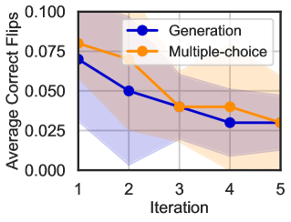
The image is a line chart comparing the performance of two methods, "Generation" and "Multiple-choice," over five iterations. The performance metric is the "Average Correct Flips." Both methods show a decreasing trend, with shaded regions indicating confidence intervals or variability around the mean values.
### Components/Axes
* **Chart Type:** Line chart with shaded confidence bands.
* **Y-Axis:**
* **Label:** "Average Correct Flips"
* **Scale:** Linear, ranging from 0.000 to 0.100.
* **Ticks:** 0.000, 0.025, 0.050, 0.075, 0.100.
* **X-Axis:**
* **Label:** "Iteration"
* **Scale:** Linear, discrete integer values.
* **Ticks:** 1, 2, 3, 4, 5.
* **Legend:**
* **Position:** Top-right corner of the plot area.
* **Series 1:** "Generation" - Represented by a blue line with circular markers.
* **Series 2:** "Multiple-choice" - Represented by an orange line with circular markers.
* **Visual Elements:**
* **Confidence Bands:** Each line has a corresponding shaded area of the same color but with lower opacity, representing the range of data (e.g., standard deviation, confidence interval).
* **Grid:** A light gray grid is present in the background.
### Detailed Analysis
**Trend Verification & Data Points (Approximate):**
1. **Generation (Blue Line):**
* **Trend:** The line shows a steep downward slope from iteration 1 to 2, followed by a more gradual decline through iterations 3, 4, and 5.
* **Approximate Values:**
* Iteration 1: ~0.070
* Iteration 2: ~0.050
* Iteration 3: ~0.040
* Iteration 4: ~0.030
* Iteration 5: ~0.028
* **Confidence Band:** The blue shaded area is widest at iteration 1 (spanning roughly 0.040 to 0.100) and narrows considerably by iteration 5.
2. **Multiple-choice (Orange Line):**
* **Trend:** The line starts higher than the blue line, drops sharply between iterations 1 and 2, then plateaus with a very slight downward trend from iteration 2 to 5.
* **Approximate Values:**
* Iteration 1: ~0.080
* Iteration 2: ~0.065
* Iteration 3: ~0.040
* Iteration 4: ~0.040
* Iteration 5: ~0.030
* **Confidence Band:** The orange shaded area is also widest at iteration 1 (spanning roughly 0.055 to 0.100) and narrows over time, though it remains wider than the blue band at iterations 4 and 5.
**Component Isolation:**
* **Header:** Contains the Y-axis label and the top portion of the plot area.
* **Main Chart:** The central plotting area containing the two lines, their confidence bands, and the grid.
* **Footer:** Contains the X-axis label and tick marks.
### Key Observations
1. **Initial Performance:** The "Multiple-choice" method starts with a higher average correct flips value (~0.080) than the "Generation" method (~0.070) at iteration 1.
2. **Rate of Decline:** The "Generation" method experiences a more consistent and steeper decline across all iterations. The "Multiple-choice" method's decline is most pronounced in the first two iterations, after which it stabilizes.
3. **Convergence:** By iteration 3, the mean values of both methods converge at approximately 0.040. From iteration 4 onward, the "Generation" method's mean falls slightly below that of "Multiple-choice."
4. **Variability:** The confidence intervals for both methods are substantial, particularly in early iterations. The bands overlap significantly throughout the chart, especially from iteration 3 onwards, indicating that the difference in mean performance between the two methods may not be statistically significant at those points.
5. **Final State:** At iteration 5, both methods show low average correct flips (between ~0.028 and ~0.030), with overlapping confidence intervals.
### Interpretation
The chart demonstrates that both the "Generation" and "Multiple-choice" methods see a reduction in the "Average Correct Flips" metric as the number of iterations increases. This suggests that the task or problem being measured becomes more difficult, or the methods' effectiveness diminishes, with repeated iterations.
The "Multiple-choice" approach appears to have a higher initial performance but stabilizes after a sharp early drop. The "Generation" approach degrades more steadily. The critical observation is the **overlap of the confidence bands**. This visual overlap suggests that while the point estimates (the lines) differ, the underlying data has enough variability that we cannot confidently state one method is superior to the other at any given iteration based solely on this chart. The trend is clear—performance decreases for both—but the precise comparison between methods is uncertain. The data implies that the choice between these methods may depend more on factors other than this specific performance metric over multiple iterations, such as computational cost, speed, or performance on other unmeasured dimensions.