\n
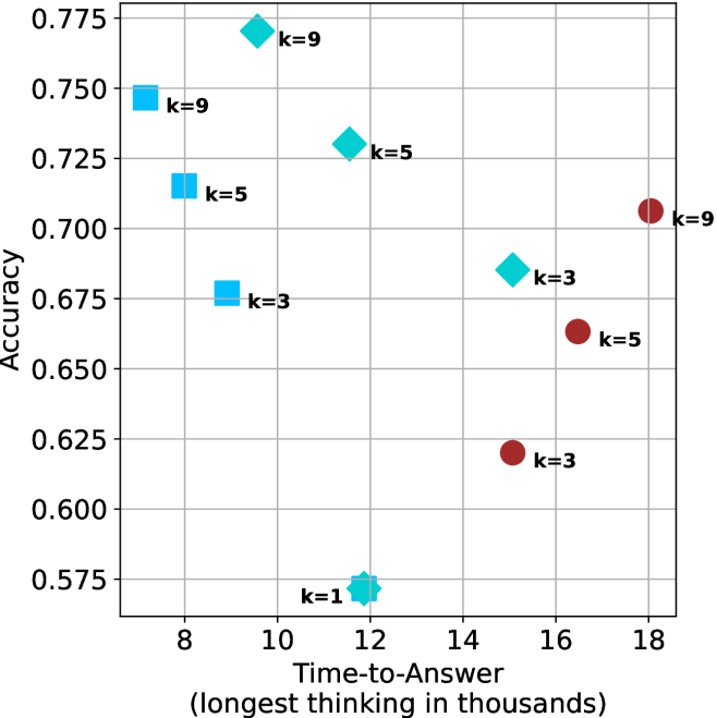
## Scatter Plot: Accuracy vs. Time-to-Answer
### Overview
This image presents a scatter plot illustrating the relationship between Accuracy and Time-to-Answer, with data points differentiated by the value of 'k'. The x-axis represents Time-to-Answer in thousands of units, and the y-axis represents Accuracy. Each data point is marked with a colored diamond or circle and labeled with its corresponding 'k' value.
### Components/Axes
* **X-axis:** Time-to-Answer (longest thinking in thousands) - Scale ranges from approximately 8 to 18.
* **Y-axis:** Accuracy - Scale ranges from approximately 0.575 to 0.775.
* **Data Points:** Represented by colored diamonds and circles.
* **Legend:** Implicitly defined by the 'k' values associated with each data point's color.
* Blue: k = 9, k = 5, k = 3
* Red: k = 9, k = 5, k = 3
* Green: k = 9, k = 5
### Detailed Analysis
The plot contains data points for k = 1, 3, 5, and 9. Let's analyze each 'k' value's trend:
* **k = 1:** One data point at approximately (12, 0.575).
* **k = 3:** Three data points:
* Approximately (8.5, 0.675) - Blue diamond
* Approximately (15.5, 0.625) - Red circle
* Approximately (10, 0.675) - Blue diamond
* **k = 5:** Three data points:
* Approximately (8.25, 0.725) - Blue diamond
* Approximately (11, 0.725) - Green diamond
* Approximately (16.5, 0.65) - Red circle
* **k = 9:** Three data points:
* Approximately (8, 0.75) - Blue diamond
* Approximately (10, 0.775) - Green diamond
* Approximately (18, 0.70) - Red circle
### Key Observations
* There is a general trend of increasing accuracy with increasing time-to-answer, but it's not strictly linear.
* For k = 3, 5, and 9, there's a noticeable spread in accuracy values for similar time-to-answer values.
* The data points for k=9 show a wider range of accuracy values compared to k=1.
* The data points for k=1 are clustered at the lower end of both axes.
### Interpretation
The data suggests that as the model spends more time "thinking" (Time-to-Answer), its accuracy generally improves. However, the variability in accuracy for a given time-to-answer, especially for higher 'k' values, indicates that other factors influence the model's performance. The 'k' parameter likely represents a model complexity or capacity parameter. Higher 'k' values allow for more complex reasoning, but also introduce more variability in the results.
The spread in accuracy for k=3, 5, and 9 suggests that the model's performance is not solely determined by the time spent thinking. There might be inherent randomness or sensitivity to the specific input data. The low accuracy and short time-to-answer for k=1 suggest that a very simple model is quick but inaccurate. The data points for k=9 show a wider range of accuracy values compared to k=1, indicating that a more complex model can achieve higher accuracy but also has the potential for greater error.
The red circles seem to represent a different subset of data or a different condition within the experiment, as they consistently show lower accuracy for the same time-to-answer compared to the blue and green diamonds. This could be due to a different training dataset, a different evaluation metric, or a different experimental setup.