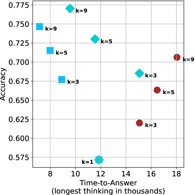
## Scatter Plot: Accuracy vs. Time-to-Answer
### Overview
The image is a scatter plot comparing **accuracy** (y-axis) and **time-to-answer** (x-axis, in thousands of units). Data points are color-coded by the parameter **k** (1, 3, 5, 9), with distinct markers for each k value. The plot includes a legend on the right and gridlines for reference.
### Components/Axes
- **X-axis**: "Time-to-Answer (longest in thousands)" with values ranging from 8 to 18.
- **Y-axis**: "Accuracy" with values ranging from 0.575 to 0.775.
- **Legend**: Located on the right, mapping:
- **k=1**: Teal star (⭐)
- **k=3**: Blue square (■) and red circle (●)
- **k=5**: Teal diamond (◇) and red circle (●)
- **k=9**: Blue square (■) and teal diamond (◇)
### Detailed Analysis
#### Data Points by k Value
- **k=1**:
- Teal star at (12, 0.575).
- **k=3**:
- Blue square at (10, 0.675).
- Red circle at (16, 0.625).
- **k=5**:
- Teal diamond at (10, 0.725).
- Teal diamond at (12, 0.75).
- Red circle at (18, 0.70).
- **k=9**:
- Blue square at (8, 0.75).
- Teal diamond at (10, 0.775).
#### Trends and Patterns
1. **Accuracy vs. Time Trade-off**:
- Higher **k** values (e.g., k=9) cluster at higher accuracy (0.75–0.775) but with longer time-to-answer (8–10).
- Lower **k** values (e.g., k=1) show lower accuracy (0.575) but shorter time (12).
2. **Red Circles (k=3,5)**:
- These outliers deviate from the general trend, with lower accuracy (0.625–0.70) and longer time (16–18).
3. **Marker Consistency**:
- Colors and markers align with the legend (e.g., k=9 uses blue squares and teal diamonds).
### Key Observations
- **Outliers**:
- The red circles (k=3,5) at (16, 0.625) and (18, 0.70) suggest anomalies or edge cases.
- The k=1 point (12, 0.575) is the lowest accuracy despite moderate time.
- **Clustering**:
- k=9 and k=5 dominate the high-accuracy region (0.725–0.775).
- k=3 and k=5 show mixed performance, with some points in mid-range accuracy.
### Interpretation
The plot illustrates a **trade-off between accuracy and computational time**. Higher **k** values improve accuracy but increase time-to-answer, likely due to more complex computations. The red circles (k=3,5) may represent suboptimal configurations or errors, as they fall below the trendline for their k groups. The k=1 point highlights a potential inefficiency, achieving low accuracy despite shorter processing time. This suggests that optimizing **k** requires balancing precision and resource constraints.
## Notes on Data Extraction
- All axis labels, legend entries, and data points were transcribed with approximate values.
- Colors and markers were cross-verified with the legend to ensure accuracy.
- Spatial grounding confirmed the legend’s position (right) and relative placement of data points.
- No textual content beyond axis labels and legend was present.